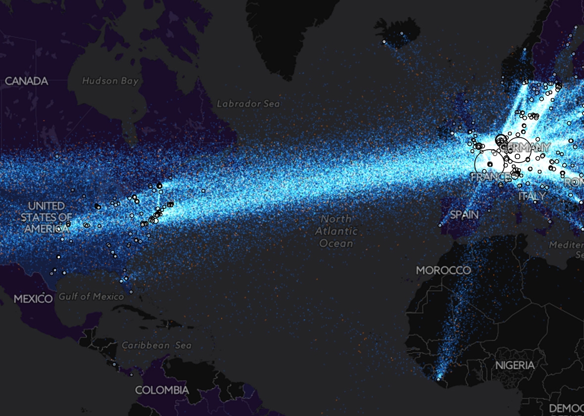
See a Visualization of Tor’s Anonymous Data Flowing Around the World

For a tool that’s meant to serve as a cloak of online anonymity, Tor is surprisingly transparent. The nonprofit Tor project whose software powers its network of thousands of volunteer proxy computers also publishes a frequently updated collection of data about the location and bandwidth of those privacy-enhancing machines on desks and in data centers around the world. Now a data visualization company has assembled that data into an interactive graphic, beautifully capturing the Tor network’s complexity and scale.
TorFlow, a project created by the data-visualization software firm Uncharted, maps the Tor network’s nodes and data movements based on the IP addresses and bandwidth of the “relay” computers that bounce around its users’ connections to prevent them from being censored or surveilled. (A simplified version is shown above, but the full interactive graphic is hosted at Uncharted’s website.) “The whole point of the Tor network is to remain anonymous,” says David Schroh, one of Uncharted’s software engineers who built TorFlow. “But by visualizing it, you can see patterns you wouldn’t expect.”
One unexpected takeaway: just how much it is actually privacy-loving Europe that supplies Tor’s bandwidth, despite the project’s American roots as a U.S. Naval Lab research project adopted by Massachusetts Institute of Technology coders. Though the United States provides more than 1,300 of Tor’s 6,000 nodes at last count, the biggest hubs on TorFlow’s map are in Germany, France, the Netherlands, and England. TorFlow also reveals Tor nodes in unlikely places, such as Libya and Liberia, where we would expect Tor to be used but not necessarily hosted. And the map shows the network’s growth over the last eight years, spreading from the West to countries like Israel, Indonesia, and Japan.
TorFlow is primarily designed to map out Tor’s infrastructure but also includes some data about the number of users in any given country, represented by the country’s shade on the map. Click on a country, and it shows a chart of the country’s Tor usage over time. (Check Egypt, and you’ll see spikes in usage during the first Arab Spring protests there in 2011 and then again after a political coup in 2013.) That makes TorFlow not just a map of anonymity online across the globe but across time, too.
Also in Wired:
Future Tense is a partnership of Slate, New America, and Arizona State University.

