Google Autocomplete Reveals the Fattest, Boringest, and Most Racist States in the Union

Courtesy of Renee DiResta / NoUpside
Note: The interactive map below may not be working in some browsers, including Internet Explorer 8. Apologies for any inconvenience while we track down the bug.
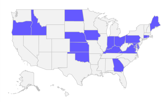
Indiana: boring. Maine: boring. Georgia: hot, racist, and boring. Oregon: liberal, weird, rainy, and boring. Ohio: boring, but important in the primaries.
Such, at least, are the verdicts rendered by Google’s autocomplete function, according to some informal research by venture capitalist and occasional blogger Renee DiResta. Suffering from mild culture shock upon her recent move from New York to San Francisco—where subways are sparse, people are obsessed with “local food,” and homeless people sprawl comfortably about the streets—she got interested in how people from different U.S. regions stereotype one another.
State by state, she started typing “Why is [state] so” into her Google search bar, and let its algorithm guess the remainder of her question. Type in “Why is Illinois so,” for instance, and it wonders if you’re going to ask, “Why is Illinois so corrupt?” For West Virginia, the top result is “poor.” Not all of the suggested descriptions are negative. Colorado is “healthy” and Delaware “business friendly.”
“It seemed like an ideal question to get at popular assumptions, since ‘Why is [state] so X?’ presupposes that X is true,” DiResta wrote. Once she had her results, she turned them into an interactive map of state stereotypes. With her blessing, I've reposted it here, because it's awesome and I wish I had thought of it myself. Mouse over any state to see the top four results.
Stereotypes don't always correspond to reality, but it turns out that there is some wisdom in the crowd's assumptions. DiResta found that states Google users think of as “expensive” in fact have some of the highest costs of living. And states whose top results include “fat” or “overweight” are indeed near the top in obesity rates, according to the CDC.
Google’s guesses change over time, so her results aren’t necessarily the same ones you’d get if you tried the searches yourself today. For instance, DiResta’s top autocomplete for Texas was “awesome,” but mine was “hot.” Perhaps she tried the search on an unsually mild day in the Lone Star State. And Tar Heel basketball fans are surely hoping that “bad this year” will not linger long among the top results for “Why is North Carolina so.”
DiResta’s full post, including a map of states that actually return positive results, is here.
Future Tense is a partnership of Slate, New America, and Arizona State University.

