Lost in Penn Station
Why are the signs at the nation’s busiest train hub so confusing?
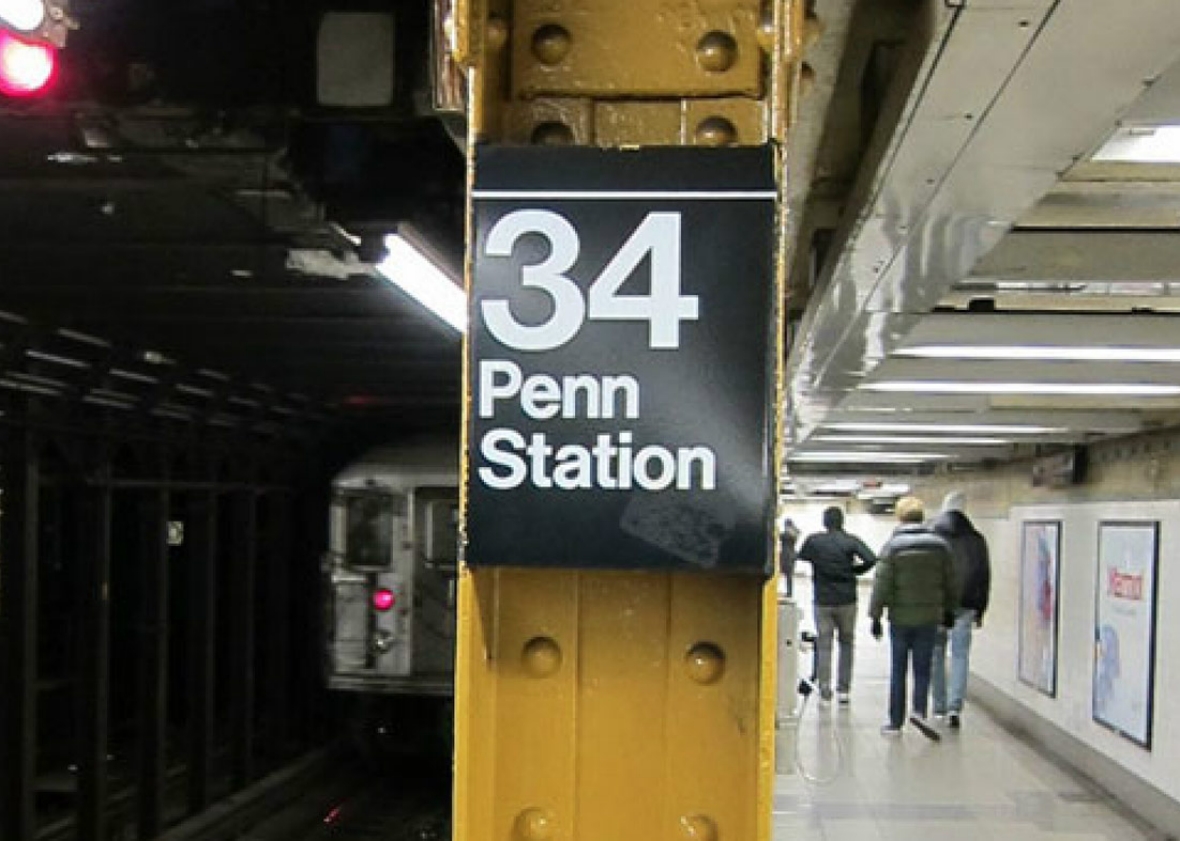
This month, Slate is republishing some of our favorite stories. Here's today's selection: Julia Turner's entire series on signs, from 2010, taught me a lot about the ways that structural problems within and between organizations affect customers; take the signage at Penn Station, which is confusing and bizarre largely because three different railroads can't agree with each other. And the fact that Slate's then-deputy editor, now editor in chief, clearly spent weeks on a quixotic project about signage—something she cared about, but which wouldn't be an easy sell at other magazines—made me feel as though Slate was willing to take chances in assigning and thinking about the world. —Dan Kois
Penn Station is a confusing place. The bustling train terminal, located on the West Side of Manhattan, is a sprawling mass of tracks, corridors, and concourses spread across three levels. It's home to three different railroads—Amtrak, New Jersey Transit, and the LIRR—and two subway lines. It's the busiest train station in North America, crowded with around 200 million passengers a year. And there's a giant sports arena, Madison Square Garden, squatting on top of it, so much of this activity occurs underground, in low-ceilinged tunnels devoid of sunlight and fresh air. For visitors, it offers a disorienting welcome to the city. By and large, New Yorkers do not like it.
One reason they don't like it is that it has bad signs. On Yelp.com, where users have given Penn 2.5 stars out of 5, comments range from "How their signs do stymie!" to "Someone needs to put up some signs as to where the stuff is" to "Without a doubt, one of the poorest and most confusing arrangements for signage and passenger movement that I can imagine." (Grand Central, by comparison, rates 4.5 stars, and the only comment on its directional signage is: "Signs for different exits are really well posted so you never get turned around.")
Of course, it's not fair to compare Penn Station and Grand Central. Penn sees four times as much traffic and is much more complex. Still, Penn Station signage is confusing, and more confusing than it needs to be. Understanding why—and how it got that way—can teach us a lot about what makes good signage good.
* * *
Consider the case of one traveler and the ways in which Penn Station's signs might confuse her. She's a New Yorker who works downtown, and she needs to catch an Amtrak train to Washington, D.C. The slide show below tracks her journey through the station.
Our traveler made it to her train, thanks entirely to the signs pictured here. In that sense, the system worked just fine. But it also put her through unnecessary stress. During her long walk down the main corridor, she passed more than five signs that made no mention of Amtrak, causing her to doubt the route she was on, even though it was right. And when she reached the Amtrak concourse, there was no sign properly identifying that she'd arrived. She had to check the departures board—and see her train to Washington listed—to confirm that she was in the right place. If, at any point, she'd given up and doubled back to the beginning, she would have lost time and been even later for her train. How could these signs be improved?
* * *
When I first started interviewing sign designers for this series, I was surprised that they didn't talk much about signs. I'd expected to learn a lot about typeface and color selection. Maybe, if I were lucky, a revolutionary new arrow.
Instead, I learned there's a reason professionals call what they do not "sign-making" but "wayfinding." Their goal is to help users find their way through complicated environments. That requires a lot more than good-looking signs. To create a sign system that works, designers must first understand how people will use a space. When beginning a hospital project, they'll map out all the possible routes a visitor might take. How would a patient with an oncology appointment get to it? How about a visitor to the maternity ward? If they're designing new signage for an existing space, they often quiz the security guards. No one knows better what people find confusing.
As designers map out the main routes, they also pay attention to the architecture. When people find their way through buildings, they are often guided as much by the space itself as by any posted signs. Does the main lobby look like a lobby, with a front desk and a building directory? If not, visitors may think they have come in the wrong entrance. People are also more likely to get lost in a building without distinguishing features visible from the street. A hospital complex with two prominent towers may be easier to navigate than one situated in a giant boxy building. If the architecture is confusing, wayfinding designers may ask the architects to make changes, or they may devise sign systems that try to clarify the space. (A design team might use three main elevator banks as orienting landmarks, for example, or assign memorable names or different color schemes to distinct zones within the space.)
Next the wayfinding team will identify every key decision point—every place where a visitor might stop and think, Where do I go from here? Each one should get a sign; that way users never get confused. It's also important to decide what information will go on each sign, doling out directions only as needed. A woman getting out of a cab at the airport doesn't need to know where the gates are yet—she just needs to know where to check in.
Only then, once all this information has been determined, will the wayfinding team start thinking about the design of the signs.
* * *
The problem at Penn Station is not that designers skipped these steps. It's that three sets of designers did them three times. Penn Station is owned by Amtrak, which manages its concourse on the western side of the station. But Amtrak leases the rest of the station out to the two other tenants: New Jersey Transit has the southeast corner, and the LIRR the northeast. (The Metropolitan Transportation Authority oversees both the LIRR and New York City Transit, which manages the two adjacent subway stations; their sign systems are similar to the LIRR's.*) The fundamental wayfinding problem at Penn Station lies in the fact that each of these entities manages its own signs, usually without consulting the others. As a result, the station essentially has three different systems of signage.
This is a crazy way to manage information at the biggest railway station in the country. The user experiences Penn Station as one place. But the current system assumes that the user experiences the station as three distinct spaces. In truth, though, as we saw in the slide show above, many journeys require travelers to cross from zone to zone.
Within each of the station's three concourses, the various wayfinding designers direct users primarily to the tracks and amenities of whomever they're working for. At this, they've done a reasonably good job. It's in directing travelers to other parts of the station that Penn's sign systems often fail.
I asked David Gibson, a principal at the firm Two Twelve and the author of a recent book called TheWayfinding Handbook, to tour the station with me and examine its signage. (Gibson's firm has done some work for both N.J. Transit and the LIRR, but he didn't pull his punches.) The Long Island Rail Road concourse—which is where our beleaguered traveler spent most of her journey—is distinctive, awash in the yellowish light reflected on the ceiling of its main corridor and marked by its row of lively shops.* The signage often appears in a band above the retail signage. This gives travelers a consistent place to look, but it also means that directional signs compete with retail signs for attention.
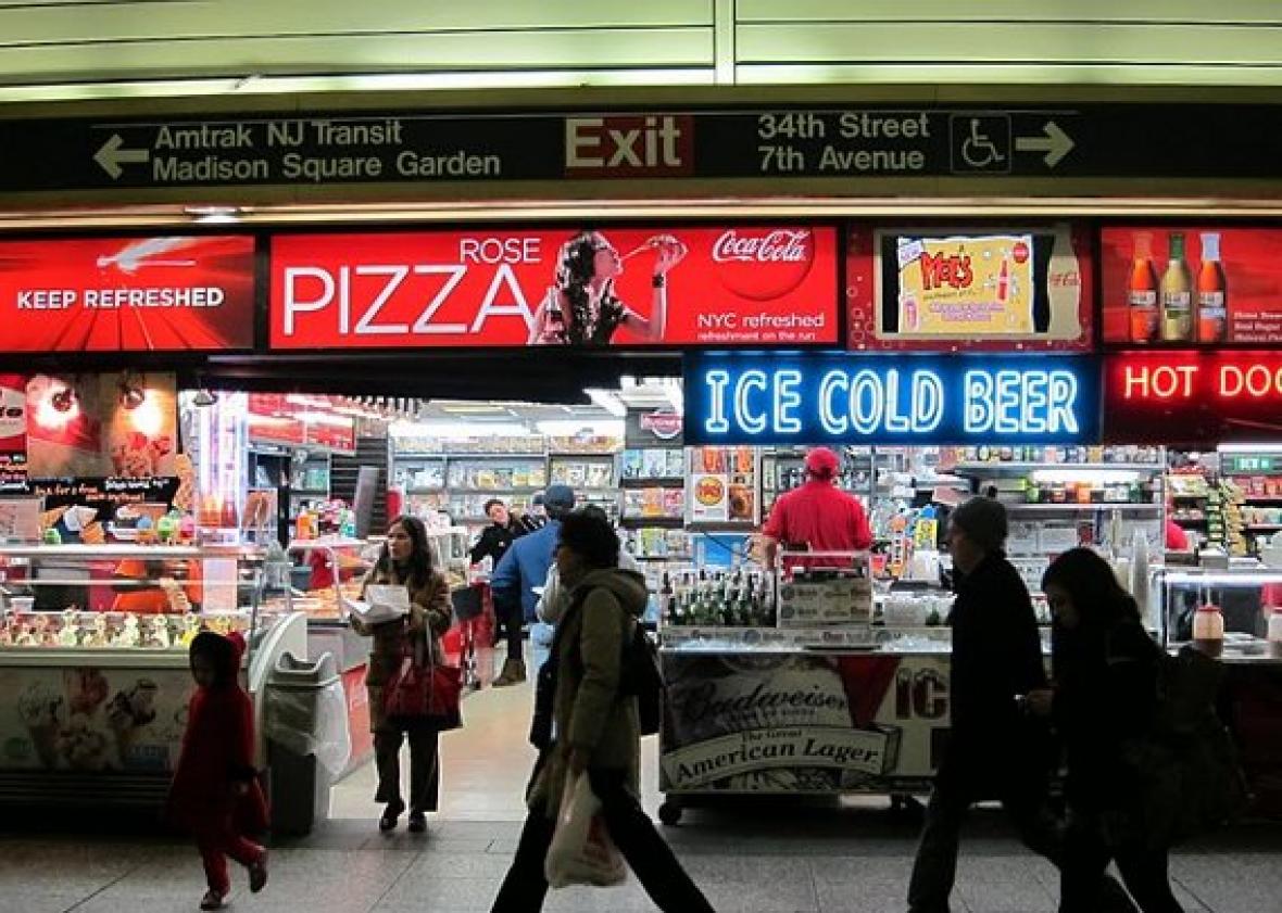
The sign style here is derived from the MTA's subway signage system. The aesthetics of these signs are clear and strong. Gibson noted that the white Helvetica type is quite legible on the dark ground and that the type size is sufficient. He also pointed out that what wayfinders call the "information hierarchy"—the relative prominence of the elements on a sign—tends to be fairly good. The concourse managers even play the electronic sound of chirping birds near the track entrances to guide visually impaired travelers to a special kiosk that can help orient them. The key problem, however, is that signs to other parts of the station are sparse and inconsistently located.
The Amtrak concourse is abidingly blue, and marked by its higher ceilings. Its signs also use a sans-serif font, although one that's slenderer and more delicate than Helvetica. To Gibson, the style seemed retro; all that blue felt too much like "an old '50s bus station."
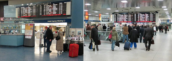
Because Amtrak dispatchers control N.J. Transit's trains, the Amtrak departures boards list N.J. Transit departures as well, a nice concession to another station tenant. But even that is slightly confusing: Why not list LIRR departures, too? Although one board is labeled "Amtrak Departures," the other just says "Departures." How is the first-time LIRR passenger to know she's in the wrong place?
Gibson was impressed by the feel of the New Jersey Transit Concourse, which is the most recently renovated. The architects created a pleasing environment with a pink-and-black-stone color scheme, and the piped-in classical music creates the sensation of a cultured commute.
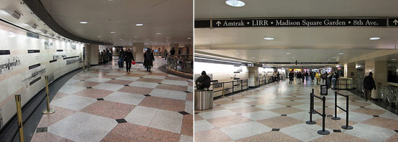
The signs use a serif font—an unusual choice in transportation signage, where sans-serif typefaces have long been in vogue. But most designers agree that serif fonts can work for signage as long as the line spacing and type size is well handled. Here, Gibson felt the size was a little small. It's hard to read any signs but the ones immediately in front of us. This sign even directs N.J. Transit riders to Amtrak and the LIRR, although it might confuse a passenger looking for the subway lines. The low ceilings are probably to blame for the skinny signs and small type—any bigger, and taller passengers might have to duck. Unfortunately, however, given the hulk of Madison Square Garden upstairs, New Jersey Transit can't do much about them.
Watch a video tour of Penn Station's signage with David Gibson.
Each of these three sign systems has strengths and weaknesses. But the problems with Penn Station are not, fundamentally, design problems. They're power problems. If the authority in Penn Station were centralized—or if Amtrak stepped up to its role as landlord and decided to address the station's wayfinding problems with a unified sign system—the place could be made less confusing.
Mike Gallagher, Amtrak's Superintendent of Passenger Services for Penn, pointed out via e-mail that while each tenant manages its own signs, Penn has "ample signage throughout the station, directing passengers to the area of the station they are looking to travel from." But having lots of signs is a pale substitute for having signs that really speak to one another.
Lance Wyman, a pioneering wayfinding designer, recalls encountering this problem when doing some work for Amtrak at Penn in the 1990s. He told me that after a meeting, he once asked, " 'Who can I talk to to try to coordinate all of this working as one system?' And one guy said, 'Oh, we don't talk to each other.' He was joking but he wasn't joking, you know? I mean, it's the truth!" Penn's tenants do coordinate their efforts on occasion—as when the LIRR and N.J. Transit joined forces to promote trains to New Jersey's Meadowlands Stadium last fall—but such initiatives are sporadic and ad hoc.
Fixing Penn Station's wayfinding would be a challenge, primarily because the architectural structure of the place is not readily apparent to the traveler. (An irony, given that the original Penn Station, torn down in 1965, was literally transparent—topped with a glass atrium.)
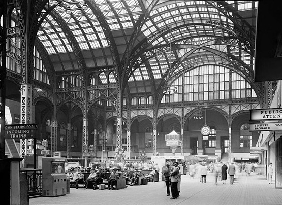
The current space, a warren of underground bunkers, is difficult to visualize unless you've been there many times. But David Gibson pointed out that a wayfinding design team could take advantage of the distinct spaces the three tenants have already created. Passengers already sense that the station has different zones; the wayfinding team would need to work to heighten those contrasts, and strengthen the cues that help people identify where they are and where they need to go. Another challenge: The station has an enormous number of entrances. Passengers can enter from several portals to the street, or from scores of stairways from individual rail and subway tracks underground. It would be tricky to determine where to place orienting maps and other cues to welcome new arrivals. But it could be done.
Penn Station is a remarkably challenging environment for wayfinding. But it's a useful place to examine, because it highlights the single most crucial thing a wayfinding designer must do: think about the user and understand how he will perceive a space. When signs are good, and you pay attention to them, you can sense the level of thought that went into them. Someone, somewhere, anticipated the journey you are on, and the information you would need. At Penn Station as a whole, it's no one's job to think about how you'll get where you're going. And you can tell.
More from this series: Why signs are better now than they've ever been; how smarter signs could make London easier to navigate; the international war over the exit sign; how GPS could kill the sign. Plus: Send Slate your hand-drawn maps. See more road signs in this Magnum Photos gallery.
