Bad Latitude
The trouble with viral maps. Plus: Some fun viral maps!
Virginians name their boys William. Vermonters like Phish. Louisiana has gonorrhea.
If you have an Internet connection, you’ve likely seen one of these maps of America, in which each state’s character is boiled down to a single predilection or predicament. The maps are undeniably entertaining: You check out the state you live in, the state your cousin lives in, the state you dislike for whatever reason, and then send it to a friend so she can do the same. Thanks to their shareability, the maps have quickly become a fixture of Facebook, Twitter, and websites (Slate among them) eager to profit from our fascination with federalism.
There’s nothing wrong with reading and sharing maps like this, of course—they’re fun and might even teach you some trivia. But the maps are often misleading. Crucial information can be left out, and patterns can emerge where there are none. The underlying data is usually noisier than it appears, and a small change in methodology can result in drastically different maps. If you understand the sensitivity of the data and the process used to create the map, this isn’t much of an issue. But when someone shares an amusing U.S. map on Facebook, how long do you usually spend reading the fine print about methodology? You might be surprised at what you’re missing.
Many different kinds of U.S. maps have gone viral in recent months. My focus here is on maps of the United States in which each state is given a single, non-numeric label, as these tend to be among the most widely shared. For instance, you may have seen the maps of popular baby names by year created by Reuben Fischer-Baum. In many instances, a single name surges in popularity in a given year, appears to take over the United States like a virus, and then fades away. The name Ashley, for example, appears to go from limited popularity in the 1980s to near ubiquity by the early ’90s.
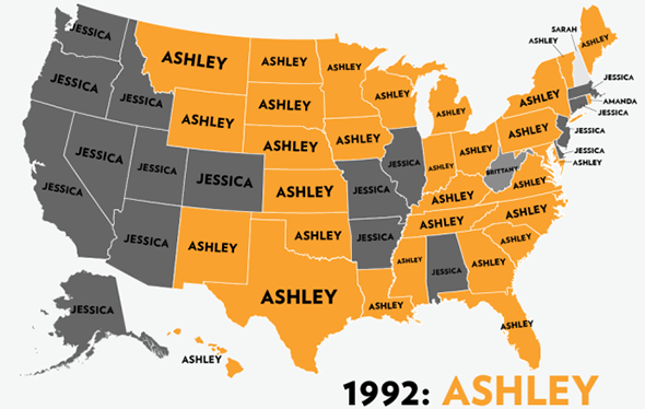
Courtesy of Reuben Fischer-Baum/Jezebel
Watch the maps in GIF form, and it’s impossible not to come away with the conclusion that American parents were in the grip of an Ashley-naming epidemic in the final years of George H. W. Bush’s presidency:
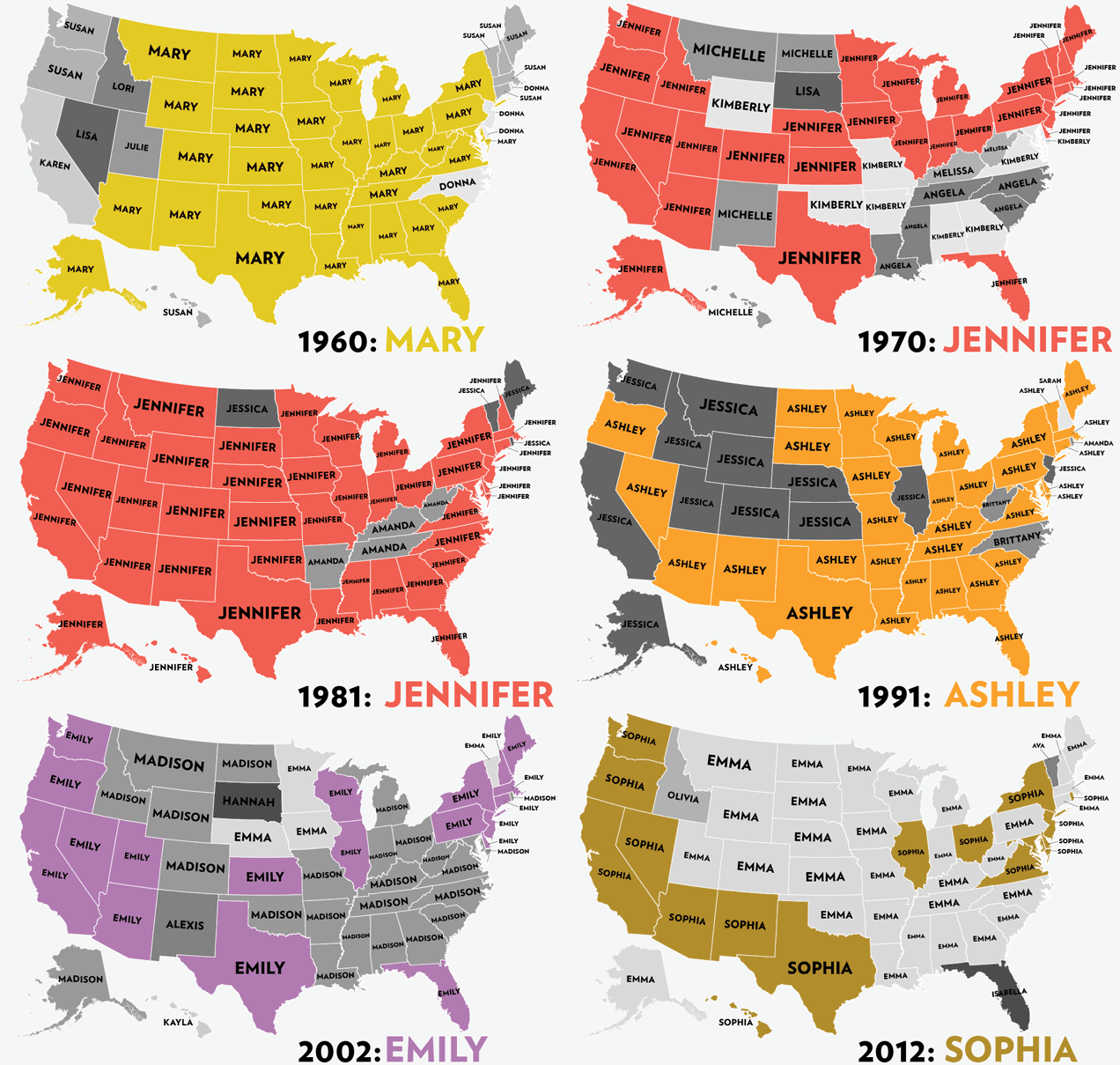
In 1984, only 13 states are labeled Ashley; by 1992, 30 states are. But it turns out that in 1984, a female baby born in the United States was actually 8 percent more likely to be named Ashley than in 1992.
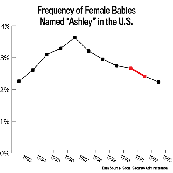
Chart by Ben Blatt/Slate
Ashley was still the most popular girls’ name in 1991 and 1992. But its newfound dominance of the map is not the result of its growing popularity. Ashley was on the decline by the early ’90s—but other names were declining even faster. The original maps don’t actually say that Ashley was increasing in popularity in the early ’90s, but the way the information is presented, that misunderstanding is almost unavoidable.
Even within each individual name map, the results are not always as straightforward as they seem. In the 1992 map, Missouri is marked Jessica, while Iowa, its neighbor to the north, is marked Ashley. Glancing at the map quickly, you would likely assume that Ashley was therefore more popular in Iowa than in Missouri. But in 1992, 2.7 percent of all babies born in Missouri were named Ashley. This is a higher rate than in Iowa (2.3 percent) and indeed higher than the national average (2.4 percent). It just so happens that Jessica was even more popular in Missouri than Ashley.
Again, this doesn’t mean the baby-name maps are wrong. They don’t purport to show anything except the most commonly given name in each state. In fact, these particular maps are well-designed and informative, if you have time to wade through the implications of the data. But it’s easy to see false trends here. Behind each map is data for hundreds of names across 50 states that would need to be examined closely to find the real trends. Unfortunately, there is no such thing as a viral Excel sheet.
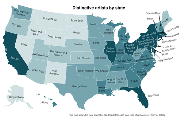
Even a carefully researched and explicated map can be lifted in JPEG form and distributed without proper context. A perfect example of this is the map below, created by Music Machinery blogger Paul Lamere. The map shows each state’s “Most Distinctive Band”:
Courtesy of Paul Lamere/The Echo Nest
Lamere’s concept was well thought out, and his original post took care to explain his process and to offer the appropriate caveats to his readers. The map was meant to illustrate something very specific: which band is more popular in a given state than in any other state. But when the map was republished, on sites including BuzzFeed, Time, and Slate, his notes disappeared, and, even worse, the map was given a new, misleading title. Now the map was being described as showing each state’s favorite band, period. Naturally, “Your State’s Favorite Band” is a more attractive and easier to understand headline than “Your State’s Most Distinctive Band.” If it wasn’t for Mother Jones taking other sites to task for this mislabeling, the error may have gone unnoticed. (Slate’s post on the map has since been corrected.)
I talked to Kirk Goldsberry, who teaches cartography at Harvard, about the rise of viral maps. He noted that people tend to be very trusting of maps. Information a reader might be inclined to question if presented as text might be more blithely accepted if presented in the form of a map. This certainly seems to be the case when it comes to the distinctive songs map. If a music critic asserted in a review that Sufjan Stevens is the most listened to act in Illinois, you would be skeptical of that claim. More listened to than Jay Z? Than Katy Perry? Than the Beatles? When incorrectly labeled as “Each State’s Favorite Band,” the map was making such a claim. But in the context of a map, readers were slower to realize the mistake, if they noticed it at all.
Even knowing that the map is showing the most distinct, not the most popular, band for each state, the map can still be misleading if you don’t pay attention to the methodology. For example, Lamere made the decision to only include bands among the 50 most listened to in each state for his sample, so that the map would feature acts with a reasonable level of popularity. Without such a cutoff, the most distinctive band in many states would be a local act many readers would never have heard of. In Virginia, for example, if the cutoff had been the top 1,000 most listened to artists, as opposed to the top 50, the commonwealth’s most distinctive artist would have been HardHittaz—a group that is not in the top 10,000 most listened to groups in the United States.
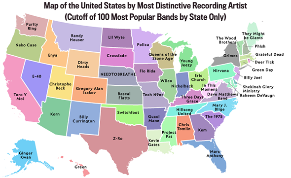
Lamere’s choice of 50 as a cutoff was therefore reasonable—it produced a map where the majority of the acts are recognizable to most readers—but it was also arbitrary. Below are two maps created using the same methodology and same data that Lamere used, only in these maps, the cutoff is 35 and 100 instead of 50.

Map by Ben Blatt/Slate
Map by Ben Blatt/Slate
As you can see, the choice of cutoff drastically affects the results. Let’s look at Illinois again. When the cutoff is 50, Sufjan Stevens wins out. At 35, the state’s most distinctive artist is the Rolling Stones; at 100, it’s Wilco. Likewise, New York’s most distinctive artist shifts from Bob Dylan to James Blake to Grimes based on whether the cutoff is 35, 50, or 100, respectively. These alternate maps show how fickle data can be.
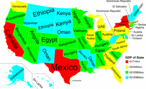
This is not to say that just because a map goes viral that it is shoddy or misleading cartography. Consider this viral map created by Reddit user Phaenti on the subreddit MapPorn that compares each state to a country with roughly the same GDP. The map was republished widely, including on Slate.
Courtesy of Phaenthi/Reddit
This map may seem purely wacky at first, but it does a great job of illustrating the size of the American economy. You knew Texas’ economy was huge, but you might not have realized it was the same size as a large industrial country like Mexico. Even many small states like Wyoming and Idaho measure up to countries whose population exceeds 50 million. This element of surprise is likely what made the map a viral hit, and rightfully so.
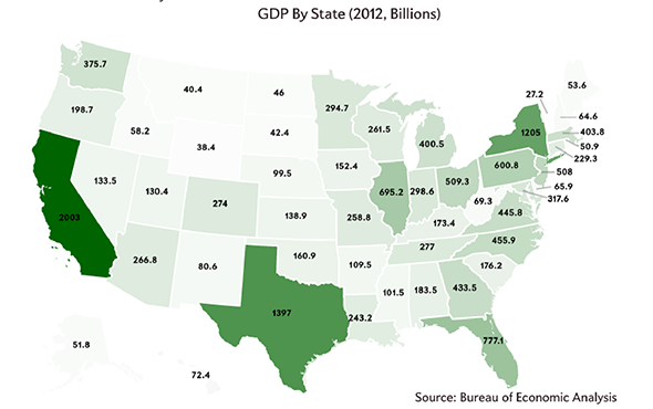
That said, if you really want to know the size of each state’s economy (and their sizes relative to one another), this map isn’t of much use, unless you’re already familiar with the GDPs of nations around the world. (Do you know how Nigeria’s GDP compares with that of the Philippines? Probably not.) But you also probably wouldn’t bother sharing this map on Facebook:
Map by Ben Blatt/Slate
Given the inherent limits of most viral maps, you might expect professional cartographers to dislike them. But people who love maps love maps. Harvard’s Goldsberry sees viral maps as merely the latest chapter in a long, fruitful history of amateur mapmaking. I also asked Ian Muehlenhaus, a professor of cartography at University of Wisconsin–La Crosse, what he thought of these simple state maps. “Are these maps useful tools for learning? Most of the time, no,” he said. “Does that mean these maps are bad? No. They are damn entertaining!”
I’d been wary of making my own state maps, but the enthusiasm of these cartographers made me think that maybe they aren’t so problematic after all, especially if the mapmaker is as clear as possible about his methodology. So I built some maps of my own. Do they fall into the same pitfalls that other simple U.S. maps do? Probably. Do New Yorkers never name their daughters Brooklyn, or do they just love Brianna more? Do people from Massachusetts dislike Gladiator or are they just really obsessed with The Departed? Is it fair to say Colorado’s “most distinct” vice is marijuana, when more people in the state still smoke tobacco? These maps don’t answer these questions. But hopefully they’ll entertain you! Just don’t forget to read the fine print.
Correction, May 1, 2014: The countries of Jamaica and Djibouti were originally misspelled in the maps interactive.
See more of Slate’s maps.
