This post originally appeared in Business Insider.
Business Insider contributor Randy Olson passed along this map, created by Reddit user Phaenthi, that presents U.S. states and corresponding countries with similar GDP. Olson, who moderates the subreddit DataisBeautiful, noted that the map is not adjusted for population size—“e.g., Minnesota has a population of ~5.5 million and Nigeria has a population of ~175 million.”
California is the obvious powerhouse, with a GDP of about $2 trillion in 2012 compared to Canada’s 2012 total of about $1.82 trillion. And the 2012 GDP of Texas was about $1.4 trillion, making it considerably bigger than Mexico’s $1.18 trillion. New York saw a 2012 GDP of about $1.2 trillion, compared to South Korea’s $1.12 trillion.
Illinois ($695 billion 2012 GDP), driven by private industries and manufacturing, is comparable to Saudi Arabia ($711 billion) and its oil-driven economy. A couple of other surprises: Colorado ($274 billion) is bigger than Egypt ($254 billion), and Indiana ($298 billion) is considerably bigger than Israel ($241 billion).
The 2012 GDP of the entire United States was about $16.2 trillion. Check it out:
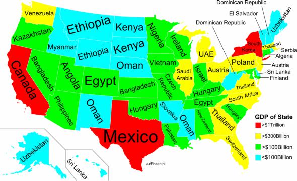
Reddit/Phaenthi
See also: This Funny World Map Shows What Every Country Leads the World in