The Web's Best Visualizations of Hurricane Sandy
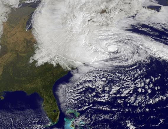
Photo by NASA via Getty Images
There are all kinds of ways to watch Hurricane Sandy: out your window, on cable news, via photos on Twitter and Instagram. Here at Future Tense, we're collecting some of the Web's best and most creative visualizations of the storm, from an artistic wind map of the United States, created by a pair of data-visualization enthusiasts, to the view from space, courtesy of NASA. A few are embedded here as videos, but in most cases, you'll want to click through to the original source to get the full effect. We'll update this as we find more, and if you have any suggestions for additions to the list, feel free to provide a link in the comments below.
1. The Overview
NASA has posted an animation of Sandy's lumbering path up the East Coast based on satellite observations from Oct. 26 to Oct. 29. The video amounts to a recap of the storm's progress so far. As of the end of the animation, the storm had not yet made landfall.
2. The Comparison
Using images from the NOAA and NASA, respectively, the Wall Street Journal has put together a simple interactive overlay that allows you to compare the extent of Hurricane Irene to that of Hurricane Sandy. Ominously, Sandy makes Irene appear puny by comparison. That's thanks in part to its merger with an extratropical storm system. A still screenshot of the interactive is below. To play with the interactive, visit the Wall Street Journal here.
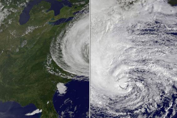
Screenshot courtesy of the Wall Street Journal / Interactive available at WSJ.com
3. The Wind Map
Designed by data-visualization artists Fernanda Viegas and Martin Wattenberg, this U.S. wind map isn’t Sandy-specific, but it conveys the storm's effects on the East Coast's wind patterns clearly and beautifully. Its creators are careful to note that this is a piece of art, not science, so viewers should look elsewhere for precise data on local wind speeds. As data visualization, though, it's an instant classic. Screenshot below, full experience here.
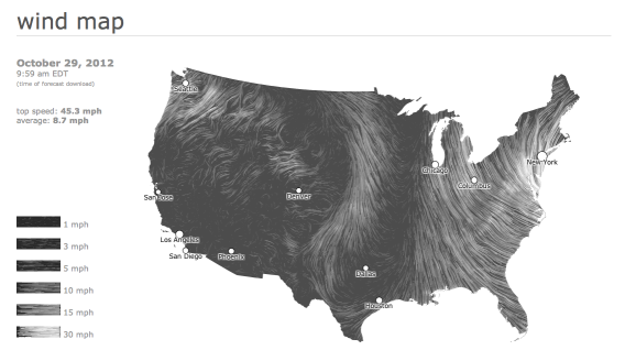
Screenshot / Hint.fm/wind
4. The View From the Space Station
Gorgeous, if a little dizzying, is this video footage of Sandy from the International Space Station, which passed over the storm this morning. Video embedded below.
5. The View From The Times
The New York Times has mounted a webcam at the top of its building in New York's Times Square, which updates with a new photo every minute. It's online here.
6. Instacane
Chris Ackermann and Peter Ng put together this collection of Sandy-related Instagram snapshots from around the country. The images range from devastated ocean piers in Maryland to cleaned-out grocery-store shelves in New York to people's cute cats covering their faces in fear, with some obviously Photoshopped joke images sprinkled in. More useful as a chronicle of the Internet's reactions to the storm than as a visualization of the storm itself. The full collection is online here.
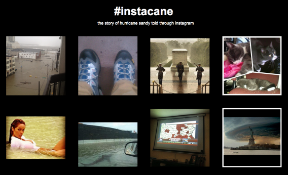
Screenshot / Instacane.com
7. The Crisis Map
Google has been collecting data from a multitude of local sources to put together a map that includes everything from weather conditions to traffic to the locations of emergency shelters. The map is online here, and my colleague Amrita Khalid has more here.


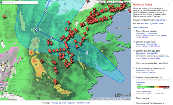
Screenshot / Google Crisis Map
Future Tense is a partnership of Slate, New America, and Arizona State University.

