Renzo Piano's California Adventure Part I
-
 Photograph © 2008 Museum Associates/LACMA.
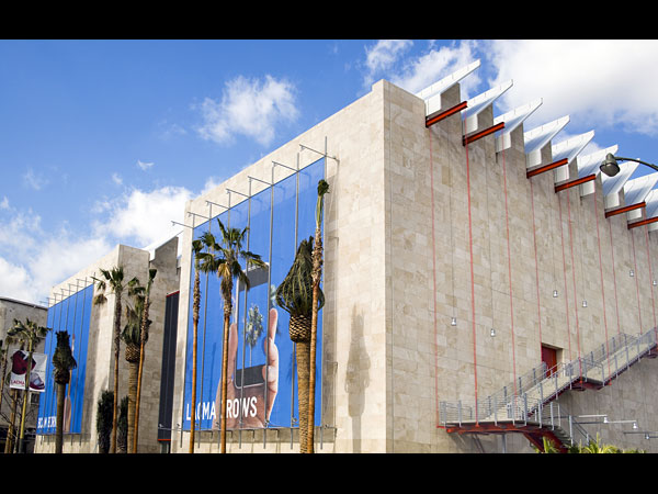
Two museums, both in California and both designed by Renzo Piano, opened this year. Great architecture is not just a function of design talent but is also the result of dialogues among the architect, the client, and the site. These two buildings in Los Angeles and San Francisco demonstrate how this three-way conversation can produce different results. At the Los Angeles County Museum of Art, the clients were museum director Michael Govan and Eli Broad, the founder of KB Home and SunAmerica, who paid the $56 million bill and presumably called the shots (including insisting that the new wing be named the Broad Contemporary Art Museum). The challenging setting is an unremarkable site on Wilshire Boulevard. It's hard to know which of these factors got out of kilter, but the Broad Museum, while it has its moments, falls far short of greatness.
-
 Photograph by Witold Rybczynski.
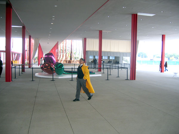
The Los Angeles County Museum of Art encompasses seven buildings housing a renowned Asian collection, Latin American paintings, pre-Columbian artifacts, and contemporary art. Part of Piano's job was to develop a master plan to pull the 20-acre campus together. To that end, he created a new entrance, reorienting the museum toward Wilshire Boulevard. The "BP Grand Entrance," named after its benefactor, consists of a flat roof supported on skinny steel columns and resembles nothing as much as a large service station. OK, the roof is covered in solar panels that provide power to a nearby art installation, but it's still a lifeless and uninspired space.
-
 Photograph © 2008 Museum Associates/LACMA.
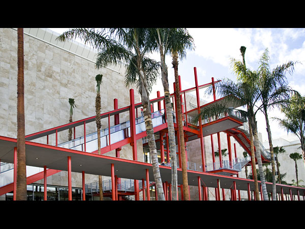
The steel structure of the service station roof morphs into a jungle gym that stretches across the back of the Broad Museum and incorporates covered walkways, an escalator, and stairs. The long exterior escalator has reminded some critics of the Pompidou Center, Piano's first major building, designed with Richard Rogers. In fact, its architectural impact is much less forceful, except for the shocking red color. I think the color is Piano trying to be playful, but the effect is oddly mechanical: "If it's steel, paint it red." Moreover, the contrast between the lipstick red and the beige travertine of the museum itself is, to put it mildly, infelicitous.
-
 Photograph by Witold Rybczynski.
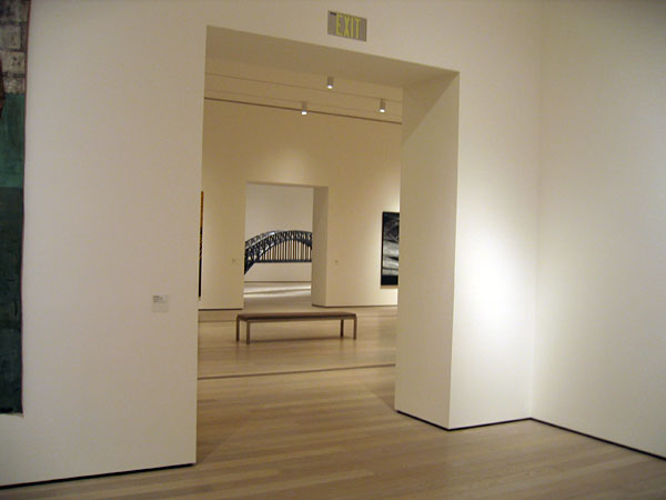
The organization of the museum couldn't be simpler: three floors of exhibition galleries, each floor consisting of a pair of loftlike spaces. The galleries on the lower levels are generic spaces with wooden floors, white walls, and strip lighting on the ceiling; they could be anywhere. The near absence of windows produces a dull atmosphere, like being in a basement. Chris Burden's Hell Gate Bridge is visible in the far room.
-
 Photograph by Witold Rybczynski.
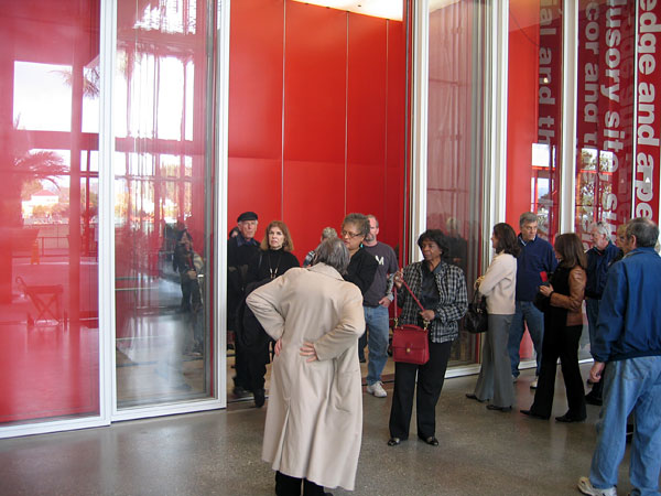
Elevators are a fixture of modern architecture, yet, unlike staircases, they are not part of the spatial experience; instead, you enter a cupboardlike space and a few minutes later emerge in a completely different part of the building. Piano made an interesting effort to overcome this drawback in his addition to the Morgan Library in New York, which has a large glass elevator that swishes silently up and down in the lobby. He continues his experiment here with an elevator that feels more like a room than a piece of mechanical equipment, an impression heightened by the floor-to-ceiling sliding doors. And more Renzo red.
-
 Photograph by Witold Rybczynski.
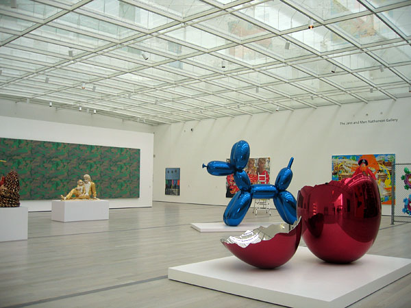
The galleries on the top floor are hangarlike, column-free spaces with gently arched glass ceilings that function as vast skylights. The soft light entering the room is indirect since the glass roof is shaded on the exterior, a technique that Piano used with great success at the Nasher Sculpture Collection in Dallas. Here, because the span is much greater, the structure supporting the glass is heavier, hence more visually intrusive—not that Jeff Koons' colorful concoctions don't more than hold their own. But the dark grid, which reminded me of a cheap suspended ceiling, is ungainly and doesn't enhance what should have been a luminous space.
-
 Photograph by Witold Rybczynski.
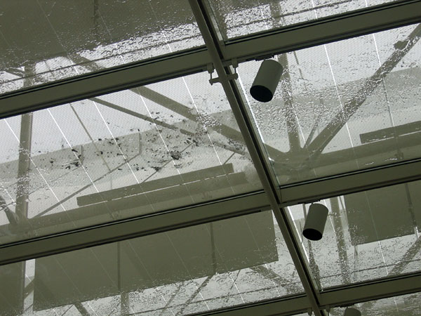
I suppose only an architect would go into an art gallery and look at the ceiling, but I'm not a fan of Koons, so my attention wandered. Nineteenth-century museums had glass ceilings (surmounted by skylights), but the glass was milky white to mask the mechanical impedimenta above. Since Piano uses clear glass, the structural members, shading screens, and backs of the sun baffles are all visible—and not in an interesting way. It rained the morning of my visit, and drops of water were spattered across the glass, along with dead leaves. This trifling detail was especially disturbing since Piano's minimalist designs promise—and usually deliver—perfection. Not here.
-
 Photograph by Witold Rybczynski.
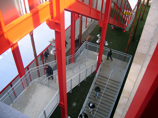
Descending the stair in the red jungle gym is a delight. The sight of people walking in all directions is like being inside an Escher drawing. The views in and out (the famous "HOLLYWOOD" sign and the Santa Monica Mountains are visible in the distance), and the spatial effects, make this an effective outdoor rendering of the grand staircases found in most traditional museums.
-
 Photograph by Witold Rybczynski.
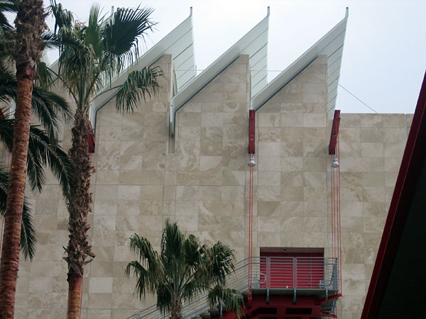
The Broad Museum has one iconic moment, architecturally speaking: the saw-tooth arrangement of baffles that shade the glass roof from the south sun. This is the view of the museum that is most often reproduced in photographs, although it is, in fact, not the front but the side of the building. The folded metal baffles effectively contrast with the smooth travertine wall; on the other hand, the red I-beams and suspension rods supporting the fire escape appear self-consciously ornamental. One doesn't expect such gratuitous gestures from Piano.
-
 Photograph by Witold Rybczynski.
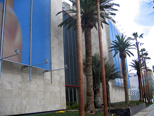
The Wilshire Boulevard façade of the museum is covered in fabric screens, the work of artist John Baldessari. Although Piano has described the screens as "pieces of art," they resemble large banners, the sort of things that all museums today regularly display to advertise blockbuster shows. The presence of banners only draws attention to the banality of the two blank travertine walls facing the street. If you want to see an effectively designed windowless wall, take a look at John Russell Pope's masterful National Gallery of Art on Pennsylvania Avenue in Washington, D.C. The play of light on the moldings and panels is so lively that you don't notice the almost complete absence of openings in the 785-foot-long façade.
-
 © 2008 Museum Associates/LACMA.
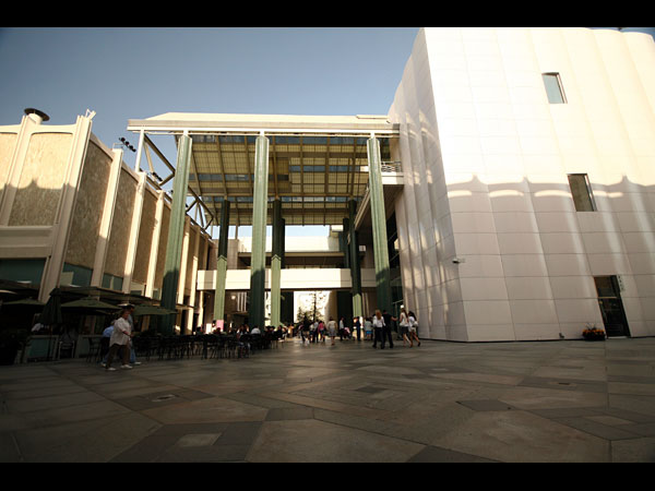
When Broad first approached Piano about the museum, the architect demurred. "As I already told you, it's very frustrating to play a good piece by a string quartet in the middle of three badly played rock concerts," he responded. Piano was referring to the existing museum buildings, whose architecture is pretty bad, as if a shopping mall had been converted into a cultural facility. But after sitting in the outdoor cafe, watching groups of excited children running across the roofed plaza and teenagers wandering in off the street, it struck me that this vulgar (in the literal sense of the word) Southern Californian solution to an art museum succeeded in one important way. In part because of its lack of pretension, this is an art museum in which people appear decidedly at home. It is Piano's lackluster string quartet, rather, that ends up looking out of place.
Next time: how the architect fared in San Francisco.