Anti-Icons
-
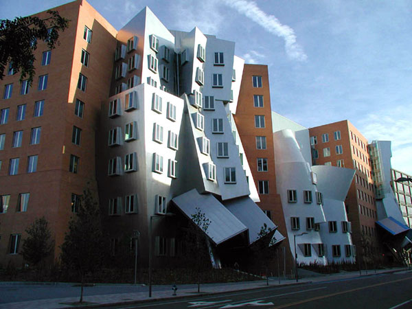 Stata Center, MIT. Gehry & Partners. Photograph licensed per Creative Commons. Courtesy Wikipedia.org.
Painter Paul Klee once wrote that while painters could make wheels square, architects had to make them round. Not any more. In the past, public and institutional buildings were expected to convey a sense of solidity and order; today they can just as easily suggest collapse and disharmony. In his forthcoming book, Architecture of the Absurd, John Silber takes aim at architects such as Frank Gehry, Steven Holl, and Daniel Libeskind, who, in a desire to create iconic architecture, frequently make their wheels square. The result is laboratories that appear to totter and wobble (right), student dorms inspired by sponges, and museums that look like crystals—leaky crystals, in the case of Libeskind's Denver Art Museum. Silber, the outspoken president of Boston University for 25 years, excoriates these architects—and, by implication, their clients—for disfiguring, as he puts it, what should be a practical art. His spirited, if sometimes perfunctory, essay raises an interesting question: if not architectural high jinks, then what?
-
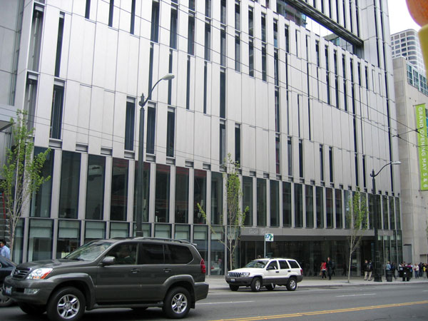 Seattle Art Museum. Allied Works Architecture. Courtesy Witold Rybczynski.
The new addition to the Seattle Art Museum, which opened last summer, provides one answer: an anti-icon. Instead of architectural pyrotechnics, the designer, Brad Cloepfil of Allied Works Architecture, opted for what, at first glance, appears to be almost corporate blandness. Almost, but not quite. The dull stainless steel suits the often overcast Northwest light, and the sliding shutters that control light entering the galleries create changing patterns on the exterior wall. The upper floors of this loftlike building, currently leased as offices, can be converted into gallery space in the future, when the museum expands. This pragmatic approach gives the museum maximum flexibility, although at the price of somewhat uninspired interiors.
-
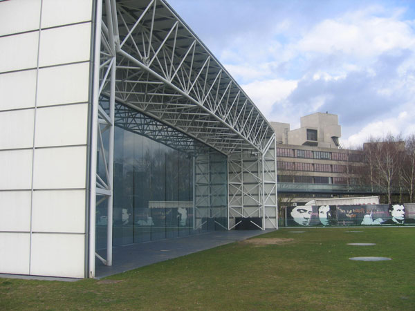 Sainsbury Centre for Visual Arts, Norwich, U.K. Foster & Partners. Courtesy Witold Rybczynski.
The Seattle Art Museum addition represents an alternative tradition of pre-Bilbao museum design, in which the building takes second place to the art. Norman Foster's art museums, such as the Carré d'Art in Nimes and the revamped Sackler Galleries in London, have been similarly responsive. In his first public building, the University of East Anglia's Sainsbury Centre for Visual Arts (right), built in 1977, Foster pared the architecture down to a minimum, producing, essentially, an elegant airplane hangar. Exhibition spaces, a museum restaurant, an art history department, and a cafeteria share the vast, 100-foot-wide, 430-foot-long, column-free interior. Except for the glass walls at each end, there are almost no windows (although there are skylights), and architectural expression has been made subservient to flexibility and versatility. Over 30 years, the building has successfully accommodated many changes in exhibition display, use, and programming.
-
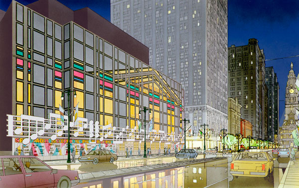 A design for the Philadelphia Symphony Orchestra Concert Hall. Venturi Scott Brown and Associates Inc. Courtesy Venturi Scott Brown and Associates Inc.
Robert and Lisa Sainsbury wanted an ungrand setting for their art collection, but many clients demand precisely grandeur. Robert Venturi discovered this when he was commissioned to design a new home for the Philadelphia Symphony Orchestra in 1987. Venturi once wrote, "It is all right to decorate construction but never construct decoration." His solution for the concert hall was a straightforward, sidewalk-hugging building (right), with a glass-walled lobby overlooking the street, and surface-applied decoration. The strategy of designing what he called a "decorated shed" allowed him to allocate the bulk of the budget to meeting the demanding functional requirements of the hall itself. Unfortunately for the orchestra, and for its patrons, Venturi's design was set aside in favor of something more "exciting." The excitement came at a steep price: an inflated construction budget, a building that fits poorly into its surroundings, and a hall with less-than-stellar acoustics.
-
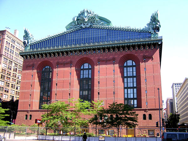 Harold T. Washington Library. Hammond, Beeby & Babka. Photograph by Douglas Kaye. Courtesy wikipedia.org.
Chicago's Harold T. Washington Library, which opened in 1991, is an example of decorated construction. The acroteria, or rooftop sculptures, include owls representing wisdom, ears of corn standing in for Midwestern plenty, and puff-cheeked cherubs symbolizing the Windy City. But otherwise this building is really a large box, albeit a Beaux-Arts box, rather than a high-tech box like the Sainsbury Centre. The architects, Hammond, Beeby & Babka, who won the commission in an international competition, simplified the form of the building, which allowed them to increase the quality of the materials. The interior walls, for example, are hand-laid plaster, rather than cheap wallboard; furniture is durable oak, rather than metal and plastic.
-
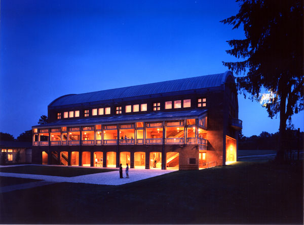 Seiji Ozawa Hall, Tanglewood. William Rawn Associates. Photograph by Steve Rosenthal. Courtesy Steve Rosenthal.
Iconic buildings often jeopardize function for the sake of architectural effects, Frank Lloyd Wright's Guggenheim Museum being perhaps the most notorious example. For the Seiji Ozawa Hall, which opened in Tanglewood, Mass., in 1994, architect William Rawn followed the advice of his acoustician, Lawrence Kirkegaard, and designed a heavy-walled brick barn of a building, lined with wood. He softened the boxy effect by adding an open porch, where the audience could gather during intermissions. The result is an outstanding space in which to listen to music. Legendary acoustician Leo Beranek recently ranked Ozawa Hall one of the two best concert halls built in the United States in the past 50 years and the 13th best hall in the world.
-
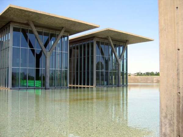 Modern Art Museum of Fort Worth. Tadao Ando. Courtesy Witold Rybczynski.
In architecture, a little excitement goes a long way, and the problem with iconic buildings is that they are generally too exciting, which detracts from their primary function. Tadao Ando avoided this problem by using distinctly prosaic forms at the Modern Art Museum of Fort Worth. Although the Y-shaped supports are striking, the overall atmosphere is one of calm and contemplation, accentuated by the straightforward geometry and the still water of the reflecting pool. Exactly what you want in a museum.
-
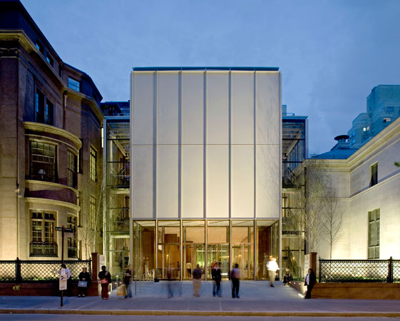 The Morgan Library and Museum exterior. Renzo Piano Building Workshop. Photograph by Michel Denancé. Courtesy the Morgan Library and Museum.
Expanding the Morgan Library and Museum in New York, the Renzo Piano Building Workshop might have been tempted to add its own "statement" to Charles Follen McKim's beautiful neoclassical palazzo. That is what Frank Gehry proposed to do with his saillike extension to the Corcoran Gallery of Art in Washington, D.C. (mercifully unbuilt). Instead, Piano, who ever since the laid-back Menil Collection in Houston has become a sort of Mr. Anti-Icon, opted to let McKim be the star, and created a distinctly low-key but handsome and exceptionally well-built addition, which solves problems rather than scoring artistic points.
-
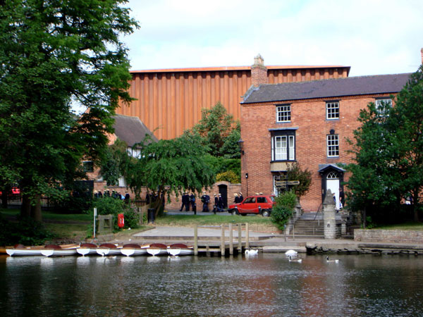 Royal Shakespeare Company Courtyard Theatre, Stratford-upon-Avon, U.K. Ian Ritchie Architects. Courtesy Ian Ritchie Architects.
The Royal Shakespeare Company needed a temporary home for three years while it transformed and enlarged its permanent theater in Stratford-upon-Avon. The solution, devised by Ian Ritchie Architects, is a horseshoe-shaped 1,050-seat, thrust-stage auditorium situated within a windowless box. The box is built of folded Cor-Ten steel wall panels that were erected and bolted together as quickly as they will later be unbolted when the building is taken down. Cor-Ten is an oxidizing steel that creates its own deep-red, protective layer of "rust," and does not need painting. The self-effacing steel box, which has been likened to a "jumbo shipping container," unexpectedly harmonizes with its traditional surroundings. Without any of the trappings of iconic architecture, the Courtyard Theatre has been embraced by its public. The only problem is that it has become so popular, people may find it hard to leave.
-
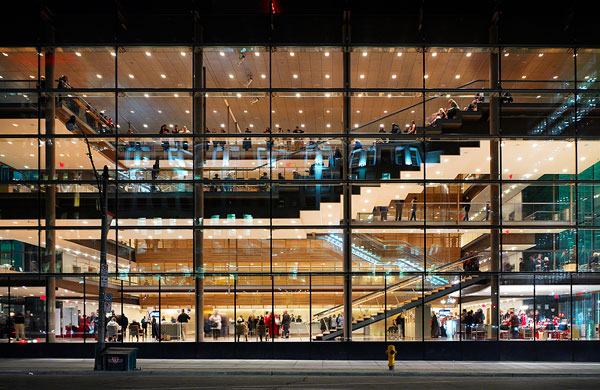 Four Seasons Centre for the Performing Arts, Toronto. Diamond & Schmitt Architects. Photograph by Tom Arban. Courtesy Diamond & Schmitt Architects.
The recently opened Four Seasons Centre for the Performing Arts in Toronto, a 2,000-seat opera house, is remarkable for what it isn't: It isn't flashy (it's built primarily out of brick), it isn't designed by an itinerant starchitect (Diamond & Schmitt is a local firm), and at $135 million, it isn't expensive (Disney Hall in Los Angeles is reputed to have cost twice as much). The Four Seasons Centre is determinedly un-iconic, which is a very Canadian attitude—half the year it's just too cold to stand around gaping at architecture. Like Venturi, architect Jack Diamond opted for a glass-fronted lobby visible from the street, although he eschewed postmodern decoration; like Rawn, he allocated the bulk of his budget to the interior, and in the process produced a hall that has exceptionally good sightlines and acoustics. Silber is right; those in the position to commission public or institutional buildings should pay less attention to architectural form and more to architectural function.