The Mile-High Club
-
 Photograph courtesy the author.
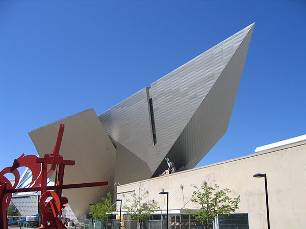
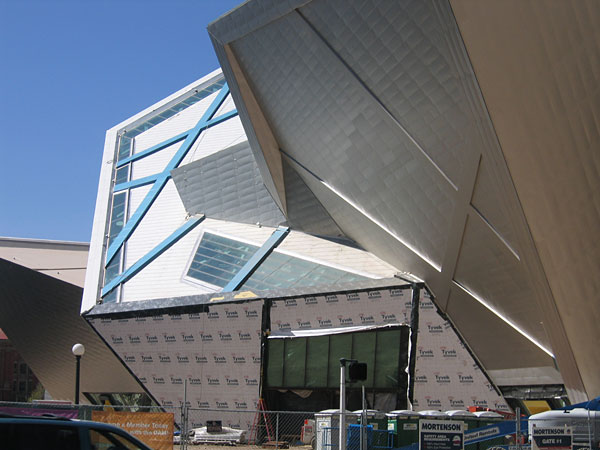
Anyone visiting Denver, as I did recently, will be curious to see Daniel Libeskind's first American building, due to open in September. The dramatic 163,000-square-foot addition to the Denver Art Museum (designed in association with the Davis Partnership) occupies a prominent downtown site overlooking Denver's Civic Center Park, a classical landscape of the City Beautiful era. Libeskind's signature motifs are all in evidence: zigzag lines, spiky shapes, dramatic cantilevers. People associate the tortured forms of the Jewish Museum in Berlin (which opened in 2001) with suffering and anguish, but their reappearance here suggests that they may be a personal idiosyncrasy. Libeskind himself has been quoted as saying that the Denver addition was inspired by the nearby Rocky Mountains.
-
 CREDIT: Photograph courtesy the author.
Whether you like this sort of mannered architecture is a matter of taste. Frank Gehry's swirlings and churnings have always seemed lighthearted and whimsical, buoyed by an endearing take-it-or-leave-it quality. Libeskind's forms strike me as aggressive. Standing in front of his building is like being buttonholed by someone shouting insistently in your face: And this! And this! And this!
-
 Photograph courtesy the author.
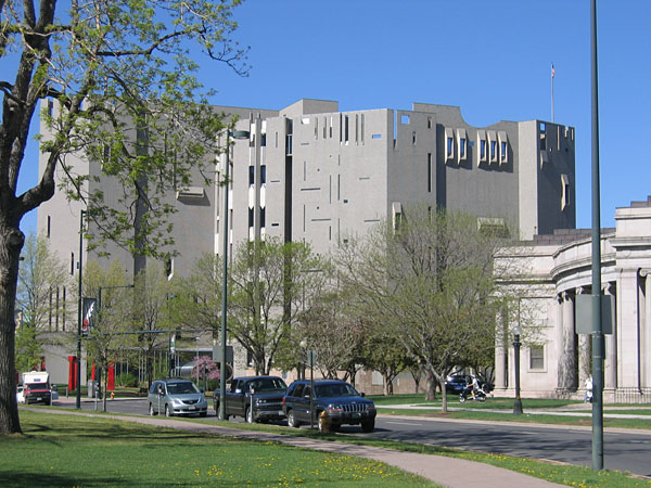
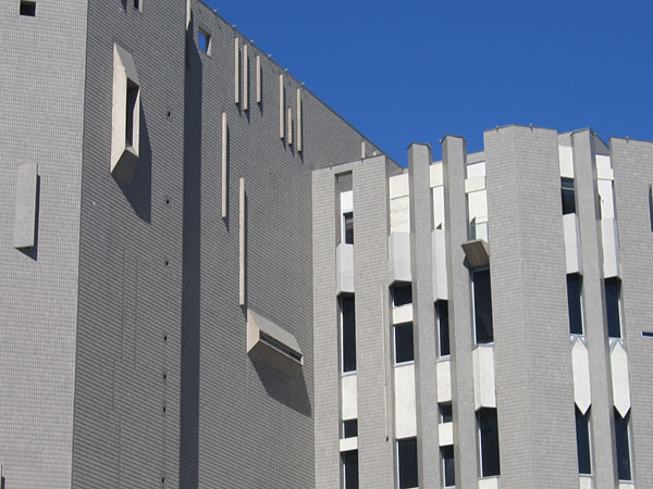
Libeskind's addition takes its place beside the original museum, a distinctly eccentric building. The museum resembles anything but a building for the arts—a medieval keep, perhaps, or a reformatory for wayward girls (girls rather than boys, for in spite of its massive bulk, it is curiously delicate).
-
 Gio Ponti (for M. Singer & Sons), CREDIT: Superleggera Side Chair, 1951.
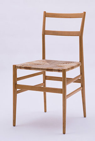
The 1971 museum was designed by the Italian architect Gio Ponti (in association with James Sudler). It is Ponti's only building in America, indeed, one of his few public buildings anywhere. His architectural oeuvre is small, although distinguished by the 32-story Pirelli tower in Milan, the first modern skyscraper in Europe. Ponti (1891-1979) was something of a dilettante. He designed ceramics, silverware, textiles, and a famous espresso machine ("La Cornuta" for Pavoni) and was the founding editor of the influential architecture and design magazine Domus. Perhaps his best-known—and best—creation was the Superleggera chair (right). Designed in 1957 and still in production by Cassina, the simple ash and rush design manages to be Modern and not-Modern, industrialized and peasantlike, and classically beautiful, all at once.
Image courtesy Museum of Modern Art, New York. -
 Photograph courtesy the author.
In its own way, Ponti's museum is as iconoclastic as Libeskind's. Instead of titanium, its seven-story bulk is entirely covered in faceted, shiny gray ceramic tiles (specially manufactured by Dow Corning). It sprouts windows of every sort, all of them vaguely fortresslike: embrasures, firing slits, slots, and openings that look as if sections of wall had been peeled away with a giant can-opener. Just as Libeskind shocks by defying convention, Ponti thumbs his nose at the rules of rational Modernism. No structural members are visible, the shapes are blatantly decorative, the forms do not follow any discernible functional logic.
-
 Photograph courtesy the author.
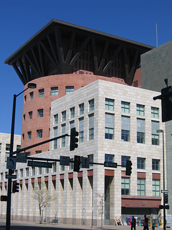
The third structure in this artistic acropolis is Michael Graves' Denver Public Library. Completed in 1996 (in association with Klipp Colussy Jenks DuBois), this large building works hard at relating to its urban context. There is a long pedestrian arcade along the street, the walls are finished in stone (like many older downtown Denver buildings), and the windows are classically proportioned and arranged. The most prominent feature is a drum containing circular reading rooms, with giant structural supports hiding mechanical equipment. The struts, which make me think of a Colorado mine structure, are as willful in their way as Ponti's haphazard apertures.
-
 Photograph courtesy the author.
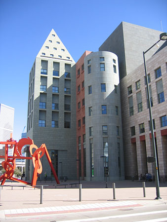
The library shares a pedestrian plaza with the museum, and on this side its scale is nicely modulated by several spires and towers that recall the work of Louis Kahn and Aldo Rossi. However, Kahn has aged well, while Graves' personal interpretation of classicism appears less compelling as the years go by. The stripped classical buildings of the 1930s that the library evokes were serious attempts to extend a tradition into modern times. Now, there is something slightly cartoonish about Graves' simplified forms, which undermines their gravity. His over-reliance on style may explain why this building, only 10 years old, already looks dated.
-
 Photograph courtesy the author.
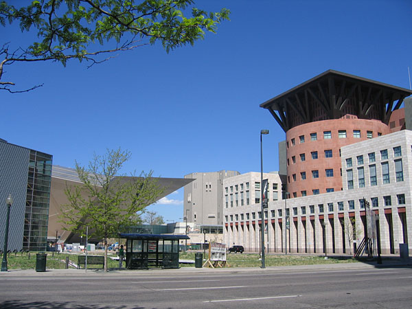
The three buildings in Denver make an odd grouping. Not a success—they simply don't add up to anything meaningful—but an interesting failure. For one, they reflect the different faces of architectural Postmodernism: Aestheticism, Historicism, Expressionism. Architecture's tottering, wayward course between 1970 and 2000 is all here. These buildings also show the peril of shock as an architectural compulsion. Ponti's iconoclastic design appears a little tired; some of the tiles have fallen off, and the sculpted top looks kitschy. Graves' colorful neoclassicism lacks gravitas; we don't know whether to be impressed or to smile. While it's too early yet to assess Libeskind's design, one wonders how it will look in 30 years. Will it still startle, as it does today, or will it merely make us sigh? Shock is delightful in an amusement park, but in a building it can only, in the long-run, prove an anticlimax.