The Brilliant Fake Novels of Listen Up Philip

Cover design by Teddy Blanks. Courtesy of the artist.
In her review of Listen Up Philip, the new Alex Ross Perry movie about a young writer (Jason Schwartzman), the older writer who takes him under his wing (Jonathan Pryce), and the women they both antagonize (Elisabeth Moss et al), Dana Stevens writes: “The brilliantly designed book covers for their combined works—with pompous titles like Necessity Never Rests, Madness & Women, or I, Zimmerman—stand among the best jokes of the movie, sending up in a few choice images the whole institution of the macho literary novelist.”
I agree, and so, over email, I asked Perry and Teddy Blanks, who designed the book covers, how these terrific literary jokes came to be and which particular writers inspired them. Listen Up Philip is available on-demand starting Tuesday, and opens in theaters across the country this weekend.
Were there specific real-life books you had in mind when coming up with the titles?
Alex Ross Perry: Not really. They just all needed to sound real. I hate it in movies when the titles of books the characters are meant to have written just don’t feel right. Every one of these titles, I had to imagine it on my shelf next to Philip Roth’s novels, or Saul Bellow’s, or Richard Yates’.

Cover design by Teddy Blanks. Courtesy of the artist.
Were the book titles all in the script?
Teddy Blanks: I don’t remember any of the titles from reading the screenplay. Most of them came out of a long text message exchange between Alex and Jason Schwartzman—and there were a few good ones that didn’t end up in the film because I never got around to designing them, like Champs Can’t Wait and Afraid of Freedom. But I came up with a few titles myself, including Ike Zimmerman’s autobiography, I, Zimmerman, and his short story collection When the Chips Are Down, which appears next to my name during the end titles, and is a reference to CHIPS, the design studio I co-founded.

Cover design by Teddy Blanks. Courtesy of the artist.
Did you imagine any of them beyond the titles? Did you come up with plots or characters?
Perry: We had a pretty decent idea of what they were mostly about, but generally I think the titles and covers sold the content enough. Teddy and I actually have written a synopsis of every single Ike book along with a bit of historical information about the reception at the time of publication that I hope we find a way to release into the world. A little supplemental information about the film for those who care to dig deeper.

Cover design by Teddy Blanks. Courtesy of the artist.
To what extent do you see these books as satire? Madness & Women seems to poke fun at Roth’s depiction of women—and I assumed Audit was a joke about Ike’s finances, since it marked his comeback? The Cinch suggests Ike is trying to become more accessible (I believe the voiceover refers to it as a “failed genre experiment”).
Perry: Well actually, Zimmerman’s Madness & Women was an idea I got during a location scout when I noticed a nonfiction study from 1972 called Women and Madness by Phyllis Chesler. It’s a feminist study of women and mental health, and I thought inverting it might be a perfect Ike book, perhaps his biggest hit. Maybe Ike even named the novel after Chesler’s popular book.

Cover design by Teddy Blanks. Courtesy of the artist.
Audit is the only one that came about for practical reasons—those being that the Jaguar we were borrowing to be Ike’s car already had a custom plate that said “Audit,” so we decided Audit should be a successful book that paid for the car. Otherwise, the titles just had to feel right, and in the case of some of the later titles, feel like the work of a guy who has strayed from what was his bread and butter.

Cover design by Teddy Blanks. Courtesy of the artist.
Blanks: From our synopses, I can tell you that The Cinch and The Shrug are both attempts at Raymond Chandler-esque detective novels featuring the same private eye character. I loved the idea that Zimmerman, for all his literary clout, harbored a secret desire to write popular genre fiction, but couldn’t quite cut it because he was too pretentious or whatever. I also loved the idea that they would have the same exact cover, as if the publisher had decided to market them like a Sue Grafton series.

Cover design by Teddy Blanks. Courtesy of the artist.
Are there real-life book covers you had in mind when designing these imaginary ones? The Madness & Women cover evokes the design of Roth’s early novels, of course, but what about the others?
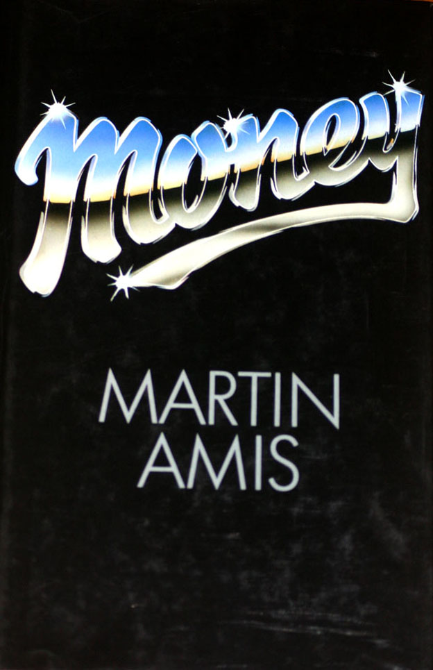
Blanks: For the most part, I was toying with the prevalent design tropes of the ’70s and ’80s, when most of Zimmerman’s books were supposed to have been released. (We made an extensive chronology before filming started.) I have a difficult-to-shake affinity for that era’s book covers, along with large collection of the illustrative, often swashy typefaces that were commonly used on them, so it was fun and relatively easy for me to create believable approximations without having to make specific allusions. That said, Audit is a direct rip-off of the first edition cover of Martin Amis’s Money, which I love, and I, Zimmerman apes the cover of Roth’s autobiography, The Facts, which is designed by Milton Glaser, though I didn’t get the font quite right.

Cover design by Teddy Blanks. Courtesy of the artist.
A Woman’s Point of View is from 1988, which is right around the time everyone was switching to digital type, and for whatever reason, there’s a style of cover from around then that is self-consciously “classic”—small type centered on the page, an evocative vintage illustration, muddy, muted colors. Bad Eating is Zimmerman’s most recent novel, from 2008, and I was going for a bright colors, big sans-serif type, extremely cropped photo, Chip Kidd-ish kind of thing, or almost a slight nod to a Jonathan Franzen cover.

Cover design by Teddy Blanks. Courtesy of the artist.
The Exploding Head Trick made me think of David Foster Wallace, partly because the author, Josh Fawn, commits suicide, and the profile of him that Philip (Jason Schwartzman) passes on vaguely recalls one that David Lipsky wrote of Wallace and later turned into a book. Did you have Wallace in mind at all?
Perry: Actually David Foster Wallace is one of my favorite writers, and in fact the Josh Fawn character and his irritating book title and design are sort of an homage to Wallace’s somewhat well-documented polite tolerance of Mark Leyner, a writer with whom he was sometimes circumstantially grouped but whose titles are infuriating and absurd to the point of being illogical. I liked the idea that Philip, like Wallace or Jonathan Franzen, is a serious writer who takes the craft of fiction seriously and Josh Fawn is a slouch who just sort of goofs around and irks those who think that their craft is something to be respected and protected.

Cover design by Teddy Blanks. Courtesy of the artist.
Blanks: While the cover for Philip’s new book, Obidant, with its giant type in the clouds, was absolutely meant as a reference to Infinite Jest, I only remember discussing with Alex that the cover for The Exploding Head Trick be infuriating and stupid—a real eyesore—which I think it is.

Cover design by Teddy Blanks. Courtesy of the artist.
The use of the book covers in the movie reminded me visually of Wes Anderson’s movies. Were you thinking of his work? Someone else’s?

Cover design by Teddy Blanks. Courtesy of the artist.
Here’s the funny thing I realized about being influenced by something like Wes Anderson’s films: It’s really easy to make a perfectly composed, God’s-eye shot or a person-center frame with a wide lens. A student film can do it, a commercial can do it, uninspired filmmakers can take his visual style and copy it. But it’s hard, without a guy who has Teddy’s skills—I would even say impossible—to be inspired by the visual details that he puts into his films. So if there is one element I’m happier to have been inspired by, it’s not his style but his love of objects and details, which you really need talented people to fully realize. You can put those in an entirely handheld, sloppy-feeling movie that looks nothing like anything he has ever made or will ever make, and still hit the same note.

Cover design by Teddy Blanks. Courtesy of the artist.
Perry: I guess it’s pretty easy to see his influence here, and he readily admits that the device was something he stole from Truffaut. But mostly it was important to me that Ike just feel real. That we don’t say he is a respected author with a vast body of work but that we actually see it. I think that goes a long way towards selling the idea, to the audience, that this guy has been around for decades. And originally I just wanted to use them for the end credits, but once we shot them—and we actually did shoot them all, on 16mm, by placing them on a music stand in direct sunlight—it became clear that putting them in the film, very briefly, right before we meet Ike, was necessary and would provide the necessary identification to Ike for the audience.
Blanks: While making the end-title sequence, I decided that a character didn’t necessarily need to be a novelist to have released a book, so we gave Zimmerman’s daughter Melanie a memoir (like Margaret Salinger’s Dream Catcher) called A Daughter’s Point of View. Ashley got a coffee table book of her photos, and Yvette got her dissertation on William Godwin published by a small university press. Our only regret was not coming up with something for Alex’s cat.

Cover design by Teddy Blanks. Courtesy of the artist.