Watch the Country Get Fatter in One Animated Map
How the obesity epidemic spread across the U.S.

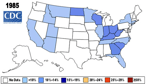
This map from the CDC shows why obesity in the U.S. can be considered an epidemic. As the GIF progresses from 1985 to 2010, the colors used to represent obesity in each state move steadily from lean blues to fatter oranges and reds. Though the GIF suggests that the epidemic is most intense in the South, a study conducted by researchers at the University of Alabama at Birmingham suggests people in the South may just be more honest in self-reporting their weight.
The Atlantic reports that the GIF shows statewide population percentages of people medically designated as obese, which means they have a body mass index of 30 or greater. But the way BMI is calculated—by taking a person’s weight and dividing it by the square of that person’s height—makes it an imperfect measurement of obesity. A high BMI does not always mean a person is unhealthy, though it may warrant further investigation. Even so, the CDC says a BMI calculation is a reliable way of indicating whether a person’s body fat may eventually lead to other health problems, such as heart disease, diabetes, cancer and hypertension.