Do You Draw Good Maps?
A professor has been examining hand-drawn maps for three decades. Send him yours.
Suppose you have a friend from out of town staying with you for the weekend. You've caught up, you've gone to the museum, you've had a nice dinner. It's now Sunday morning, and you just want your house guest to leave for a while so you can do your laundry. "Why don't you walk downtown?"you'll say. "There's a bookstore you might like." And then you draw him a map.
In this series I've been examining the world of professional sign design. But the pros aren't the only people who make tools that help us get around. Whenever we guide someone to the supermarket, the conference room, a surfing spot, or the Coke machine, we design what the pros would call our own wayfinding systems, devices that help people navigate.
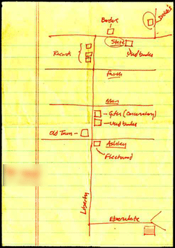
Paul Stiff, a reader in typography and graphic communication at the University of Reading in the United Kingdom, studies information design, and he is fascinated by these fragments of "demotic" wayfinding. Stiff has been accumulating homespun maps for three decades now. One of his very first finds: a map picked up from the floor of a corridor at his work, something that was "literally, a back-of-the-envelope sketch."
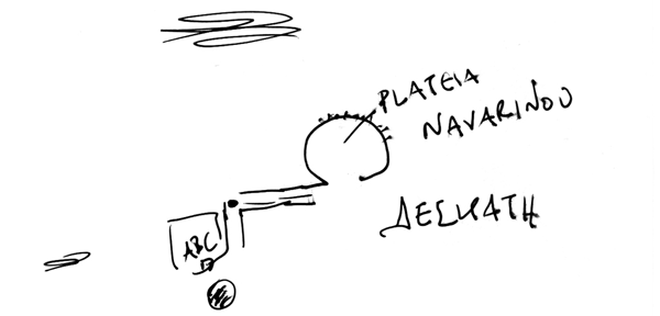
Stiff believes that we amateurs have something to teach the pros. Our maps are efficient—they edit out unnecessary information. They often include what Stiff calls "an error detector, something that tells you something's gone wrong." (If you see the red barn, you've gone too far.) They adhere not to mapmaking norms but to the user's particular needs. This map, drawn for Stiff by a friend in Greece, abandons the cardinal points—that scribble at the top is the sea, which is actually to the southwest of Thessalonika—and spells out the name of a local tavern in Greek script, to help Stiff recognize the sign.

The maps we draw for one another also have a certain ephemeral beauty. Each map is the product of a conversation. While most professional maps serve "countless numbers of people who have countless purposes," Stiff says, maps like these are "made for an audience of one." Examining these bits of personal cartography—studying the ways "we edit, we twist, we rearrange, supportively"—can teach us how humans really perceive and understand maps.
So here's our request: Send us your maps! Please do not sit down and draft a beautiful, geographically accurate and impeccably stylish sketch of your hometown. We want found objects, maps that were really drawn in a specific moment to orient a real person for a real task.
Update, April 29, 2010: We are no longer accepting submissions. You can see some of the coolest maps submitted by Slate readers here.
More from this series: Why signs are better now than they've ever been; why the signs in Penn Station are so confusing; how smarter signs could make London easier to navigate; the international war over the exit sign; how GPS could kill the sign. Plus: See more road signs in this Magnum Photos gallery.
