
Slate is an Amazon affiliate and may receive a commission from purchases you make through our links.
The Best Book Jackets of 2016
From Margaret Atwood’s Hag-Seed to Han Kang’s The Vegetarian, the most eye-catching and imaginative cover art of the year.
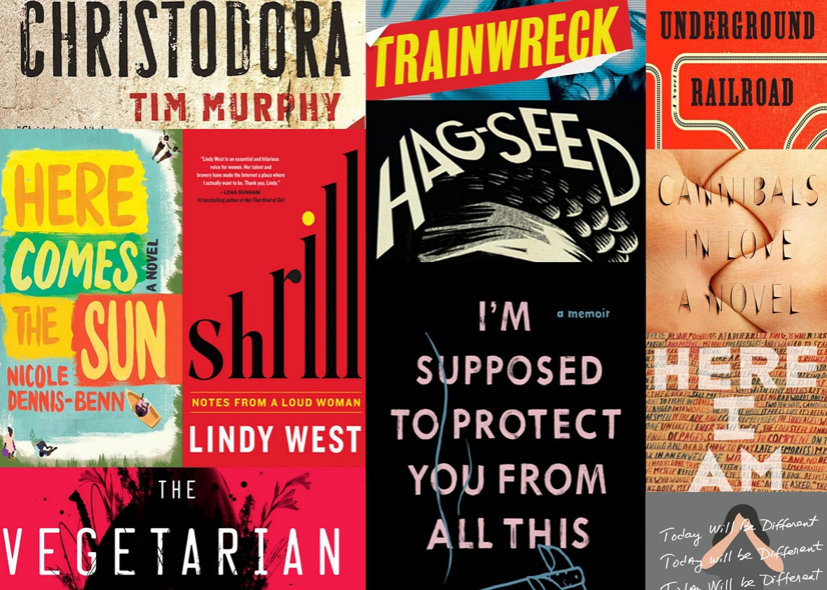
Photo illustration by Slate. Images by Amazon
Slate’s Best Books of 2016 coverage:
Monday: Laura Miller’s favorite books of the year.
Tuesday: The best comics and the best book jackets of the year.
Wednesday: Katy Waldman’s favorite books of the year.
Thursday: Mark O’Connell’s favorite books of the year.
Friday: The best audiobooks of the year.
Ask any artist, and they’ll tell you: Designing a book jacket is not easy. The challenge is multilayered: creating a marketable image that pops while also paying tribute to the book’s themes and content, realizing the author’s intended vision, and leaving a distinct artistic stamp.
There were many great books in 2016, but some of the covers on display this year were no less impressive. Below are our picks for the 11 best book jackets of 2016, with comments from the designers on how their vision came to fruition, what ideas they were trying to communicate, and how satisfied they were with the end result.
Christopher Brand, Han Kang’s The Vegetarian

The Vegetarian is beautifully written, but also dark and strange—sometimes disturbing.
Odd and dreamlike passages from the book offered plenty of inspiration for the cover design. While working on this, I tried to focus on creating a cover that was true to the story, but also not too off-putting to potential readers. After reading The Vegetarian, you perceive the cover that we ended up with as maybe a little bit literal. Normally that is something that I like to avoid, but I think it works in this case because of how surreal the writing is.
Another direction that I pursued was this idea of a humanlike vase that I thought could represent the protagonist and her transformation throughout the book. This second option was presented as more of a sketch and it was never fully realized because everyone was leaning toward the red design that ended up being the final cover. The author also liked it, and this was a rare occasion where the design from the first round made it through the approval process without any changes.
Marina Drukman, Sady Doyle’s Trainwreck

This book is an investigation of the female trainwreck: how she came to be, how she evolved, and what she means in today’s climate of tabloids and social media. One of the first steps in my design process is to identify the tone of the book: dry or humorous, bold or delicate, conceptual or literal, or various combinations of the above. At some point I realized that I couldn’t get too clever or too pretty with this cover. The book’s subject matter and writing style are very bold and to the point; there was no room for humorous interpretations, which had been my initial approach.
One thing I decided on right away was typography: to apply a typeface widely used in tabloid print. This led to the look and placement of boxes and frames throughout, as well as the color scheme. Then I played with the idea of using an image of a broken doll, but discovered that the doll took away from the book’s serious subject of a woman being scrutinized by the public for being too bold, too sexy, too unapologetic, too much the opposite of what’s considered “good girl” behavior. I ended up with a photograph of a blond woman blocking cameras away from her face. Then I added a TV screen over the image, and made it monochromatic in order to not distract from what had to be paid close attention to.
Na Kim, Mike Roberts’ Cannibals in Love

In reference to his own work in progress, Mike (the main character of Cannibals in Love) talks about wanting to “express those negative spaces between two bodies, where the relationship breathes … belly-to-belly with the intimacy of a stabbing.” I think the same can be said about Cannibals in Love. The design is meant to embody Mike’s raw and visceral storytelling, and reveal an immediate sense of intimacy and horror.
Like a mixtape, Cannibals in Love shifts back and forth through different moments in Mike’s life. Rather than visually limiting the scope of the book to one scene, the cover is a collage of the various vignettes that the author provided. Accordingly, I tried to design it in a way that reflected the book—a mixtape of text and imagery.
Vladimir Zimakov, Margaret Atwood’s Hag-Seed (International Edition)

Problem-solving is always a big part of creating a cover image, but what made this particular project so unique is that it felt like solving a mystery. The main difference was that the text was not yet finished when we started. We had some clues from Margaret Atwood: It’s set in prison; there’s been a storm and the lights have gone off; some of the main themes deal with magic, illusion, and theater. Since the novel was a contemporary interpretation of a classic Shakespearean play, the cover also had to combine the past with the present.
Based on those clues, I produced about six completely different drafts—some were focused on the main character and some on the setting and overall feel. For one cover in the second round of drafts, I zoomed in on the eye of Caliban and that became our solution: It introduced some of the main themes of the book—solitude, fear, and threat—without being too literal and giving too much away.
Kelly Blair, Maria Semple’s Today Will Be Different
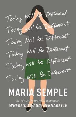
Maria Semple’s sense of humor about her protagonist made me think immediately of Geoff McFetridge’s work, of which I’m a huge fan—it’s smart, funny, and intriguing all at the same time. The main character of the book uses “Today Will Be Different” as a sort of mantra—willing it to happen—so repeating the title in text made sense to me. I also did a version where the whole mantra was written out diary-style, and at first, there was some hesitation about the gray background, so I was asked to mock up some other versions of the girl. None of them were nearly as compelling as Geoff’s original painting, however.
There were a few other designs in the running, some playing into the sense of the character throwing up her hands and crying uncle, others showing her crazy path through the city. Luckily, in the end, everyone came back around to Geoff’s painting. And Semple wrote the repeating title out in her own handwriting for the final jacket as the finishing touch!
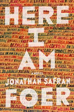
I’ve been fortunate to design the covers for most of Jonathan’s books. This was by far the hardest. In fact, it’s probably one of the hardest jobs I have ever worked on. It took more than 80 visuals to get to this final cover. We tried a lot of different ideas, none of which quite clicked. At one point I was taken off the job, and I resigned myself to the fact that perhaps, after 15 years, it was time for a change and a fresh pair of eyes, and that our working relationship was sadly over. Then to my huge relief, Jonathan and his U.K. editor Simon came back to me with a brainwave, and we started work on the text-based cover.
The artwork itself ended up being 6 feet long and 3 feet high, with more than 1,000 painted words. I had to paint it again from scratch when the final edit came in, and then correct it when it had been copy edited. I went through an awful lot of paint, board, and wrist pain.
I think it fits the book pretty well. The detail and meaning of the words merge, and you are left with a colorful, textural wall. The novel refers a lot to division and separation, to boundaries and to walls. It looks deceptively simple and straightforward for something that took more than a year, but it has a personality and weight of its own, and that’s something I’ve always tried for with Jonathan’s covers. I think we got there in the end.
Grace Han, Nadja Spiegelman’s I’m Supposed to Protect You From All This

In I’m Supposed to Protect You From All This, Nadja Spiegelman delves into the complex relationships she has with the women in her family. Through this memoir, they all confront their past, and it is beautifully painful, vulnerable, and profound. I wanted the cover to feel personal yet relatable.
Initially, the cover only had a cigarette. We added a hand later in the process, adding a human element. For me, the act of smoking conveys a sense of reflection, as well as rebellion—the internal and outward battles these women fight.
Chelsea Cardinal, Lindy West’s Shrill
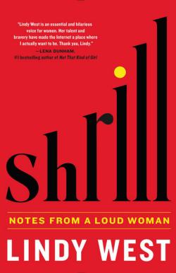
The idea for this cover was to create sort of a visually onomatopoeic type of alteration: The title Shrill would feel as though it gets more “shrill” toward the end—as is often the conversational tendency with shrillness. It was a lucky moment with the shapes of the letters, in the word easily lending itself to what I thought of as “shrill-ification”—a simple height alteration, to create a typographic image that alludes to increasing volume or pitch.
My initial sketches for the cover were, stylistically, more retro and minimalist, but it went through several rounds of marketing dissection and any variety of other mysterious things that go on behind the scenes after a design gets pitched. In the end it’s a different cover—and, in my opinion, not as elegantly handled. But I’m probably the only one who thinks so, being so close to it and having personal feelings about how I’d have liked it to look. The initial impact of the idea survived in the final design.
Jennifer Heuer, Nicole Dennis-Benn’s Here Comes the Sun
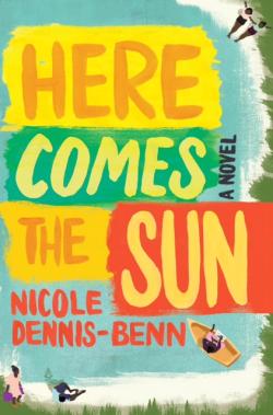
Here Comes the Sun by Nicole Dennis-Benn is a visually and emotionally lush novel that takes place in Jamaica, and follows the lives of two sisters (one adult, one still in school) and their mother. In it, we get a sense of classism and racism as well as a societal pressure to fit into a fairly rigid and small community.
I began researching Jamaican dancehall posters for color, composition, and typography. I was also looking at a lot of Kara Walker’s antebellum artwork and then doing research based on the description of the houses, beach coves, characters, and so forth. The art director and I had settled into the Kara Walker approach for some time before we swung back to the dancehall-style typography, and a more editorial illustration. While I was rooting for the cut-paper version, I understood that this needed a more commercial package. This direction also made sense conceptually, as the youngest daughter was struggling to become a painter, so approaching it more figuratively, in the end, felt appropriate.
Oliver Munday, Colson Whitehead’s The Underground Railroad

With obvious reason, everyone in-house was unable to contain their excitement for this book. I will say that it is rare to get to work on the art for a contemporary novel that is so clearly marked as a masterpiece.
The final version of the jacket was put together after several missteps. I’d originally planned to make the cover a bit more unconventional, but my attempts failed to depict a gravitas commensurate with the text (admittedly an impossible task). What we settled on was a design that wouldn’t alienate readers with any of the designer’s pretensions, one that spoke more to the dignity of the book. Simply reifying the railroad—the fulcrum of the novel itself—was enough to hint at the book’s wonderful strangeness, without revealing too much. The subterranean tracks and the implied digging work on multiple levels as the text does, and this proved an ideal entry point into the alternate world that Colson so exceptionally brings to life.
Michael James Casey, Tim Murphy’s Christodora

This drawing was done in August 2008 while I was working as an architectural intern, living in New York City for the first time. Christodora House, with its tower form looming over Tompkins Square Park, was a regular object of my attention while I lived nearby, at the corner of 7th Street and Avenue B. At the time I was doing lots of cityscape drawings, and Christodora’s scale over the surrounding neighborhood—its unembellished brick mass rising upward and topped off with stepped terraces—always held my attention while wandering the blocks below. The vantage point of my drawing foregrounds the tower into its neighborhood context of St. Brigid’s church, school, and Tompkins Square Park.
I was honored to have it selected for the cover of Tim Murphy’s novel Christodora, which features a sprawling cast of characters whose fates are intertwined in the building. Just as the drawing of the building is dependent upon its surroundings, the fictional characters and real life residents of Christodora House are inextricably linked to the lives constantly unfolding on the streets and sidewalks of the East Village below.
Cannibals in Love
Check out this great listen on Audible.com. Soulful, gritty, and hilarious, Cannibals in Love is the debut novel from a bold new voice in fiction, and a manifesto for the generation that came of age at the dawn of the 21st century. Mike is about to graduate from college and inherit a world much d...