Thom Mayne's U.S. Federal Building
-
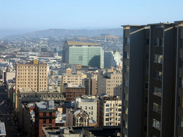 Courtesy Witold Rybczynski.
It's hard to miss San Francisco's new U.S. Federal Building, a narrow 18-story office slab with a skewed, not-quite-mansard roof. Completed in March of last year, the building is a study in contradictions: an ambitious energy-conserving agenda, a tight budget, and a highly restrictive set of security concerns. How did Pritzker Prize-winning architect Thom Mayne deal with this challenging mix?
-
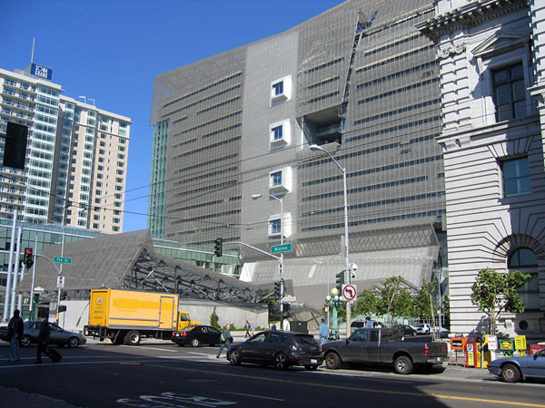 Courtesy Witold Rybczynski.
The first impression of the Federal Building, which is in the South of Market district, is somewhat intimidating. Its inscrutable facade is shrouded in a perforated-stainless-steel scrim, which is mysteriously sliced and peeled away, apparently at random. At the base of the building, the screen mutates into a folded roof that covers what appears to be a greenhouse but is actually a day care center. The imposing pavilion in the foreground, whose complicated roof resembles a trestle bridge, turns out to be a coffee shop. As often happens in a Mayne design, many things are not what they seem.
-
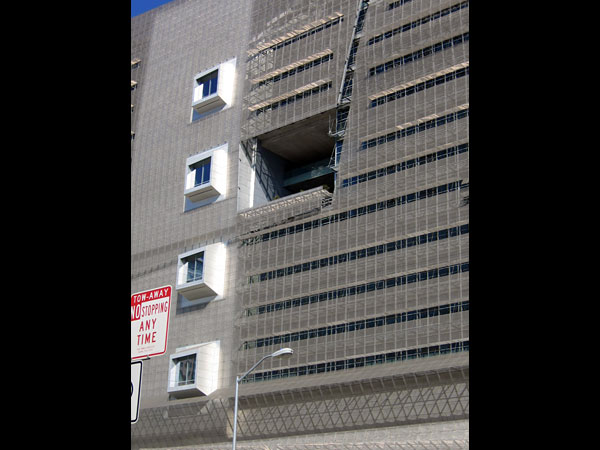 Courtesy Witold Rybczynski.
The flak jacket metal scrim is actually an energy-conserving feature, developed by Mayne's firm, Morphosis. Since the outside walls of this shallow office building are floor-to-ceiling glass—to reduce the need for artificial lighting—the scrim provides shade. Openable windows allow mechanical air conditioning to be replaced by natural ventilation, taking advantage of the benign Northern California climate. (The other side of the building—the northwest—is shaded by vertical frosted-glass fins.) Furthermore, automated windows allow cool air into the building at night, turning the heavy concrete structure into a passive thermal sink. These measures have reduced energy consumption by a reported 33 percent below the already demanding requirements of California's energy code. Although there have been some complaints about overheating, on the energy front the building seems to be an undoubted success. The four bay windows, which reminded me of Marcel Breuer's Whitney Museum, correspond to the elevator lobbies; the large opening on the right is a public terrace, which the architects call a "sky garden."
-
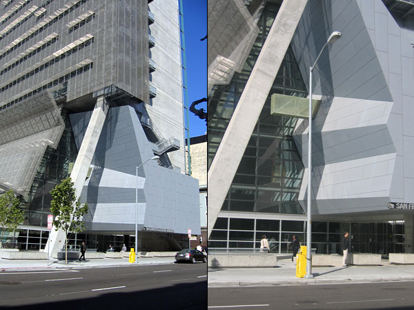 Courtesy Witold Rybczynski.
The entrance to a building, especially a public building, should be welcoming. Not here. The scrim crumples; a column leans precariously aslant; a beam forces its snout out of the wall, which is folded like origami. It's like entering Dr. Caligari's cabinet. I'm beginning to think that an iconoclast like Mayne may not be the best architect for a public project.
-
 Courtesy Witold Rybczynski.
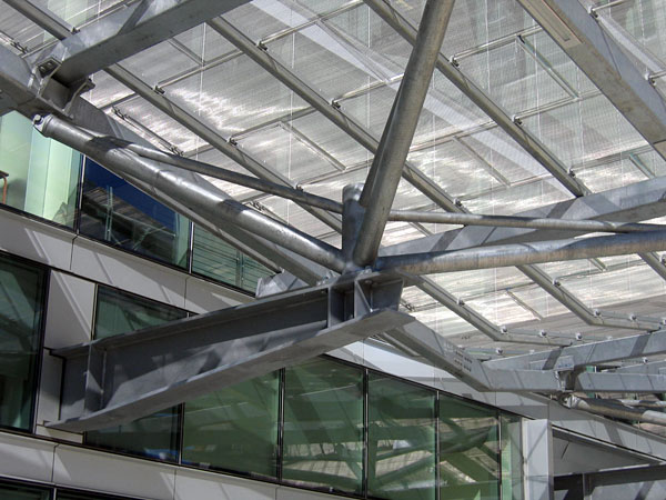
The construction cost of $240 per square foot was modest—a high-end office building can easily cost three times as much. However, one senses that Mayne relished the budgetary constraint, for it allowed him to indulge his interest in rough industrial materials: bare concrete and galvanized metal, exposed nuts and bolts, a suspended ceiling in the coffee shop that resembles chicken wire. The imagery is industrial, but unlike Norman Foster and Renzo Piano, whose high-tech structures are exercises in sophisticated metal joinery, Mayne uses construction almost as a whimsical form of decoration. Nothing is done simply if it can be complicated. This mannered approach reminds me of Robert Venturi. Of course, Mayne's in-your-face architecture is quite different from Venturi's historically inspired "decorated sheds," but both architects delight in discovering opportunities for idiosyncratic weirdness.
-
 Courtesy Witold Rybczynski.
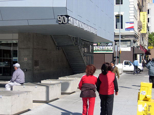
The names of civic buildings have customarily been carved into their facades, usually above the main entrance. That is altogether too traditional—and straightforward—for Mayne. As Venturi often does, he located the name at the very bottom of the wall, so the letters appear to be in danger of sliding off. The precariousness is further reinforced by having the street number on a different—and tilted—surface. The tongue-in-cheek result is intended to undermine tradition, although on repeated viewing, it can seem somewhat contrived.
-
 Courtesy Witold Rybczynski.
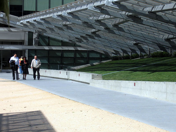
Mayne frequently thumbs his nose at convention—you expected this, but I'll give you that. A large overhang, for example, seems to be there to shade the adjacent walkway, but it doesn't—quite. The complicated structure might suggest a giant garden pergola, if it didn't resemble the unpoetic underside of stadium bleachers. Such jarring effects are either challenging or irritating, depending on your point of view. I admire Mayne's sense of architectural conviction, and it's not that public buildings can't occasionally flaunt convention, but in his case, the flaunting seems both willful and arbitrary, the architectural equivalent of wearing a baseball cap backward.
-
 Courtesy Witold Rybczynski.
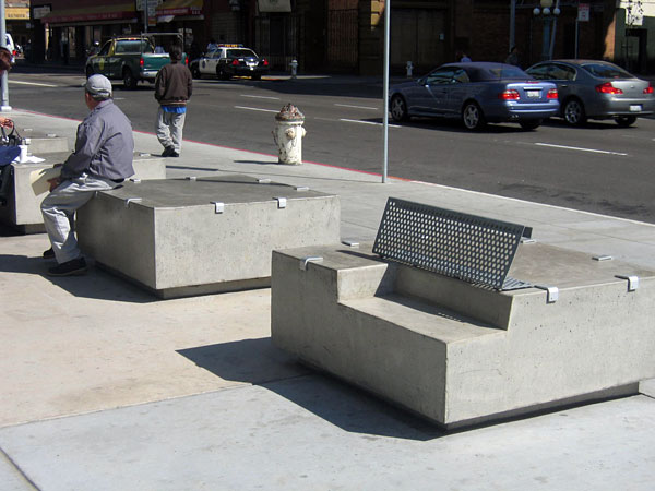
Ever since the Oklahoma City bombing, federal buildings have required protection against truck bombers. Architects struggle to find alternatives to bollards and concrete planters, and Morphosis is no exception. At the entrance to the U.S. Federal Building, the crash barriers take the form of bulky concrete boxes (adorned with the now-ubiquitous anti-skateboarding hardware). Some of the boxes incorporate seats. Morphosis doesn't really do playful, however, and the uncomfortable benches look more like mechanical devices than appealing places to sit—as the gentleman at left has obviously decided.
-
 Courtesy Witold Rybczynski.
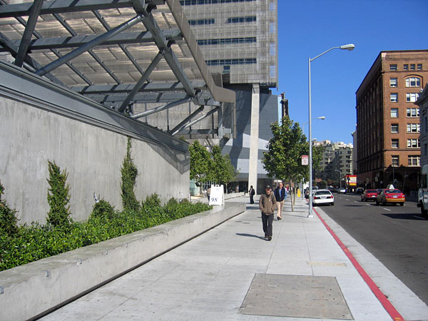
The security consultants—our terrorist age's version of bean counters—have also had their way elsewhere. Planters and sitting walls can't hide the fact that most of the walls along the sidewalk are blank concrete; even the coffee shop, shown here, was deemed a potential target. What a shame, especially in as walkable a city as San Francisco. From a pedestrian's point of view, the experience of the U.S. Federal Building is about as interesting as walking beside a boarded-up store. Our descendants will look back at our fortified "public" buildings and ask, "What on earth were they thinking?"
-
 Courtesy Witold Rybczynski.
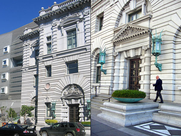
Across the street from U.S. Federal Building is the James R. Browning U.S. Courthouse, designed by James Knox Taylor in 1905. Taylor, who was supervising architect of the U.S. Treasury and had been a partner of Cass Gilbert, was merely a highly competent practitioner, not an architectural star. But he was fortunate to work at a time when federal buildings were built—and funded—to last, and crash barriers were limited to the truck dock. His handsome Neoclassical structure has been a strong presence on the street for more than a century, weathering changing functions (it was originally a customs house and has served as a post office) and the 1989 earthquake. The building was recently renovated, and its longevity seems assured. One hundred years from now—in 2108—this granite pile will likely still be there, serving the public in one capacity or another, still useful, still cherished. I wonder if its standoffish neighbor across the street will fare as well.