The New de Young Museum
-
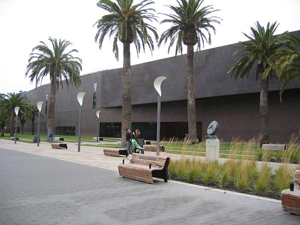 Image courtesy the author.
The new de Young museum in San Francisco, which opened in 2005, replaces a Spanish-style building that had been insensitively "modernized" in 1949, fatally weakened by the 1989 Loma Prieta earthquake, and finally demolished in 2003. Despite billing itself as a "museum of the 21st century," the new building has many of the hallmarks of a 19th-century art gallery: skylights, separate wings for different collections, landscaped courtyards, and a grand staircase. What is decidedly unconventional, in this age of extrovert cultural institutions, is the exterior appearance, which, from a distance, is slightly forbidding, uncommunicative, almost grim.
-
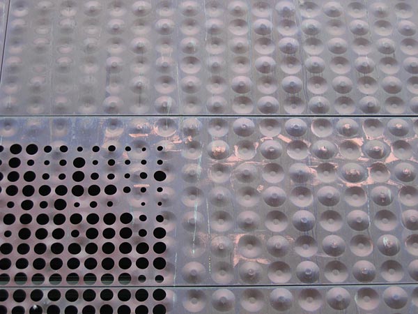 Image courtesy the author.
Unusual exterior cladding is something of a trademark of the primary design architects, the Swiss firm Herzog & de Meuron, who have previously used skins of twisted copper strips, printed acrylic, and silk-screened glass and concrete. The walls of the de Young are paper-thin copper panels, both dimpled and perforated. The dimples—concave and convex—create changing textures, while the perforations, which vary in size and density, emphasize the thinness and create the effect of a scrim. Like the exteriors of many recent buildings (Zaha Hadid's Rosenthal Center for Contemporary Art in Cincinnati, Daniel Libeskind's Denver Art Museum, Herzog & de Meuron's own addition to the Walker Art Gallery), the walls neither reveal structure nor express inner organization. Instead, the patterns are purely ornamental, which makes them curiously similar in function to the moldings and decorations on the exteriors of classical buildings. The trend suggests just how far from its Modernist roots the current generation of architects has strayed.
-
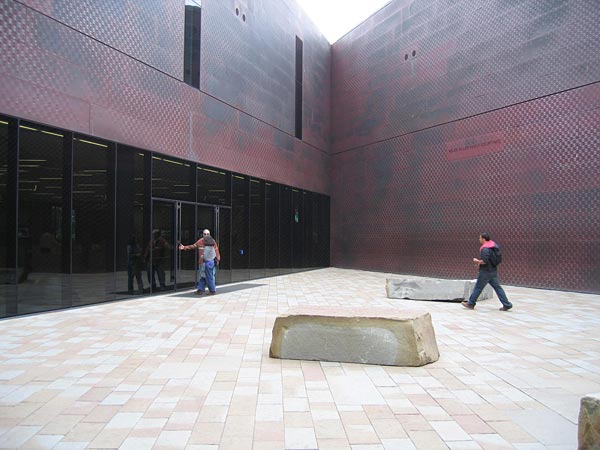 Image courtesy the author.
The copper walls of the de Young are currently reddish-brown. As they oxidize they will turn green and blend into the Golden Gate Park setting, but I wonder if, close-up, the effect will be any more congenial. The entry court, with its acute geometry and dark-tinted glass, is scarcely welcoming, and while the walls have a shimmering quality, after a time they appear oppressively uniform.
-
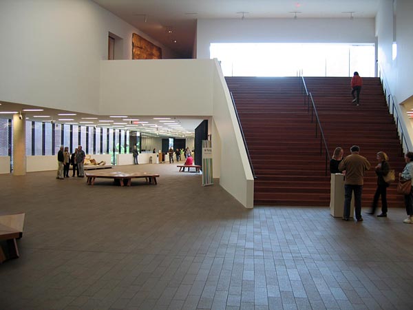 Image courtesy the author.
The de Young is basically a big, two-story box (with a third level below grade) penetrated by interior courts, some of which—designed by landscape architect Walter Hood—are heavily planted. What are unusual are the courtyard shapes: triangles, trapezoids, sharply angled wedges. The oblique geometry creates an interior that is spatially dynamic and slightly disorienting, though not unpleasantly so. At the heart of the building, overlooked by a huge Gerhard Richter mural, is a two-story hall containing a broad staircase that leads to the main gallery level.
-
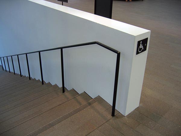 Image courtesy the author.
The preliminary design of the museum exceeded the budget and required the building to be scaled down and simplified. Perhaps it was the cost-cutting that caused the lack of considered detail in parts of the building: no baseboards, no protective caps on balustrades, no door frames, just thousands of square feet of plaster wallboard. The handrail of the main stair, for example, is simply a steel pipe, painted black. It feels cheap for a $135 million building. Or perhaps the architects did not want the sort of slick detailing that characterizes so many new museums and opted for a rough-and-ready solution instead?
-
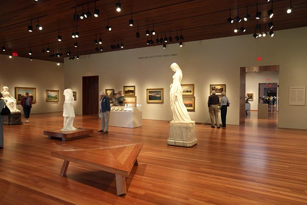 Image © Neema Frederic/Gamma.
The exhibition galleries are beautifully executed. They are organized in three discrete wings, reflecting the de Young's diverse collections. The galleries for Oceanic and African art have dramatic vitrines; Contemporary art is displayed in simple white spaces; and the collection of pre-Modern American art is shown in more traditional rooms (right). Scattered throughout the museum are comfortable wooden benches, designed by the architects, in a variety of geometrical shapes that resemble faceted wood diamonds. It is a particularly nice touch, one that subtly undermines the serious atmosphere of the galleries.
-
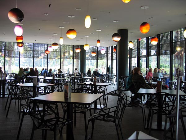 Image courtesy the author.
Jacques Herzog and Pierre de Meuron are masters of minimalism—they don't do cozy. The cafe, with its mostly black color scheme and suspended pendant lights shaped like glass lozenges, has all the charm of a high-school cafeteria. The ceiling, punctured with lights, smoke detectors, and air-conditioning slots, seems an afterthought. Why are so many recent museum cafes underdesigned? (The gemütlich Café Sabarsky at the Neue Gallerie in New York is a notable exception.) Purist to the point of bareness, these Bauhaus eateries seem calculated to get us back to the galleries as quickly as possible.
-
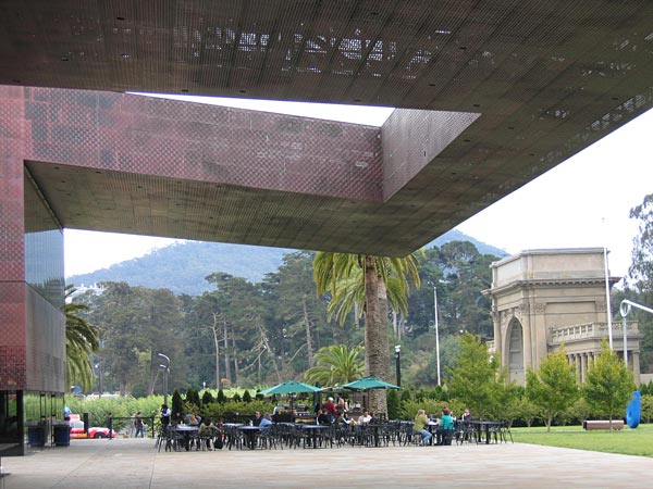 Image courtesy the author.
Outside the cafe is an outdoor terrace beneath a dramatic steel canopy. The 55-foot cantilever is typical of Herzog & de Meuron's work, which can veer from Calvinist severity to operatic theatricality at the drop of a hat. In this case one might say cinematic theatricality, since the setting reminded me of a sci-fi movie: Blade Runner with palm trees. One feels tiny beneath the looming shape and the experience, which should have been peaceful, is slightly ominous.
-
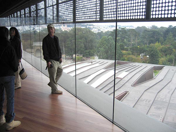 Image courtesy the author.
If, like me, you get tired of walking around and looking at paintings, you want a relaxing place to sit, a garden, an atrium, a court. At the de Young, when you want to get away from the art you go up—to a tower. In the enclosed ninth-floor observation deck, the lack of details is particularly effective, since nothing distracts from the dramatic 360-degree view of the city, the park, and the bay. Even the top of the Golden Gate Bridge is visible. Immediately below, the copper roof of the museum has been carefully designed to create the effect of what the architects call a "fifth facade."
-
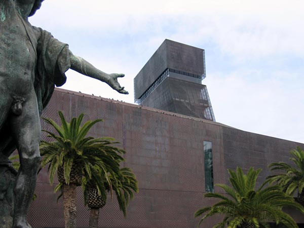 Image courtesy the author.
The 144-foot tower provides spectacular views, but at a cost. It is true that the old building had a tower, yet the current version, an industrial-looking structure, is an intrusive presence in Golden Gate Park. It is a rare false note in a building that combines stylish minimalism and (dare I say, Swiss) practicality, mostly with success. The forbidding exterior reflects Herzog & de Meuron's reluctance to jump on the "my museum is more exciting than your museum" bandwagon, and creates an interesting contrast with the open, loose, non-hierarchical interior. The latter seems particularly suitable, not only to the eclectic collection of the museum, but also to San Francisco itself.