Does the International Wheelchair Symbol Need a Redesign?
Via Wikimedia Commons
The best design podcast around is Roman Mars’ 99% Invisible. On it he covers design questions large and small, from his fascination with rebar to the history of slot machines to the great Los Angeles Red Car conspiracy. Here at The Eye, we cross-post his new episodes and host excerpts from the 99% Invisible blog, which offers complementary visuals for each episode.
This week's edition—a look at the history and possible future of the International Symbol of Access reported by Lauren Ober—can be played below. Or keep reading to learn more.
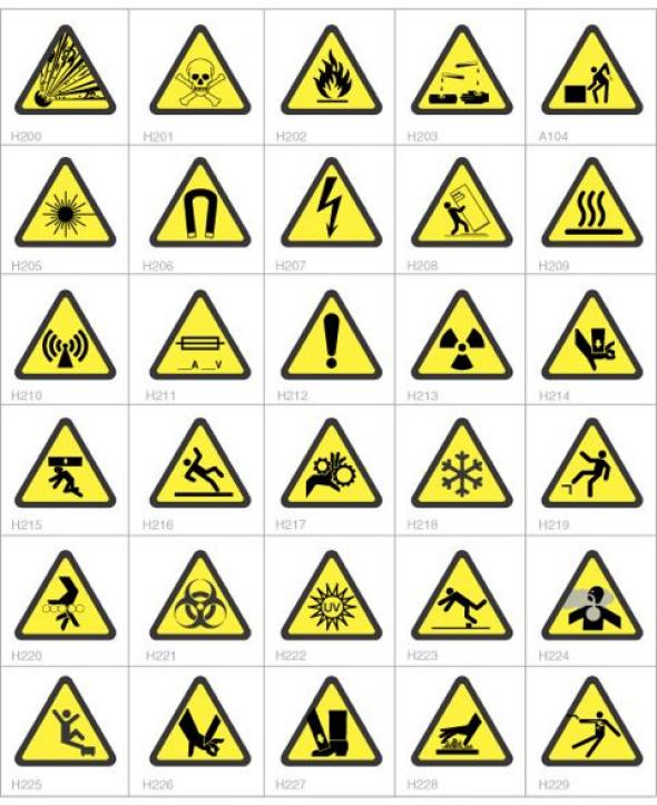
There is a beauty to a universal standard. The idea that people across the world can agree that when they interact with one specific thing, everyone will be on the same page—regardless of language or culture or geographic locale. If you’re in Belgrade, Serbia, or Shanghai or São Paulo, you can look at a sign and know instantly, without speaking a word of the local language, that this floor is slippery. That the emergency exit is over there. That that substance is poisonous, and you should not eat it.
Courtesy of Cellotape
The group behind those internationally recognized logos is called the International Organization for Standardization.
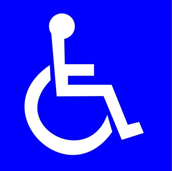
One of the most recognizable ISO symbols in the International Symbol of Access. You might not know it by that name, but you’ve seen it (above).
The International Symbol of Access is everywhere—on parking spaces, on buttons that operate automatic doors, in bathrooms, on seats on the bus or at movie theaters. Anywhere there’s an indication of special accommodations made for people with disabilities.
The logo was created through a design contest in 1968, coordinated by an organization now called Rehabilitation International. The logo would have to be readily identifiable from reasonable distance, self-descriptive, simple, unambiguous, and practical. The winner was a Danish designer named Susanne Koefed—though her original design didn’t have a head!
Within a decade, the logo—the one with a head—was endorsed by both the United Nations and ISO. And so over time, the International Symbol of Access became embedded in the urban fabric of cities and towns across the world. People began to pay attention to the kinds of special building accommodations that spaces need to be inviting for people with varying degrees of ability. And then in 1990, Congress passed the landmark Americans With Disabilities Act, which President George H. W. Bush signed into law. Modeled on the Civil Rights Act of 1964, the ADA:
[P]rohibits discrimination and guarantees that people with disabilities have the same opportunities as everyone else to participate in the mainstream of American life—to enjoy employment opportunities, to purchase goods and services, and to participate in State and local government programs and services.
The presence of this single, attractive logo to signify a universal right for access helped create an atmosphere in which the world could begin to adapt to new building parameters and regulations. In many ways, the adoption of the international accessibility icon is a success story of a simple design changing the world for the better.
But this isn’t the end of the story. Because as the logo got absorbed into the built environment, and the politics of (dis)ability became more nuanced, some people started finding it a little lacking.
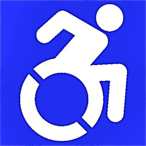
And so one group, the Accessible Icon Project, has created a new logo that it hopes will ultimately replace ISO standard.
Courtesy of Sarah Hendron and the Accessible Icon Project
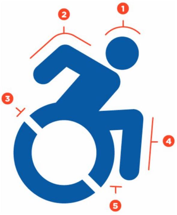
Here, in the Accessible Icon Project’s words, is what’s different:
Courtesy of Sarah Hendron and the Accessible Icon Project
1. Head is forward to indicate the forward motion of the person through space. Here the person is the “driver” or decision maker about her mobility.
2. Arm angle is pointing backward to suggest the dynamic mobility of a chair user, regardless of whether or not she uses her arms. Depicting the body in motion represents the symbolically active status of navigating the world.
3. By including white angled knockouts, the symbol presents the wheel as being in motion. These knockouts also work for creating stencils used in spray paint application of the icon. Having just one version of the logo keeps things more consistent and allows viewers to more clearly understand the intended message.
4. The human depiction in this icon is consistent with other body representations found in the ISO 7001 – DOT Pictograms. Using a different portrayal of the human body would clash with these established and widely used icons and could lead to confusion.
5. The leg has been moved forward to allow for more space between it and the wheel which allows for better readability and cleaner application of icon as a stencil.
Some people from the Accessible Icon Project have taken to altering signs with the current universal symbol of access, as seen below.
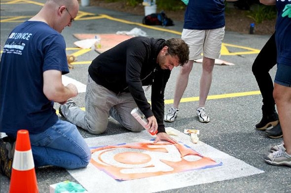
Courtesy of Sarah Hendron and the Accessible Icon Project
The DIY nature of this logo redesign project points to the fact that the process by which this new project is getting adopted is the complete opposite of how the universal symbol of access became entrenched in global society. Rather than go for a universal buy-in from on high, the Accessible Icon Project has been entirely grass roots—which can be a problem. Because without starting life as a universally—and internationally—recognized symbol, there’s a lack of clarity as to whether this new sign meets the standards put into effect by the Americans With Disabilities Act.
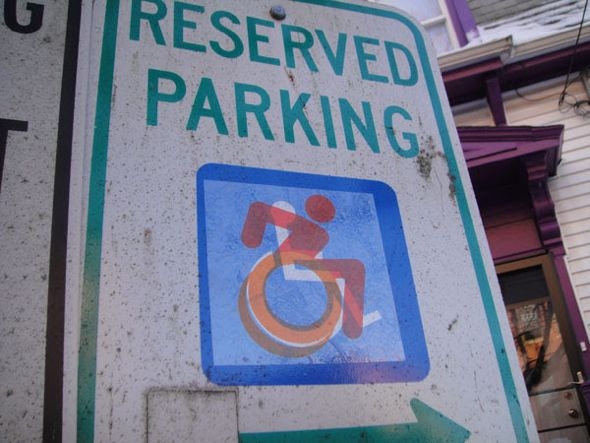
Courtesy of Sarah Hendron and the Accessible Icon Project
So it all comes back to the question of what we are trying to accomplish through our symbols. Having one unified icon can tell one clear story all over the world. But sometimes stories change. After all, the group behind the International Symbol of Access—Rehabilitation International—used to be called the International Society for the Welfare of Cripples! The meanings and associations that words have shift over time. And sometimes the symbols need to as well.
But, you know, universality does have an upside. Especially if you’re in Belgrade and about to accidentally ingest poison.

Via My Safety Sign
To learn more, check out the 99% Invisible post or listen to the show.
99% Invisible is distributed by PRX.
