Interaction Design Lessons from Science Fiction Movies
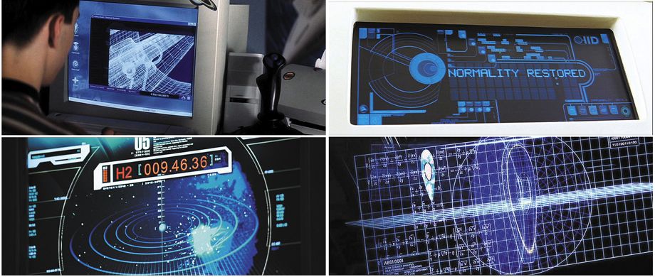
Courtesy (clockwise from left) Dreamworks; Touchstone; MGM; 20th Century Fox
By far the best design podcast around—and one of the best podcasts, period—is Roman Mars’ 99% Invisible. On it he covers design questions large and small, from his fascination with rebar to the history of slot machines to the great Los Angeles Red Car conspiracy. Here at The Eye, we will be cross-posting his new episodes so you can check them out, and we’ll also host excerpts from his podcast’s terrific blog, which offers complementary visuals for each episode.
His most recent show—about the design lessons in science-fiction movies—can be played below. Or keep reading to learn more.
We have seen the future, and the future is mostly blue.
Or, put another way: In our representations of the future in science-fiction movies, blue seems to be the dominant color of our interfaces with technology yet to come. And that is one of the many design lessons we can learn from sci-fi.
Designers and sci-fi aficionados Chris Noessel and Nathan Shedroff spent years compiling real-world lessons that designers can, should, and already do take from science fiction. Their 2012 book, Make It So: Interaction Design Lessons From Science Fiction is a comprehensive compendium of their findings.
To give you a sense of how exhaustive their research is in this field, take note that the lesson above—future screens are mostly blue—was determined empirically. Shedroff and Noessel catalogued virtually every interface from every sci-fi movie from 1968 through 2011 and determined an average color per year.
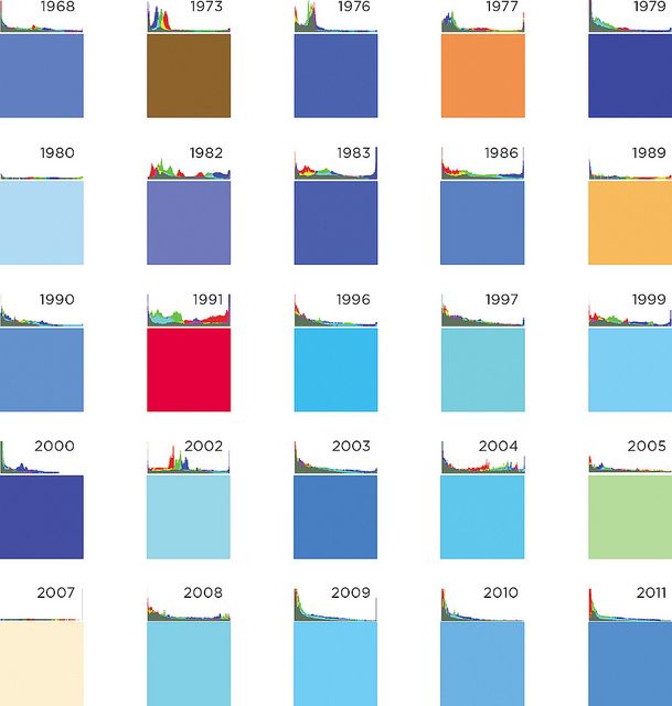
Courtesy of Nathan Shedroff and Chris Noessel
So why is blue the chosen color? Noessel posits that, because blue is so rare in nature (if you discount the sky and the ocean, which are arguably not blue) there’s something fundamentally mystical, unnatural, and inhuman about it.
Whether or not screens in the future will, in fact, be blue is beside the point. Make It So is about applying the ways we conceive of the future to the design of our present moment. After all, if sci-fi is about letting our imaginations run wild and creating imagined worlds, then there are plenty of design lessons from looking at the experience of the characters moving through those worlds. And even if your sci-fi world is 1,000 years in the future, those choices are in constant dialogue with the present.
Even the first sci-fi film is a sign of its times. In Georges Méliès Le Voyage dans la lune (A Trip to the Moon, 1902), there are hardly any interfaces!
Hence, science fiction can help us understand what we want in the present. And, when components of science fiction saturate the public imagination, it can affect how we design things. Consider the MicroTAC, one of Motorola’s first flip phones. It did not sell well.
The MicroTAC had a mouthpiece that flipped down. When the Motorola designers took this phone to Argonne National Laboratory for advice, the Argonne engineers said they had made the phone the wrong way—it ought to open upwards, not downwards. Like on Star Trek.
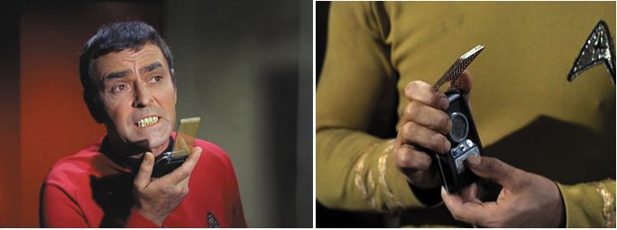
Courtesy of Paramount
They had the subsequent generation open upwards. It was wildly successful. And it was called the StarTAC.
Star Trek also may have helped create the entire image-under-glass paradigm that governs our digital world. The interface—known as LCARS—is cool-looking. It’s distinctive. And it’s actually the result of a budget shortfall.
Star Trek: The Next Generation didn’t have as much money for set design as did the original series, which had panels wired with jewels and glowing buttons. Instead, they cut out sheets of film and put them over glass panes. To this day, people still modify their computers and tablets to make them look like an LCARS device from the 24th century, by way of the late '80s.
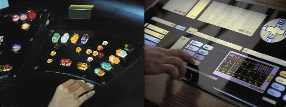
Courtesy of Paramount
The most interesting lessons from sci-fi come when you assume, for the sake of argument, that everything in sci-fi is there for a reason—even things that look like mistakes. There’s a word for this, apologetics, which usually refers to the act of attempting to close logical loopholes in theology.
Take Star Wars, for instance, in the scene when Luke and Han Solo are in the Millennium Falcon blowing up TIE fighters.
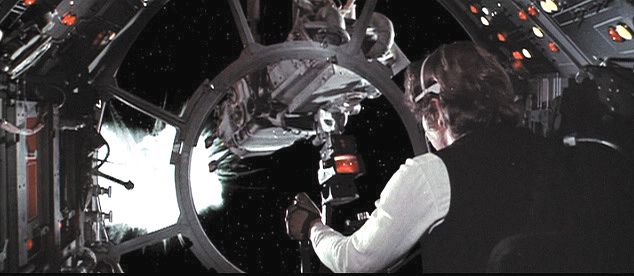
Courtesy of 20th Century Fox.
If they’re fighting in the cold vacuum of space, why do we hear the ships exploding? Sound doesn’t exist without air.
George Lucas probably figured that a silent gun fight would have been way less dramatic. He wanted to make the scene feel real to the audience, even if it was less true to reality. And if we move from the point of view that what works for the audience will work for the user, we can ask ourselves: Could this make sense? Is there an explanation that can warrant hearing ships exploding in space?
Well, what if the sound is the interface? Audio is a much more efficient gauge of surroundings, since it spans 360 degrees, whereas vision only covers 120 degrees. It might be that there are sensors on the outside of the Millennium Falcon that provide 3-D sound inside the gunner seat. So when we hear ships blow up, we’re actually hearing an augmented reality interface that Luke and Han hear. Maybe?
Here’s another one: In 2001: A Space Odyssey, Dr. Floyd is on a satellite, making a video call to his daughter back on earth. You see his daughter button-mashing the controls on the video phone, but, strangely, you don’t hear any of the buttons.
Maybe the sound designer was sleeping on the job. But phones really ought to work this way. It could be that the system was context-aware enough to acknowledge that its user is a child, and that it could disregard her button-mashing.
With design thinking, there are logical excuses for every interface discrepancy. And it makes sci-fi that much more fun to watch.

Courtesy of 20th Century Fox
To learn more about the design lessons of sci-fi movies and to see additional photos from the films, read the rest of the 99% Invisible post or listen to the show. 99% Invisible is distributed by PRX.
