Baseball’s Strike Zone Expansion Is Out of Control
When will someone shrink it back down to size?

Photo by Justin Edmonds/Getty Images
This article originally appeared in the Hardball Times.
The playoffs are here, which means games are scrutinized more than at any other time in the season, with millions of extra eyeballs watching and every game crucial to the outcome of such short series. One of the most controversial aspects of each game is the called strike zone, with seemingly no game passing without at least one team, if not both, unhappy with the performance of the home plate umpire.
We know by now that the strike zone has been expanding during the PITCHf/x era. (PITCHf/x pitch-tracking cameras have been installed throughout Major League Baseball since 2006.) I discovered this for the first time in the middle of last season, then followed up with a much more detailed examination of the topic at the end of 2013. Brian Mills was concurrently, independently discovering the same phenomenon, which he published in a wonderful academic paper earlier this year. All of these results concluded with data from the end of the 2013 season. Jeff Sullivan recently found evidence that the strike zone was continuing to grow in 2014, and I wanted to return to the same approach that I had used earlier to analyze the most recent regular season.
My approach involves splitting up the front plane of home plate into a grid of 1-inch-by-1-inch cells, and calculating the percentage of called pitches that crossed the plate in each grid cell that were deemed strikes. Every cell location that is called a strike more often than a ball is included in the strike zone for a given season.
What I found was perhaps not surprising—the strike zone did continue to expand, and that expansion was almost entirely due to the bottom of the zone dropping once again. What surprised me was that this season saw the largest single-year increase in the size of the strike zone in the PITCHf/x era.
| Average Size of Called Strike Zone (sq. in.) |
|---|
| Year | Size |
| 2008 | 436 |
| 2009 | 435 |
| 2010 | 436 |
| 2011 | 448 |
| 2012 | 456 |
| 2013 | 459 |
| 2014 | 475 |
The average strike zone size increased by 16 square inches in 2014 over 2013, growing the zone to a robust 40 square inches larger than just five seasons prior. In the previous articles, we discussed how the zone has actually been squeezing in at the sides slightly, but is stretching like crazy down from the knees as if it is under the clutches of gravity. (And like Radiohead said in “Fake Plastic Trees,” gravity always wins.) I’ve zoomed in on the lower band of the strike zone by considering only those pitches that arrive at home plate less than 21 inches above the ground.
| Average Size of Called Strike Zone Below 21″ (sq. in.) |
|---|
| Year | Size |
| 2008 | 0 |
| 2009 | 0 |
| 2010 | 6 |
| 2011 | 11 |
| 2012 | 19 |
| 2013 | 30 |
| 2014 | 47 |
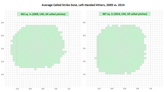
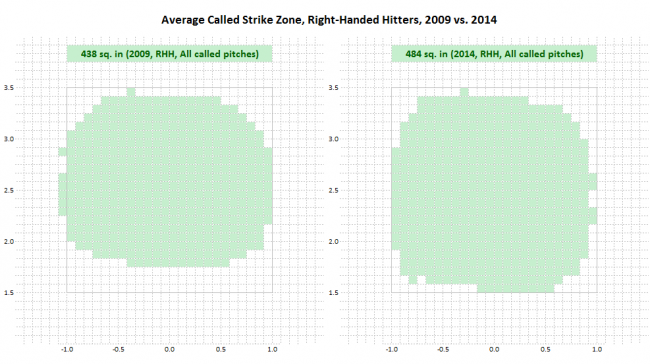
It is clear from this table that the falling bottom of the strike zone is accounting for the entire growth of the zone as a whole. While tables show the hard numbers, looking at the strike zone visually can perhaps give a better impression of which areas are most affected, and how much the zone has changed in merely a five-year span.


Note: The strike zone images are shown from the umpire’s perspective.
The box in the images is shown purely for a frame of reference. We can see that the strike zone has had a full 3 inches—the diameter of a baseball—tacked on to the bottom within half a decade. The called zone was wider than it was tall in 2009, but with the trimming of the sides and the massive expansion at the bottom, its width and height have become virtually equal in 2014.
| Percentage of Total Pitches Thrown Between 18” and 24” Off the Ground |
|---|
| Year | Percentage of Pitches |
| 2008 | 16.9% |
| 2009 | 16.8% |
| 2010 | 17.4% |
| 2011 | 17.3% |
| 2012 | 18.1% |
| 2013 | 18.2% |
| 2014 | 18.3% |
| Percentage of Pitches For Which Batter Swings Between 18” and 24” Off the Ground |
|---|
| Year | Percentage of Pitches |
| 2008 | 45.6% |
| 2009 | 45.0% |
| 2010 | 45.4% |
| 2011 | 46.9% |
| 2012 | 47.5% |
| 2013 | 48.3% |
| 2014 | 49.2% |
Another interesting note is that while the zone for right-handed hitters has always been slightly larger than for left-handed hitters, the gap has grown to the point where righties faced a zone 17 square inches larger in 2014, on average, than their lefty counterparts. While the zone for left-handed hitters has increased 35 square inches since 2009, partly offset by a noticeable trimming of the outside “lefty strike,” the zone for right-handed hitters has swelled an incredible 46 square inches over the same period.
Previously I’ve shown that pitchers have been throwing to this expanding band at the bottom of the zone more and more each season to take advantage of the new pitcher-friendly area, and in turn hitters are now swinging more at pitches in this region. This is a trend that continued in 2014.
In my article examining this topic at the end of last season, I had calculated that the changing called strike zone had being responsible for about one-third (31 percent) of the lower run environment in 2013 as compared with 2008. Brian Mills used a different technique in his analysis and arrived at a range of 24 percent to 41 percent of the earned run difference between 2007 and 2013 being due to differences in the called strike zone. Certainly with the zone having expanded again in 2014—with the largest single-year increase during that period, no less—the run environment would have been expected to drop in the past season.
I updated the calculations for this past season using the same technique I used before, which involves using wOBA constants to calculate the expected run difference by count for the next pitch being a strike as well as the next pitch being a ball and summing up these tiny run differences over all instances of called pitches to the regions where the strike zone has been changing most notably. The three regions of interest that I defined are off the outside edge of the plate for both left-handed and right-handed batters, as well as the bottom of the zone for all hitters.
| Results of called pitches in three regions of interest, by year |
|---|
| Year | # of Balls | # of Called Strikes | Expected Runs |
| 2008 | 91,727 | 37,866 | 2,606 |
| 2013 | 85,556 | 42,456 | 1,892 |
| 2014 | 81,946 | 43,653 | 1,489 |
It is worth noting that these numbers don’t exist in a vacuum, as we can see the total number of called pitches in these regions also declined by almost 2,500 between 2013 and 2014. The reason for the lower number of called pitches is twofold. Pitchers have been throwing fewer pitches to the outside edge regions as these areas have been less likely to result in called strikes, and fewer total pitches has led to fewer called pitches. In the bottom of the zone, we’ve seen that pitch totals are getting higher, but so are batter swing rates. These swings climbed faster than the extra pitches thrown to the bottom of the zone in 2014, causing a slight reduction in called pitches in this region as well.
That being said, yet again we see the number of expected runs decline, this time by 403 runs in a single year. As a frame of reference, if we subtract this number of runs from the league total in 2013, the average number of runs scored per team per game would have dropped from 4.17 to 4.08. Teams scored an average of 4.07 runs per game in 2014, the lowest total in not only the PITCHf/x era but since 1981.
Someone inside the game recently asked me if I thought the league knew how much of an impact the changing strike zone has made on the run environment. I find it hard to believe that nobody knows, but maybe that is actually the case. It’s an interesting question—what do you think?
If you like low-scoring pitching duels, you probably love this type of change to the strike zone. The sentiment that I get, though, is that most people would prefer more offense in the game. The simple way to do that would be to simply tighten the strike zone’s belt and pull its bottom back up toward where it was when the PITCHf/x era began just a few years ago.
How low will it go? Has the zone bottomed out? We’ll have to wait until 2015 to find out.
Credit and thanks to Baseball Heat Maps for the PITCHf/x data and FanGraphs for the wOBA constants, upon which this analysis was based.
More stories from The Hardball Times: