The Secret Language of Signs
They're the most useful thing you pay no attention to. Start paying attention.
Three years ago today, the 33 members of the Bluffton University baseball team boarded a bus at their campus in Bluffton, Ohio. It was early evening, and the college students had a long night ahead of them—an 18-hour ride, punctuated only by bathroom breaks, fuel stops, and a planned breakfast at McDonald's. But their destination was enticing: Sarasota, Fla., which promised sunshine and the first game of their season.
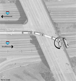
After an uneventful overnight drive, the bus stopped in Adairsville, Ga., to pick up a fresh driver, then headed south on I-75, eventually entering the HOV lane. As the bus rolled closer to Atlanta, it neared the turn-off for Northside Drive,* the first of several left-hand HOV exits that dot that stretch of highway. The driver, Jerome Niemeyer, should have kept right where the road split, continuing toward Florida in the HOV through-lane. Instead, he took the left-hand exit ramp at highway speed, apparently mistaking it for a regular lane. At the ramp's end, he drove through a stop sign and four lanes of traffic before careening into a retaining wall and flipping onto the highway 19 feet below.
The accident killed seven people—five of the Bluffton players, the bus driver, and his wife, Jean, who was along to keep him company. When the National Transportation Safety Board investigated, it blamed the crash in part on Georgia's failure to install adequate signs.
* * *
Signage—the kind we see on city streets, in airports, on highways, in hospital corridors—is the most useful thing we pay no attention to. When it works well, it tells us where we are (as when an Interstate marker assures us we're on the right highway) and it helps us to get where we want to go (as when an airport banner directs us to our gate). When it fails, we miss trains, we're late to appointments, we spend hours pacing the indistinguishable floors of underground parking garages, muttering to ourselves in mounting frustration and fury. And in some cases, especially where automobiles are involved, the consequences of bad signage can be fatal.
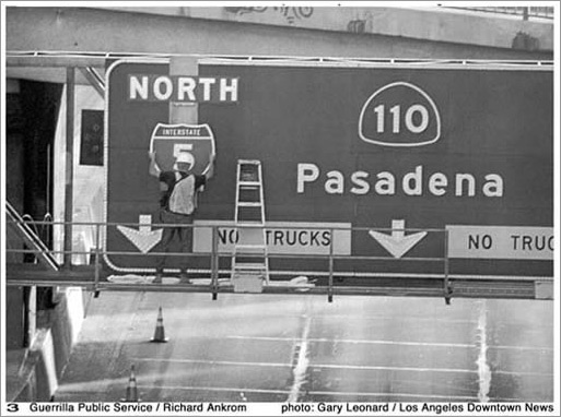
Bad signs can send perfectly ordinary citizens into spirals of obsession. Take Richard Ankrom, a Los Angeles artist who thought the junction of the 110 freeway and the 5 freeway was badly marked. In 2001, he put on an outfit that looked like the ones Caltrans highway workers wore, climbed up onto a freeway gantry, and mounted an aluminum sign he'd manufactured himself according to state specs. The sign stayed up for nine months without anyone noticing what he'd done; when the story leaked to the press and Caltrans finally cottoned on, the agency left the sign up for eight more years (eventually replacing it with one of their own that served the same function).

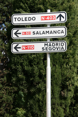
Or consider Leslie Gallery Dilworth, a Philadelphia architect who took a road trip with her husband through Spain in the 1980s. Throughout the journey, they'd marveled at the simplicity of the European road signs, which were easy to use even though neither of them spoke Spanish. Upon their return to Philly, they got lost on the way from the airport to their house, when a bad set of signs directed them to a local dump. Dilworth was so struck by her own city's inhospitality that she spent much of the next decade working with the city and local stakeholders revamping Philadelphia's sign systems. Today, she's the CEO of the Society for Environmental Graphic Design, the premier American professional group for sign designers.

Most people, when they think about it, can point to signs that have failed them: the hospital complex that felt like a labyrinth or the exit they always almost miss. But the truth is that signage today is far better than it's been at any other point in history. A century ago, sign design wasn't a profession to speak of; the signs that guided riders and pedestrians (there weren't many drivers yet) tended to be informal and ad hoc. As the automobile took off, the world found it needed traffic engineers, and it was these men and women who were the first to think seriously about sign systems. America put national standards for road signs in place in 1935.
But the developers of office buildings, shopping malls, and other pedestrian spaces were slow to follow suit. Developers tended to assume that architects would take care of sign design, and many architects would leave it up to tenants. As a result, security guards and secretaries were often the ones to help orient the lost.
The 1970s saw the first stirrings of revolution in the sign world. That's when the SEGD was founded, and it's when designers first began to seriously study how best to orient people and guide them through space. Their work was prompted in part by America's great urban thinkers: people like Kevin Lynch and Jane Jacobs, who argued that spaces should be designed not to fulfill the grand visions of architects but with humble human uses in mind. The field earned a name—"wayfinding," a Lynch coinage—and today, people in the business call themselves wayfinding designers and talk about places that have "good wayfinding" or "terrible wayfinding." By the 1980s and '90s, wayfinding advocates were involved in more development projects, but dispatches from the era have a slightly aggrieved air; designers of environmental graphics still often found themselves fighting for a place at the table. During the last 10 years, however, wayfinding has come into its own. More requests for proposals for major building initiatives now require bidders to explain how they'll handle wayfinding design. Many cities have installed wayfinding systems like the one Dilworth helped build in Philadelphia. New airports and train stations are routinely built with good navigation in mind.
Why has there been such growth in the field? One cause is the remarkable pace of economic development over the past half-century. Developed countries have been building increasingly complicated spaces—shopping malls, multiplexes, convention centers, multi-terminal airports—that require good navigation systems in order for people to use them. In addition, businesses and municipalities alike have realized that well-oriented people are calmer, happier, and more likely to spend money (and plan return visits) than people who are lost. Investing in a good wayfinding system has real financial rewards.
Another cause is our increasingly globalized planet. Much of the innovation in the sign world has been spurred by airports, places where people of all nationalities and tongues must move quickly, efficiently, and safely through huge spaces. For years, designers have been developing graphical symbols to help non-natives find the bathrooms, the baggage claims, and the bureaux de change, and, in the process, they've been inventing a global language, a kind of pictorial Esperanto.
A third cause is our society's increasing inclusiveness. The 1990 Americans With Disabilities Act was the first piece of national legislation to mandate the accessibility of privately managed public spaces like hotels and universities. And because the law deals with visual as well as physical impairment, its accessibility guidelines require that standards of legibility be maintained in directional signs; they evolved to specify everything from the size of fonts to the contrast between lettering and its background. This development turned out to be as useful for the rest of us as it was for the legally blind.
Finally, there's the fact that we have all increasingly become connoisseurs of good design. Fifty years ago, design belonged to designers. But the advent of the personal computer introduced us all to fonts, line spacing, and page layout, and machines from the photocopier to the iPhone have left us familiar with icons both clear and confusing. Navigating the Web has made us smarter about orienting ourselves in virtual space. As a result, when we see badly designed signs, we demand better. Joe Calderone, a spokesman for the Long Island Railroad, notes that the agency is not wanting for feedback: "Our customers are not shy about telling us if things don't work."
Ironically, just as our signs have improved, we've seen the advent of something that makes us less dependent on them than ever before: satellite navigation. Our iPhones and the GPS systems in our cars orient us in relation not to fixed squares of metal on our roads but to orbiting wheels of technology in the sky. Designers are confident that we'll always need signs—after all, you still need to know which street is Rogers when your car tells you to take it—but folks in the satellite business aren't so sure. By examining how signs have evolved and how they help us now, we can determine whether signage's golden age is ending or just beginning.
* * *
Of course, the advances in the sign world don't mean that we live in a world devoid of bad signs. The Bluffton bus crash stands as evidence of that. Good sign systems require careful planning, consistent funding, and assiduous maintenance, all of which can be in short supply, especially in a recession.
In the case of the Bluffton bus crash, the problem was actually a lack of signs. Left-side exits are unusual on American highways, and they're even more unusual on roads where the left lane is designated for high-occupancy vehicles. Typically, signs will announce a left exit well in advance. On I-75, though, the signs for the Northside exit never specified that it would appear on the left.
In addition, there was a sign missing at the exit itself. When the exit was designed, the Georgia DOT intended to put up two signs side-by-side: one specifying the exit lane and one specifying the HOV through-lane. But when engineers set out to install the signs in the mid-1990s, they found the poles available would support just one. So they decided not to hang the through-lane sign at the exit turnoff.
In the years that followed, the intersection was the site of two fatal crashes. And then, three years ago this week, Jerry Niemeyer mistook the Northside exit for a through-lane. By the time he realized his mistake, it was too late to avert the crash.
A subsequent investigation by the National Transportation Safety Board identified the bad signs as a primary cause of the crash. In addition, the NTSB urged the Federal Highway Administration to revise the Manual on Uniform Traffic Control Devices* (the handbook that lays down rules for signs on highways across the country) to mandate putting "LEFT" on all warning signs for HOV-only left exits, and pairing turnoff signs for such exits with signs indicating the pull-through lane whenever an exit might be confusing. Both recommendations were adopted into the revised MUTCD that was released last December.
* * *
In the Atlanta crash, an unprecedented traffic pattern, insufficient guidance, and limited supplies contributed to the installation of the bad signs. What are some of the other factors that make good signs good and bad signs bad? Over the next few weeks, I'll be examining this question in a series of pieces. I'll start today with a tour of one of the most complicated signage environments in the United States: New York's Penn Station. On Thursday, I'll examine one wayfinder's effort to subdue London, a city so disorienting that its natives often keep the famous A to Z street atlases close at hand. I'll also be introducing readers to a British designer who's been studying homespun wayfinding design—the maps we nondesigners draw when we're trying to help one another get around—and asking you to submit your maps for his inspection. Next Monday, I'll examine America's emergency fire exit signs and explain why the rest of the world thinks they should be green instead of red. And a week from Thursday, I'll examine how the advent of satellite navigation devices may change the sign world forever.
More from this series: Why the signs in Penn Station are so confusing; how smarter signs could make London easier to navigate; the international war over the exit sign; how GPS could kill the sign. Plus: Send Slate your hand-drawn maps. See more road signs in this Magnum Photos gallery.
Correction, March 1, 2010: This article originally referred to Northside Drive as Northfield Avenue. (Return to the corrected sentence.)
Correction, March 2, 2010: This article originally referred to the Manual on Uniform Traffic Control Devices as the Manual for Traffic Control Devices. (Return to the corrected sentence.)
