The Big Red Word vs. the Little Green Man
The international war over exit signs.

The classic American emergency exit sign—the bold red letters spelling out E-X-I-T—seems at first glance like an unimpeachable bit of sign design. The contrast between the letters and the background renders it highly legible, the illumination stresses the importance of the message, and the color is evocative of both fire and fire-safety devices (fire extinguishers, fire engines, fire alarms, and the like). If you're reading this in a coffee shop, cubicle, or other public place, pause and look around you; it probably won't take long to find that glowing red beacon.
But people in the rest of the world—at least, the kind of people who spend time considering how to mark a means of emergency egress—think our simple red sign is completely nuts. Many other countries use some version of the ISO standard, a symbol developed the late 1970s by a Japanese designer named Yukio Ota and adopted for international use in 1985. This take on the exit sign goes by the informal name "the running man," and looks like this:
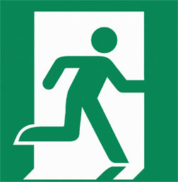
Fans of Ota's running man point to two key advantages: It's a pictogram, and it's green. The sign's wordlessness means it can be understood even by people who don't speak the local language. And the green color, they argue, just makes sense. Green is the color of safety, a color that means go the world over. Red, on the other hand, most often means danger, alert, halt, please don't touch. Why confuse panicked evacuees with a sign that means right this way in a color that means stop? International designers tend to think our system is illogical and consider our rejection of the running man to be as dumb as our refusal to adopt that other sensible international norm, the metric system.
Are the running-man advocates right? This battle over the exit sign has been brewing for 25 years now, and the little green guy is slowly making inroads in the States. But to understand whether he should triumph, we must first understand America's skepticism toward pictograms and symbols, which have long been more popular in the rest of the world than they are here.
American signs tend to be wordy. In most places in the United States, it's safe to assume people speak English. As a result, our sign systems have typically communicated in text. Europe, by contrast, developed symbolic road signs as early as 1968. On a continent where you can't drive for more than a few hours before encountering a new language, the pictorial approach made sense.
The text-based American exit sign has its origins in the 1911 Triangle Shirtwaist Fire, a blaze in a downtown Manhattan garment factory that killed 146 workers. Although signage was not primarily to blame for those fatalities—many factory doors were bolted shut in an effort to keep employees from slipping out—the exits were not clearly marked. That massive loss of life spurred the National Fire Protection Association, which had been founded in 1896 by insurance companies to develop protocols for property preservation, to take up what it called "life safety": the business of getting people out of burning buildings intact. In the 1930s and '40s, the NFPA developed criteria for emergency-exit signage, evaluating contrast levels and testing different sizes and stroke widths for lettering, eventually publishing standards that were adopted by state and local governments across the land. Robert Solomon, who runs the NFPA's Building Fire Protection and Life Safety departments, explains why the original designs used English prose instead of symbols: "The U.S. was more parochial then." He suspects that designers never considered whether foreign residents "knew what E-X-I-T meant."

Over the next few decades, however, designers around the world began to use graphical symbols with increasing frequency, especially in busy pedestrian environments where speakers of multiple languages were likely to congregate: airports, train stations, and—funnily enough—the Olympics. For the Mexico City Games in 1968, the American designer Lance Wyman introduced a system of pictograms so comprehensive the tickets were nearly textless. In the late '60s, British airports introduced a set of pictograms, some of which are still in use. (Keep Mary Quant in mind next time you see the unusual, bell-shaped dress of the women's toilet icon at Heathrow.)
America made its first great pictographic strides in 1974, when the Department of Transportation collaborated with the AIGA—the largest national professional group for designers—to standardize a series of pictograms for use at terminals and stations throughout the United States. (If you've ever wondered why there's a pipe in the common symbol for shops, wonder no more: The icon was designed in an era when people still smoked.) Although the AIGA-DOT symbol set is widely regarded as a first-rate group of pictograms, its exit sign was confusing and never caught on. And so the red "EXIT" sign rolled on.

While the ubiquitous red sign faced no competition stateside, a challenger would emerge from the Far East. In the late '70s, a Japanese association devoted to fire safety held a contest to design a new national emergency exit sign. It received 3,300 entries and—after a period of rigorous testing to determine whether each symbol could be readily understood in a smoky environment—settled on one submitted by a designer named Yukio Ota: a figure on a green ground, running out a door.
Once his concept was selected, Ota worked with the Japanese fire safety commission and the government to fine-tune the design. He remembers presenting 58 variations of the running man, tweaking the angle of the legs after a member of the committee objected to a figure that looked like he was sprinting out the door. The goal, Ota recalls, was to suggest that people should "run slowly."
Around that time, the International Organization for Standardization was preparing to publish a series of standards regulating graphical symbols. The ISO was founded after World War II, primarily to ease international trade. It issues international standards for everything from the sizes of piston rings to the threads of screws. In 1980, Japan submitted the running man to the ISO for consideration as an international exit symbol. At the time, Ota recalls, the ISO was about to adopt a Soviet proposal, but it agreed to consider his because of the extensive testing that supported the design. The Soviets squalled, but Ota's design won out. Japanese newspapers crowed with triumph when the hometown sign was selected as the international norm.

For Ota, the most remarkable thing was not that his design won but how similar his design was to the Soviets'. They, too, had submitted a figure of a man running out a door. He was amazed that two design teams, working independently, would develop such similar concepts, and the coincidence convinced him of the essential rightness of the running man. He came to believe he had designed not just Yukio Ota's exit sign, not just a Japanese exit sign, but a fundamentally human exit sign, one that speaks to some primal cognitive notion of escape.
Ota, like many designers of pictograms, is a bit of a romantic about the power of symbolic communication. The first real innovator in the field was Otto Neurath, who developed ISOTYPE, a system of pictograms intended to help workers between the world wars relate to Europe's increasingly industrial economy. Neurath used pictograms—for man, woman, sugar, wheat, gunship, etc.—to produce infographics that he displayed to packed crowds in a convention hall in Vienna, Austria. Like Neurath, Ota believes that through graphical icons, we can transcend our cultural and linguistic differences and speak to one another as global citizens. In 1964, Ota even invented a symbolic language called LoCoS, the Lovers' Communication System, which supposedly took just an hour to learn. (Click here to see some of the symbols used.) Ota's colleague and fellow icon designer Aaron Marcus recalls that LoCoS was intended to "bring human beings together and … help them love each other a little bit better."

The running man is thus the child of both rigorous science and starry-eyed utopianism, and it's now in use all over the globe. Even regions that don't use Ota's classic design often use variations of it. A recent European Council directive, for example, requires a running man on a green ground, but the symbol it offers as an example of an acceptable sign shows a man running toward, not through, a door. As a result, although the directive allows Ota's symbol, variations like the one at left are common in Europe. (The ISO is currently urging the EC to revise the directive.)
Despite the running man's widespread appeal, the NFPA has no plans to substitute it for the "EXIT" any time soon. "We update and revise [our] code every three years," the NFPA's Solomon told me. "At some point during that update, this issue always comes up." But the NFPA sees no real reason to make a switch. Solomon points out that when the NFPA investigates fires, it never encounters circumstances "where someone says I didn't know where the exit was because I didn't know … what the exit sign was. When they don't know where the exit is, it's because there was no signage there whatsoever."
Solomon knows what it's like to look for exits in a foreign land. Whenever he travels, the first thing he does is find the fire exits on his floor. (This is one of the perils of working at the NFPA, he explains.) In international hotels, he argues, it's not so difficult to decipher the word exit written in an alien language or even in an alien script. That's because in our efforts to decipher signs, we don't rely entirely on the sign itself. We take architectural cues from the sign's location: Is it at the end of a corridor? Is it near a door? We also look for indications of its significance: Is it illuminated? Is it in danger red or safety green? As a result, Solomon said, he had no trouble understanding an exit sign in Arabic that he spotted at a hotel in Egypt.
It's not that the NFPA objects to the running man. It acknowledges that green is a sensible color for exit signs. In fact, it has never mandated that "EXIT" signs be red; it only mandates the contrast between the text and the background. The NFPA even includes the ISO running man in a group of auxiliary symbols its members might want to use and allows the use of pictograms in tandem with the "EXIT" text, where local jurisdictions allow. It simply has no plans to eliminate the "EXIT" sign, which it believes still works perfectly fine.
Still, the NFPA's nods to internationalism are beginning to change the American exit sign. In recent years, more green "EXIT" signs have gone up around the country, although red ones still predominate. And in 2006, New York City changed its fire code to mandate that high-rises include the ISO pictogram on fire doors on each floor. I was surprised to learn about this ruling; the new Slate offices in Manhattan feature more bright scarlet squares than a box of red hots. But, sure enough, on the fire door itself, the running man makes his green escape.

New Yorkers may also soon see a version of the running man in the subway system. The MTA is in the process of rolling out a new series of pictograms designed by icon guru Mies Hora. These include symbols for "watch the gap"—Hora was hired after an 18-year-old girl fell between her train and the platform and was killed at an LIRR station in Queens, N.Y.—and a host of other station functions. Hora has proposed that the MTA pair a traditional "EXIT" marking with a running man, both in green; the MTA will decide how to roll out his proposals over the next few years.
Although the case for the universal symbol has a certain logic, I find myself resisting it on some gut level. Ota's running man is elegant and efficient, but a bit quiet compared with the blaring red cubes I'm used to. Encountering it in London last month, I found it retiring and shy. In a fire, wouldn't we want signs to shout at us a bit?
It's impossible for me to say, though, whether I'm just expressing a preference for what I'm used to. Hora says that the "EXIT" sign is now so familiar to Americans that it has essentially become a symbol to us. That's why he wouldn't have suggested replacing the MTA's "EXIT" signs with running men even if he'd been able to. A dual-sign approach is a bit like training wheels, a way to help us learn the unfamiliar symbol. And as Americans grow increasingly accustomed to using icons in everyday life—scan your computer screen quickly as you read this and you'll see dozens of them—the running man will gain ground. Eventually, we'll know it on sight, and green will feel like a natural color for an emergency escape. And then, perhaps, we'll see the red "EXIT" disappear.
More from this series: Why signs are better now than they've ever been; why the signs in Penn Station are so confusing; how smarter signs could make London easier to navigate; how GPS could kill the sign. Plus: Send Slate your hand-drawn maps. See more road signs in this Magnum Photos gallery.