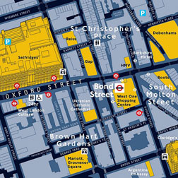
Legible London
Can better signs help people understand an extremely disorienting city?
London is a city without an organizing principle. Its streets aren't numbered, like New York's, or lettered, like those in Washington, D.C. It's not laid out on a grid, like Chicago, and no Haussmann ever came through to organize its avenues. London is just a bunch of villages that grew and grew until they merged into a giant, wriggling blob. Many of the city's roads date back to medieval times and are so twisty and short that locals don't use the term "block"—it's far too regular-sounding to apply to the odd-angled polygons formed by the city's streets.
As a result, even Londoners get lost in London. Natives often walk around with street atlases—the famous "A to Zeds"—in their pockets. Cab drivers must undertake years of intensive study (to acquire what's called "the knowledge") before they're let loose on city streets. When Transport for London removed the River Thames, one of the city's key orienting landmarks, from the tube map last year, citizens were discombobulated and outraged. The mayor, Boris Johnson, resorted to Twitter: "Can't believe that the Thames disappeared off the tube map whilst I was out the country! It will be reinstated ..." (It was.) Google Maps has made London somewhat easier to navigate, but the city comprises 32 boroughs, and you must know what borough a street is in to find it on the site, a difficult task if you're new to town.
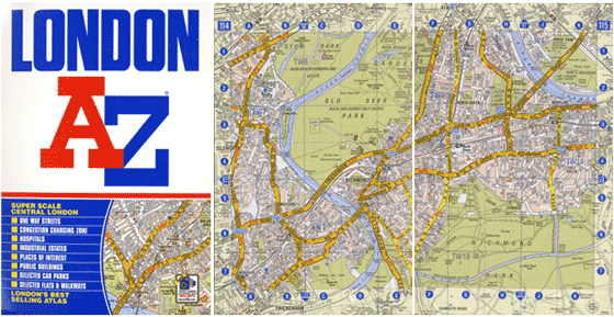
London is, in short, a city where pedestrians could use some direction. They're about to get it, in the form of an urban wayfinding system called Legible London. It's an ambitious effort to remake the way people see and use the city. And if it's successful, London will be a less congested, less polluted, healthier place.
Wayfinding signage for city streets is very different from the wayfinding programs you find in transportation environments like Penn Station or Heathrow. In an airport, the signs boss you around: Check in, go to security, proceed to your gate. On city streets, good signs are more like valets: They give you options, telling you about nearby attractions and helping you figure out where you want to go. Transport wayfinding gets you from point A to point B, but good urban wayfinding systems help you develop your own mental map of a place. As a result, they're often more aesthetically complicated than the this-way-to-baggage-claim arrows that confront harried air travelers; they usually include extensive maps or provide an index of streets or amenities.
Urban wayfinding systems seemed deeply experimental—and a little weird—when a few cities rolled them out in the late 1980s and early '90s. Skeptics wondered why a city should spend thousands, even millions, of dollars to install and maintain an expensive sign system. Couldn't tourists just use their own maps? But wayfinding advocates believed that modern cities should be, above all, usable.
These early systems drew largely on Kevin Lynch's seminal 1960 book The Image of the City, which featured research on how humans respond emotionally and cognitively to the aesthetic structures of modern cities. Lynch believed we instinctively identify five key forms in an urban environment: paths (routes we travel on), edges (barriers and boundaries), nodes (central intersections), districts (areas with distinctive character) and landmarks (notable building or sights). Even today, this taxonomy underpins urban wayfinding. In London, for example, the River Thames is a crucial edge; people locate themselves in relationship to the river, which is why even the mayor was flummoxed when it disappeared from the tube map.
Since urban wayfinding systems must pass muster with bureaucrats and neighbors, getting them approved and installed can be a laborious process. Perhaps it's not surprising, then, that comprehensive systems are more commonly found in smaller cities, where the red tape is slightly less sticky. Some of the earliest notable installations were in Philadelphia and Bristol, England. Legible London marks one of the first efforts to subdue a city so immense.
Why is London willing to try out new signage? Surprisingly, it has a lot to do with the success of an earlier sign—the amazing, iconic London subway map. When people picture London, they often picture Harry Beck's diagram of the tube. But the tube map—though a groundbreaking, elegant, and useful piece of information design—bears only a hazy relationship to the city's real layout. The map, which was first released in 1933, abandoned the geographically accurate style then customary among transit maps. Previous maps of the London system had been hard to read, because they squeezed the stops in central London close together in an effort to make room for the elongating tentacles of suburban lines. Beck deduced that transit maps don't have to be—and perhaps shouldn't be—straightforward geographical representations. And so he straightened out the map's lines and enlarged its scale in the center of London, enabling passengers to understand how the city's most-used stations and lines connected.
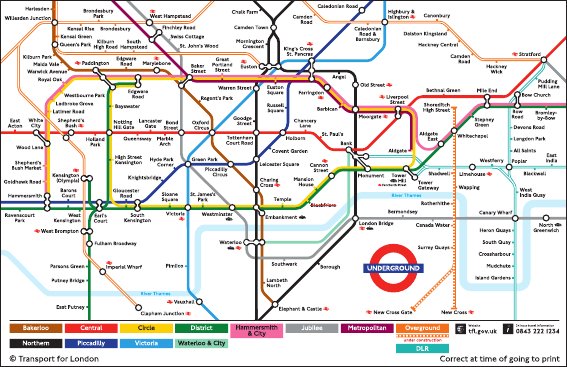
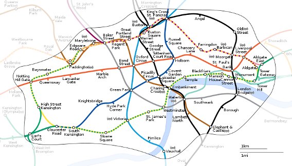
Beck's approach has been much emulated since—so much so that it's rare, these days, to find a metropolitan transit map that doesn't take some liberties with geography. But there's one major downside of Beck's map, especially considering that it's a primary means of understanding the city for locals and tourists alike: The tube diagram gives users mistaken impressions about distance—in particular, locations that are in fact quite close together can appear far apart.
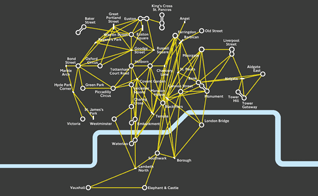
As a result, people often overestimate the difficulty of walking to nearby locations, taking the familiar tube instead. In recent years, as the tube has become more congested, that's become a problem. The tube in central London often operates at maximum capacity. At rush hour, the Oxford Circus station—located in a busy shopping district—can get so crowded it will close its doors, waiting to clear passengers from the station before it lets new ones in. As a result, the mayor's office and Transport for London (the agency that runs the Underground) have been looking for ways to encourage walking in the city. They see Legible London as a step in that direction.
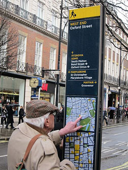
Legible London hopes to reduce tube congestion by showing Londoners how disparate pockets of the city link up. Step one is to produce a geographically accurate map of London that's designed for pedestrian use and includes key landmarks—major stores, architectural oddities, even details like the style of pavement—that will help walkers find their way. Step two is to make that map available to as many people as possible, by posting it on street signs, tube stations, and bus shelters, and by making copies available to locals and tourists in shops and hotels. The project has been developed by AIG Group, a design firm based in London. A prototype was rolled out in London's Mayfair neighborhood in 2007, and in 2009, the city opted to launch pilots in several other areas: Covent Garden and Bloomsbury, South Bank and Bankside, and Richmond and Twickenham.
Legible London is an unusually narrow project in its focus on pedestrians. Most American urban wayfinding systems, like the ones in Philadelphia and Charlotte, N.C., are designed for drivers and pedestrians, linking highway signage to major city streets to parking options to pedestrian pathways. Legible London's brief is simply to get people to walk more. Still, the London project offers an interesting window onto how urban sign systems have evolved over the past few decades.
One crucial component is the map. Traditionally, maps on these sorts of signs offered a bird's-eye view of the area in question, and were oriented with north at the top. Over the years, though, designers have learned that people tend to do better with maps that detail what the facades of buildings look like—a helpful feature for users who have trouble extrapolating from a 2-D map to the 3-D world around them. Legible London's maps put this principle into practice, featuring axonometric renderings of key landmarks.
Tim Fendley, the AIG designer heading up the Legible London project, says his firm's aim is "to help people insert themselves into the map." AIG tested several orientations during the development period, and users consistently preferred a "heads-up" orientation that puts whatever the user is facing at the top. While there were a few complaints from military men who objected to the deviation from the north-at-the-top standard, Fendley says, "We kind of figured they didn't need the help."
Another hallmark of modern wayfinding design is an evidence-based approach. Fendley's team stood on street corners in Mayfair every Friday morning for a period of months, often holding up enormous prototype maps and observing user response. These tests helped determine, for example, that the signs needed an index. Although architects had suggested doing away with the index for the sake of clean design, Fendley's team found that this frustrated users: "We took [one] out there, and three people came up and looked at it and said 'Where's Swallow Passage?' And I knew it was there; I knew the map by heart. And I was thinking, It's there! It's there! But they were like, 'Oh, rubbish!' And off they went. And I thought, 'Damn. We're going to need an index.' "
Another item that tested poorly was the original "You Are Here" icon. But AIG found that another element on its map—the target circles it used to show which destinations are within a 5-minute walk, and which are within a 15-minute walk—helped snap the user's attention to the center of the map. Initially, the circle was "a lot weaker," Fendley says, but after positive user response, "we turned the volume up."
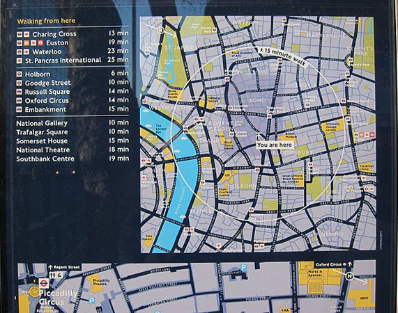
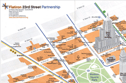
AIG also had to make hard choices in deciding which shops and landmarks would make its maps. Because wayfinding systems are often commissioned or supported by business improvement districts—groups of retailers and restaurants who band together to improve services (and, the thinking goes, foot traffic) in their areas—designers often face great pressure to put every single retailer on the map. (Indeed, the New West End Company, a business representative group in London, helped support the Legible London prototype.) A map that's overwhelmed with details, though, becomes an unusable mess. And so wayfinding designers typically devise some empirical standard to weed out the big fish from the small fry. When Philadelphia installed its signage system nearly 20 years ago, designers based their decisions on how many visitors each institution received. For Legible London, Fendley and his team devised a points system that took into account, among other things, how well-known a destination was and the length of its lease. (To see how essential such a policy is, compare the clarity of the Legible London map to this remarkably bad map of New York City's Flatiron district, put together by the Flatiron 23rd Street Partnership.)
The Legible London crew also had to figure out where its signs should be placed. It's a bit simpler to map out the key decision points in a transportation environment—when the corridors split, you want signs telling people which way to go. In the real world, nearly every point is a decision point, so traffic flow is more complicated; as a result, it's crucial to put signs where people will use them, and where they won't be in the way. AIG surveyed foot traffic, mapping out major walking routes so that Legible London's signs could be sited for maximum usability, making sure sightlines were good, and situating signs on both sides of larger streets so pedestrians wouldn't have to cross for directional counsel. The signs' bright-yellow tops are designed to attract the eye from down the street.
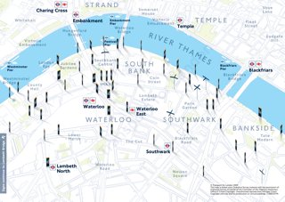
Fendley's ultimate goal is not to put up a system of signs. Rather, it's to develop a comprehensive map for London, one that's available in tube stations, bus shelters, hotel lobbies and—eventually—on the Web and on mobile phones. Before Legible London can go that far, the city needs to scare up more money. That's where a project as complicated as this one can run into trouble.
Cities that install wayfinding sign systems find that the benefits are tangible: They see increases in tourism, commerce, and foot traffic to local institutions. In the case of Legible London, the city tossed two similar groups of 50 pedestrians into the Mayfair district before and after the signs went in, asking each focus group participant to find two destinations. On average, the walkers reached their locales 16 percent more quickly once the wayfinding system was in place. The new pilot programs are a vote of confidence from the city. But the original dream, when this scheme was first discussed, was to have signs in place citywide before London is beset by tourists during the 2012 Olympics. With the city facing budget shortages and a time crunch, that goal will be extremely tough to meet.
More from this series: Why signs are better now than they've ever been; why the signs in Penn Station are so confusing; the international war over the exit sign; how GPS could kill the sign. Plus: Send Slate your hand-drawn maps. See more road signs in this Magnum Photos gallery.
