World on the Move
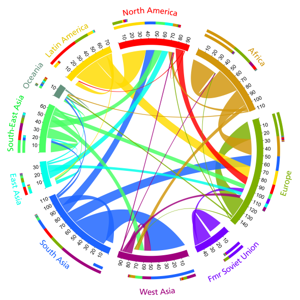
Vienna-based statistician Guy Abel and geographer Nikola Sander created the very cool interactive chart above (via Tom Murphy) that documents migration flows among regions of the world for four five-year periods between 1990 and 2010. Data from 196 countries was included, but only flows of over 50,000 people are shown.
The interactive accompanies a new article in Science summarizing their findings. Overall, they estimate that “the largest movements to occur between South and West Asia, from Latin to North America, and within Africa.”
There are a lot of big stories happening on the chart. There’s the movement of South Asians for work in the Middle East—a trend that was basically nonexistent until around 2000. There's the large and often deadly migration of Africans to Europe. The enormous internal migration within Africa from 1990 to 1995. There's significant migration from basically every region to North America but—despite its booming economies—oddly little to East Asia.
I was surprised at the high level of migration from Latin America to Europe during the 2005–2010 period, but there’s reason to believe this trend may actually be reversing in the wake of the financial crisis. The Europe slice, in particular, may look quite different in the 2010–2015 version of this chart.
Here is a static version of the chart with tick marks representing hundreds of thousands of people:

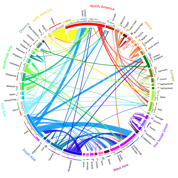
And here is a version of the chart broken out into individual countries:


