A Visual Guide to Digital Badges
-

From the earliest set of Foursquare badges, “Local” leans on a familiar signifier of geographic pride. The “digital candy” color palette is already in effect.
Related article: "Badges? We Got Badges. We Love Badges! We Want More Badges!"
-
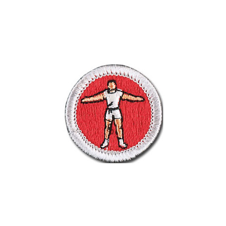
Clearly the Foursquare badge system references, and borrows from, the traditional Boy Scout merit badge (like this one for physical fitness) both in design (the circular border) and concept.
-
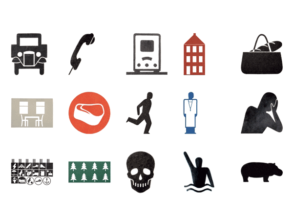
A few of Gerd Arntz’s many pictograms, meant to capture an idea at a glance, for the “visual statistics” language of the Isotype—or “International System Of TYpographic Picture Education.”
-

“Crunked,” a Foursquare badge that’s “earned” by checking in at lots of bars in one night, tweaks icon-language as much as it borrows from it.
-
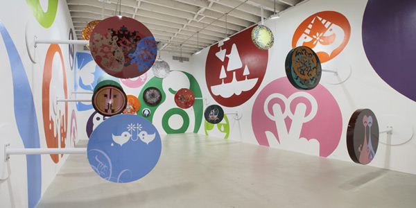
Foursquare designer Mari Sheibley cites Ryan McGinness as an influence: He has appropriated iconography to address a variety of subjects, as in Installationview, from 2005.
-
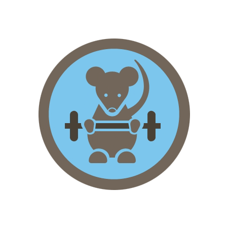
Over time Foursquare has branched into more overtly merit-badge-like behaviors, such as checking in regularly at the gym. But it has stuck with minimalism—three colors at most. Less is more.
-
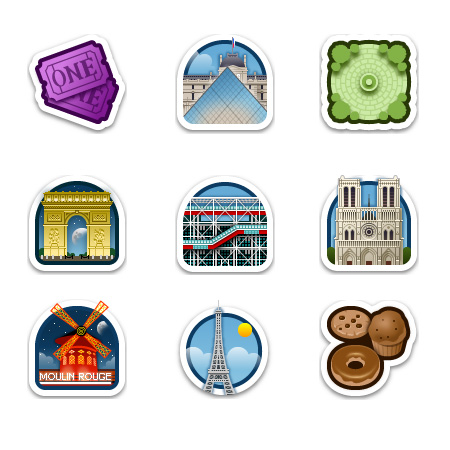
Foursquare has no monopoly on digital symbols as gamelike rewards: Travel-oriented app Gowalla’s system of “pins,” earned by visiting landmarks, restaurants, and other notable places, has its own following—and a very different visual style.
-
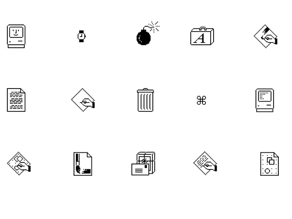
“Good icons should be more like road signs than illustrations,” according to Susan Kare, whose many creations include these early Macintosh interface graphics. These are arguably as much a visual signifier of Mac-ness as the Apple logo. Foursquare’s badge system may play a similar role for the geolocation social networking service.
-

The “Hangover” badge—earned by checking in late at a bar and early at work—is notable for its resemblance to the (presumable) self-portrait-as-icon figure on designer Sheibley’s site.
Related article: "Badges? We Got Badges. We Love Badges! We Want More Badges!"