Michael Bierut is one of the world’s leading graphic designers, a protégé of design legend Massimo Vignelli and partner in the New York office of the international design firm Pentagram since 1990 who has done design work for clients including the New York Times, Saks Fifth Avenue, and the New York Jets. Opening Tuesday is the first comprehensive retrospective of the designer’s work at SVA’s Chelsea Gallery in New York City, and Bierut’s first monograph, How To, will be out next month.
In the book’s introduction Bierut traces his life as a designer back to childhood before synthesizing the highlights of his design work through a series of image-heavy, text-light “how to” mini chapters that illuminate the lessons of each project and offer insights into the creative process of one of the most accomplished graphic designers working today. Here at the Eye, Bierut shares an excerpt titled “How to Avoid the Obvious,” in which he offers a glimpse into the process behind designing signage and graphics for the Minnesota Children’s Museum.
Courtesy of Michael Bierut/Pentagram
Graphic designers have a love/hate relationship with clichés (“love/hate relationship” being itself a cliché). In design school, we’re taught that the goal of design is to create something new. But not entirely new. A jar of spaghetti sauce should stand out from its competitors. But if it looks too different, say, like a can of motor oil, it will disorient shoppers and scare them away. Every graphic design solution, then, must navigate between comfort and cliché. Pentagram founder Alan Fletcher admired this “ability to stroke a cliché until it purrs like a metaphor.”
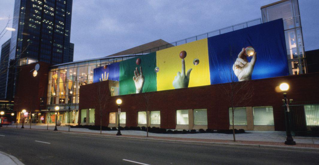
In 1995, the Minnesota Children’s Museum was moving from a cramped but cozy space in a shopping mall to a beautiful new building in downtown St. Paul designed by up-and-coming architects Julie Snow and Vincent James. We were asked to do the signage and graphics. Inevitably, the clichés poured out. Crayon markings. Bright primary colors. Building blocks, balloons, smiley faces.
Courtesy of Michael Bierut/Pentagram
In design, as in life, the antidote to stereotype is experience. Forget about the abstract idea of “children’s museums.” What makes this particular children’s museum special? Ann Bitter, the museum’s dynamic director, described her ambitions and confessed her fears. The new building was beautiful, she said, but she worried about losing the intimacy that visitors were accustomed to in the museum’s old home. Like most children’s museums, this one provided “hands-on experiences” (another cliché). Would kids feel as comfortable amid the big, beautiful, brand-new architecture?
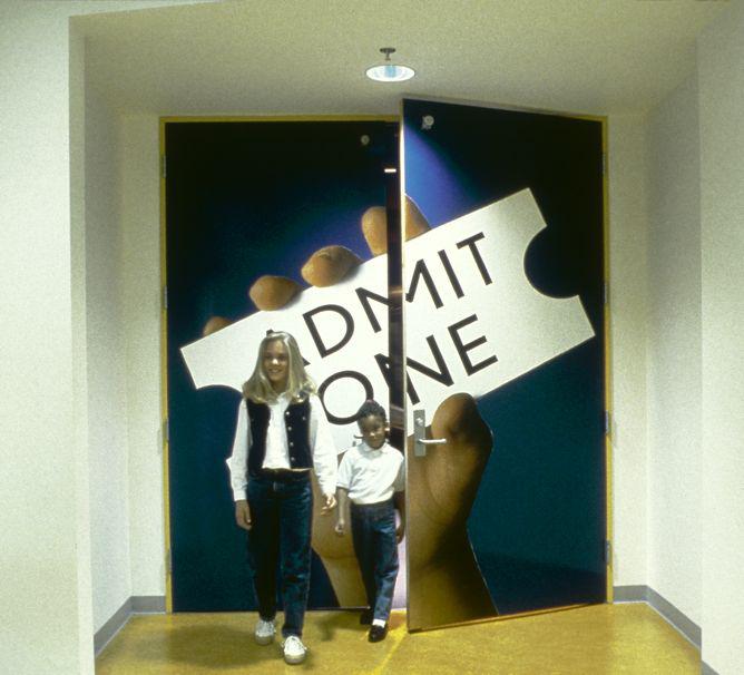
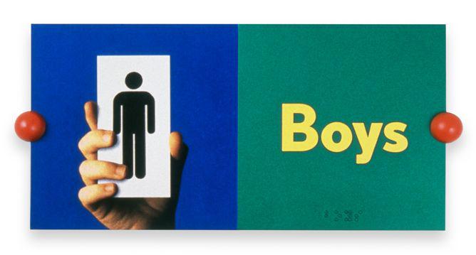
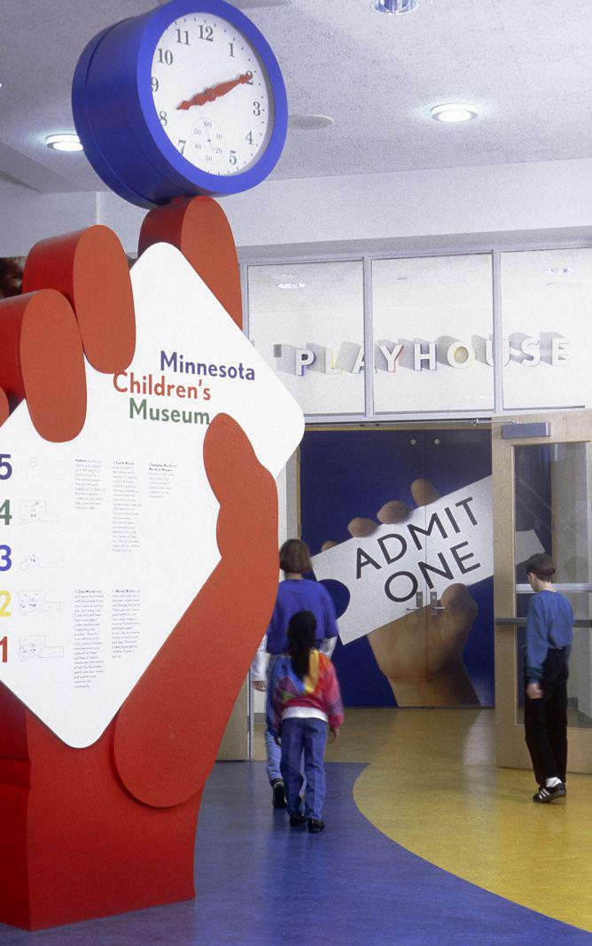
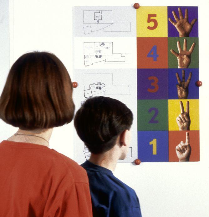
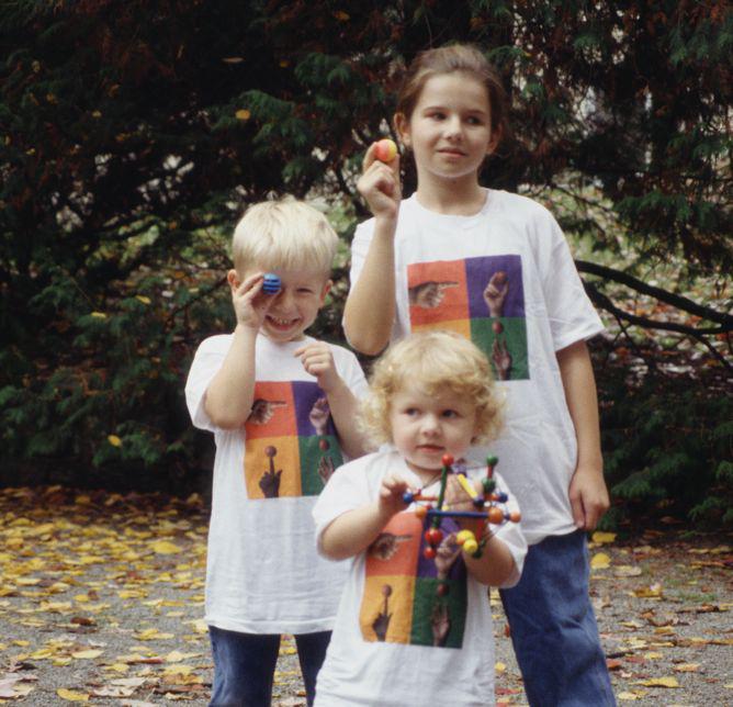
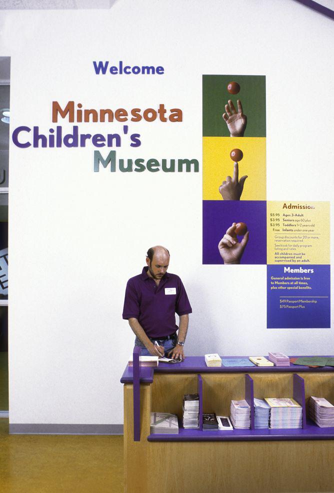
Sometimes avoiding the obvious means embracing it—and wrestling it to the ground. Children’s hands, with their invitation to touch and their inherent sense of scale, provided the key. Instead of trying to draw them (silhouettes? crayon scribbles?) we recruited local kids to serve as hand models and photographed them pointing, counting, playing. Today, at the Minnesota Children’s Museum, these hands—of children that are now in their 20s—continue to point the way, and pick out that delicate path between what’s expected and what surprises.
Courtesy of Michael Bierut/Pentagram
Courtesy of Michael Bierut/Pentagram
Courtesy of Michael Bierut/Pentagram
Courtesy of Michael Bierut/Pentagram
Excerpted from How to Use Graphic Design to Sell Things, Explain Things, Make Things Look Better, Make People Laugh, Make People Cry, and (Every Once in a While) Change the World by Michael Bierut with permission from Harper Design, an imprint of HarperCollins Publishers.
