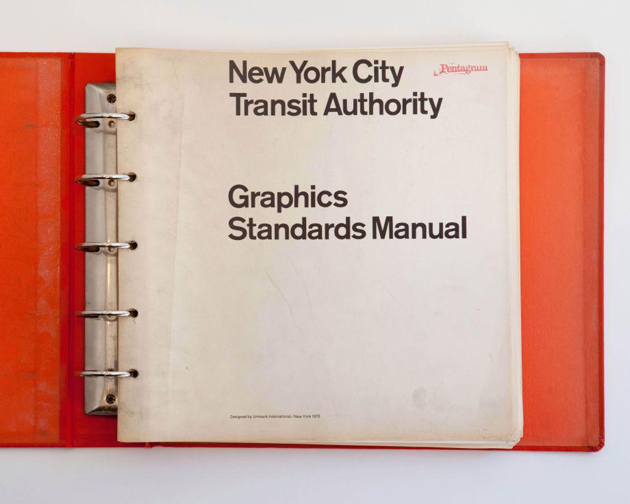
The New York City subway was a confusing mess in the 1960s, with inconsistent, haphazard signage that made navigating the system a nightmare for commuters. In 1967, the New York City Transit Authority decided to do something about it. They hired Massimo Vignelli and Bob Noorda of the design firm Unimark International to design an improved signage and wayfinding system. The designers spent four years studying the labyrinth of the subway, analyzing the habits of commuters, and devising the iconic visual identity of the NYC subway that is still in use today, documented in the 1970 New York City Transit Authority Graphic Standards Manual.
In 2012, designers Jesse Reed and Hamish Smyth of New York City design firm Pentagram discovered a rare copy of the manual in their office’s basement. They created a website that included scans of the manual to serve as a digital archive of the work that they call “one of the world’s classic examples of modern design” and shared it with friends. Within 72 hours, more than a quarter-million people had browsed the images, and they decided to approach the MTA about republishing the manual in all its full-size, printed glory.
Courtesy of Jesse Reed and Hamish Smyth
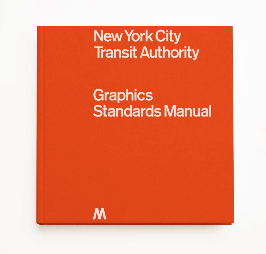
The MTA granted permission to reissue the manual as a hardcover book, on the condition that it only be made available during the length of a 30-day Kickstarter campaign to assure that the book will become and remain a collectible.
Reed told me in an email that he and Smyth are “completely shocked” by the reaction to the project, which has already received more than $500,000 in crowdfunding—more than five times its funding goal—in less than a week. “Our intentions were to maybe sell 500 books, 1,000 if we were really lucky,” he said, “but these numbers were only in our wildest dreams. That said, we’re excited that so many people will be able to buy a copy while we have the opportunity to print it.”
Courtesy of Jesse Reed and Hamish Smyth
The manual will be printed using high-quality scans of the ring-binder original. Although the reprint will have a sewn binding, it will remain faithful to its single-sided page format. It will include an introduction by Vignelli’s protégé and Pentagram partner, Michael Bierut, and an essay from New York magazine’s Christopher Bonanos.
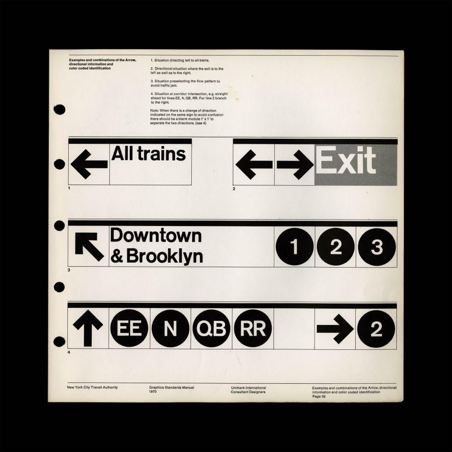
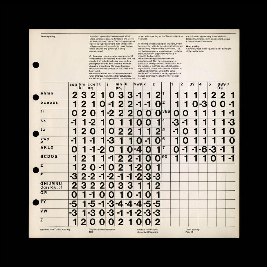
Reed emphasized that the manual is meant to be read as much as seen. He pointed to a passage on letter spacing that demonstrates how Vignelli and Noorda expected serious attention to every detail: “A modular system has been devised, which offers consistent spacing for letters and words for the three sizes of type. This unit system must be scrupulously adhered to at all times as this will preclude any inconsistency, regardless of where or when any given sign is being manufactured.”
Reed pointed out that “the vernacular that’s written into the guidelines is different than the subway language itself, but there’s harmony between the two. Unimark had clear and intentional conclusions about directional instructions for the passenger, and in order for that language to work, the guidelines had to be written with confidence, clarity, and conviction.”
Courtesy of Jesse Reed and Hamish Smyth
Courtesy of Jesse Reed and Hamish Smyth
Courtesy of Jesse Reed and Hamish Smyth
Did reading the manual change the way riders experience the NYC subway or cause them to have epiphanies about elements of the design that they may have overlooked?
“Absolutely,” Reed said. “I think we both agree that every time we transfer from one train to another, we’re more conscious of how these decisions needed to be observed, defined, and successfully implemented. These guys literally spent months analyzing the traffic and behaviors of subway riders. Legend has it that Noorda spent weeks underground stalking riders to study their movements.”
As for the design itself, he added, “there are moments of beauty in the most minute details. For example, the four-degree reduction on the diagonal bar of the arrow, which allows for visual accuracy, rather than mechanical calculation.”
In a press release about the project, Bonanos of New York magazine said: “The Standards Manual looks like arcana, and in many ways it is. But it is also an artifact from a really important moment in the history of New York: the point when the city began to realize it couldn’t just take the subway system for granted and focus all its attention on highways and car culture. The enlightenment didn’t come right away—in the 1970s, many things about the subway got worse before they got better—and signs were a small part of that rebirth, but they were a highly visible one.”
For more information about the Kickstarter project, which runs until Oct. 10, check out this video narrated by Bierut:
*Correction, Sept. 15, 2014: This post originally misstated the size of the reprinted New York City Transit Authority Graphic Standards Manual. It will be 13.5 inches by 13.5 inches, not 14.25 inches by 13.5 inches.