The 1969 moon landing was a heady moment in American history. But the romance of putting men in space began to wane after NASA’s Apollo program ended in 1972, until the agency looked to design to help keep the NASA mystique alive.
Nixon had been pushing U.S. government departments to raise the standard of design and communications with the National Endowment for the Arts Federal Graphics Improvement Program, and NASA’s fragmented, old-fashioned visual identity was an early target. The agency approached a young, small New York City–based firm run by Richard Danne and Bruce Blackburn to present a proposal for a brand-new visual identity for NASA, and in 1974, their work—the NASA Graphics Standards Manual, with instructions on designing everything from letterheads to space shuttles—was approved.
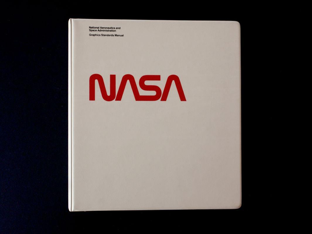
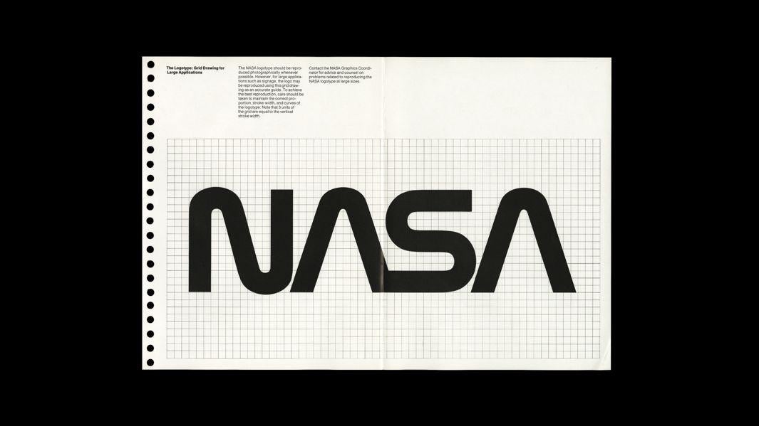
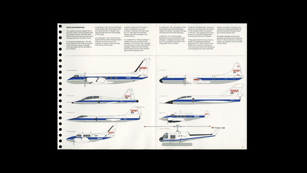
Photo by Michael Gericke. Courtesy of Danne & Blackburn.
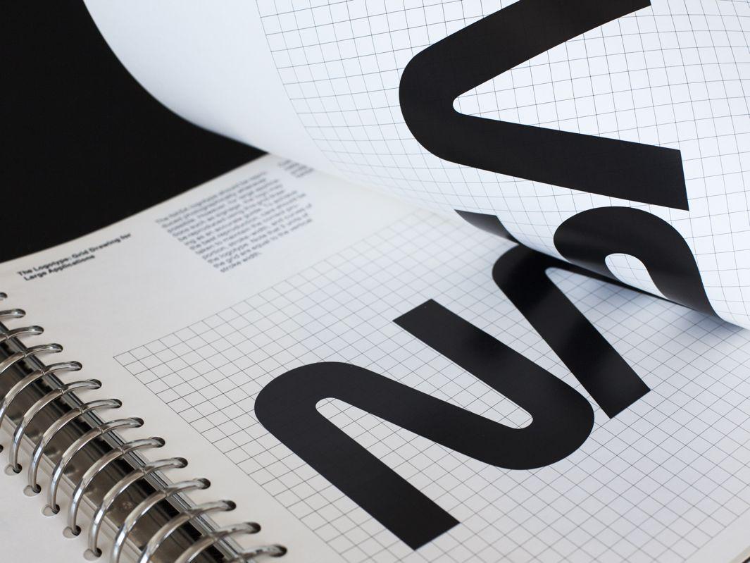
Photo by Michael Gericke. Courtesy of Danne & Blackburn.
The signature of NASA’s visual identity was the memorable logo known as “the worm,” which was jettisoned in 1992 and replaced with NASA’s original logo, known as “the meatball.”
Now, 23 years after its dethroning and 41 years after it was designed, the worm and the ring-binder manual that was built around it are being reborn as a hardcover book by designers Jesse Reed and Hamish Smyth from Pentagram. In the past few years, the designers have developed a knack for quirky Kickstarter-funded side projects that tap into a collective nostalgia for preserving the graphic identities of iconic slices of Americana—like their reissue of the 1970 New York City Transit Authority Graphic Standards Manual designed by Massimo Vignelli and Bob Noorda as a limited-edition book, or Smyth’s poster of all 468 of NYC’s subway signs.
On Tuesday, the pair launched a new Kickstarter campaign to reprint NASA’s 1975 Graphics Standards Manual. And if you are thinking that $79 is a lot of money for an obsolete manual, take note that design and space nerds have already pledged more than $384,000 to get their hands on one. Update, Sept. 11, 2015: On Thursday NASA released the original PDF of the manual. Download it free here.
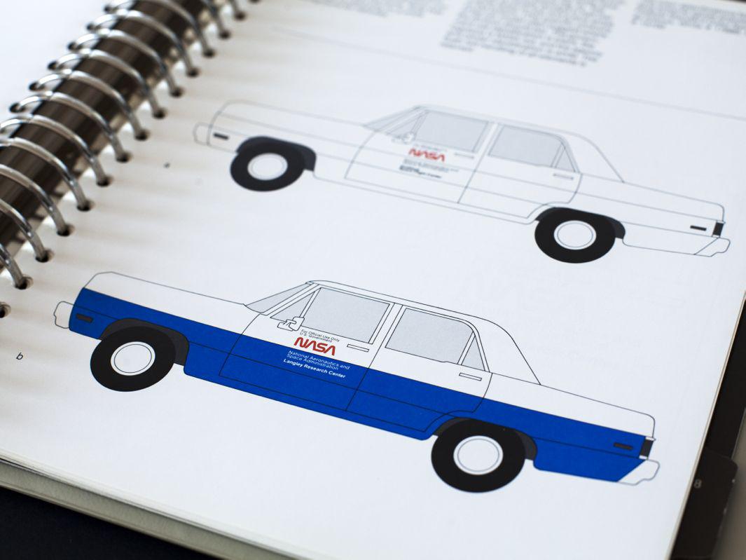
Photo by Michael Gericke. Courtesy of Danne & Blackburn.
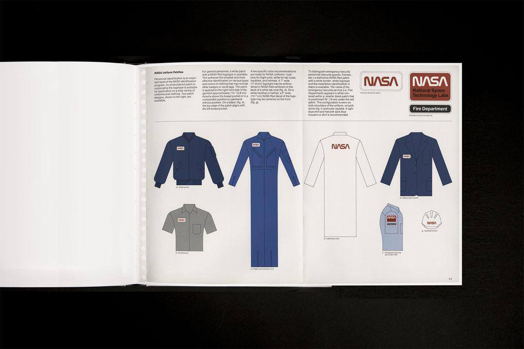
Courtesy of Danne & Blackburn
The reissue will be printed from scans of Danne’s personal copy (he will also write a forward to the manual). The designers point out that the reissue of the manual, which the New York Times notes is in the public domain, “is not sponsored or endorsed by NASA and is an independent project undertaken in an effort to preserve and disseminate an archival record of graphic design from the era.”
Reed told me in an email that the NASA manual was on his and Smyth’s “wish list” of next projects, and it has roots in a mutual childhood dream. “Hamish and I have been aware of this program since we were kids,” he said. “Growing up with the ‘worm’ logo on toy shuttles and learning about sky lab when we were younger. Fast forward to design school, the NASA manual was embedded in our foundation of superior design thinking—it represented the kind of work we wanted to do as professionals.”
Courtesy of Jesse Reed
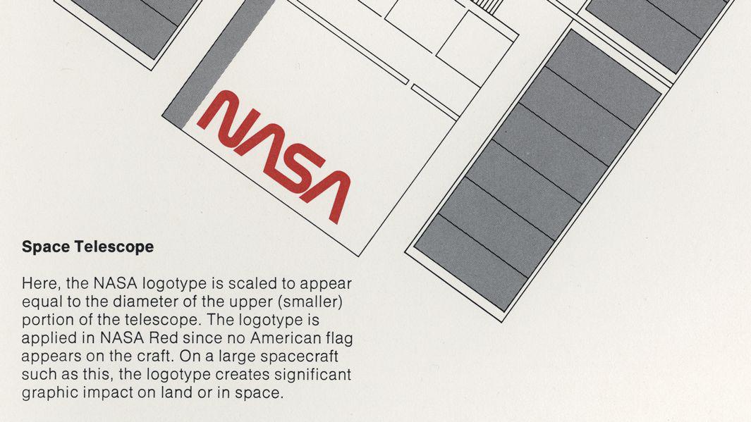
Courtesy of Danne & Blackburn
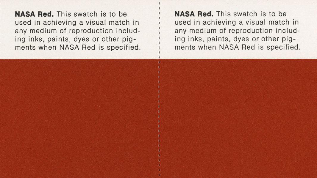
Courtesy of Danne & Blackburn
But why did they decide to reissue the NASA relic, for all intents and purposes lost in space?
“As design nerds, we think the Worm is almost perfect, and the system behind it is a wonderful example of modernist design and thinking,” the designers write. “But for everyone, we think the Worm and its design system represent an agency whose goal is to explore space and push the boundaries of science. Where the Meatball feels cartoon-like and old fashioned; the worm feels sleek, futuristic, forward-thinking.”
What’s more, they write, the manual is a “beautiful example of rational, systematic design,” and “one of those examples that sets the standard for design excellence—a document well worth preserving for the future as a learning tool, a gorgeous object, and a moment in design history.”
To hear more about the project from Danne, check out the video below: