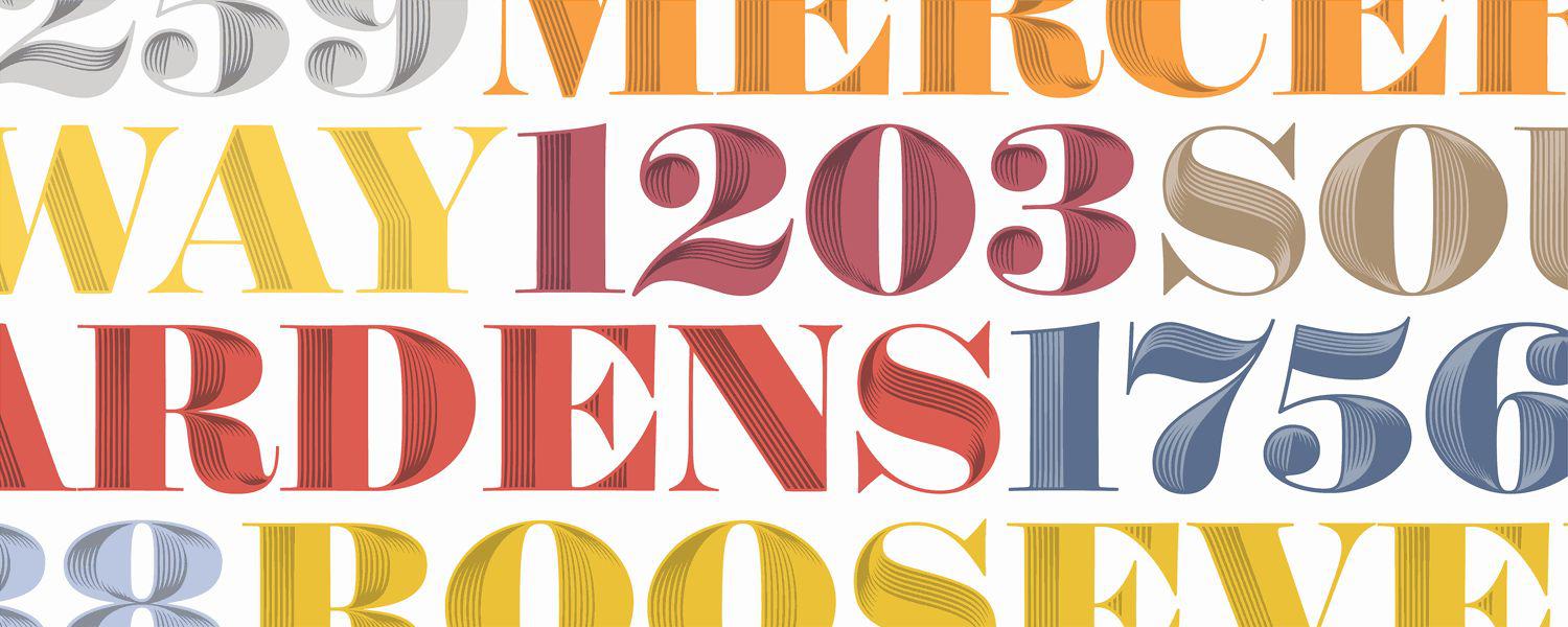
New York City–based Hoefler & Co., headed by award-winning type designer Jonathan Hoefler, has designed typefaces for magazines such as Rolling Stone and Sports Illustrated, and its Hoefler Text family of typefaces has been included in Apple operating systems. Its newest font is Obsidian, a contemporary typeface that mimics the elaborate decorative typography of the Industrial Revolution. Obsidian is derived from Surveyor, a font inspired by type used on engraved maps and charts; Surveyor’s authorship is a matter of personal disagreement between Hoefler and type designer Tobias Frere-Jones, whose much-covered legal dispute was resolved last fall.*
Courtesy of Hoefler & Co.
“We began the Obsidian project with two questions: Can a decorated typeface pay homage to this tradition while being relevant to designers today, and what tools can we create to help us get there?” says Hoefler, who worked with senior typeface designer Andy Clymer on the project. To explore and draft the typeface’s decoration, they developed software to interpret two-dimensional letterforms as three-dimensional objects by applying virtual lighting that varied in position, angle, and intensity.
Courtesy of Hoefler & Co.
When it came to naming the typeface, Hoefler says the designers started by looking to Industrial Age figures like famous British railway engineers and architects who worked in cast iron, but the flinty look of the typeface soon turned their thoughts to geology.
“A long search for names (most of which end up being trademarked already) yielded what should have been obvious going in: Obsidian, a black volcanic glass whose flinty edges even resemble the shapes in the typeface,” Hoefler told me. “That it began with an O made it irresistible: That letter is especially dramatic in the typeface. Type designers like to use a font’s signature characters in the name, wherever possible.”
Below, Hoefler takes us on a brief illustrated tour of the design process for Obsidian.
Courtesy of Hoefler & Co.
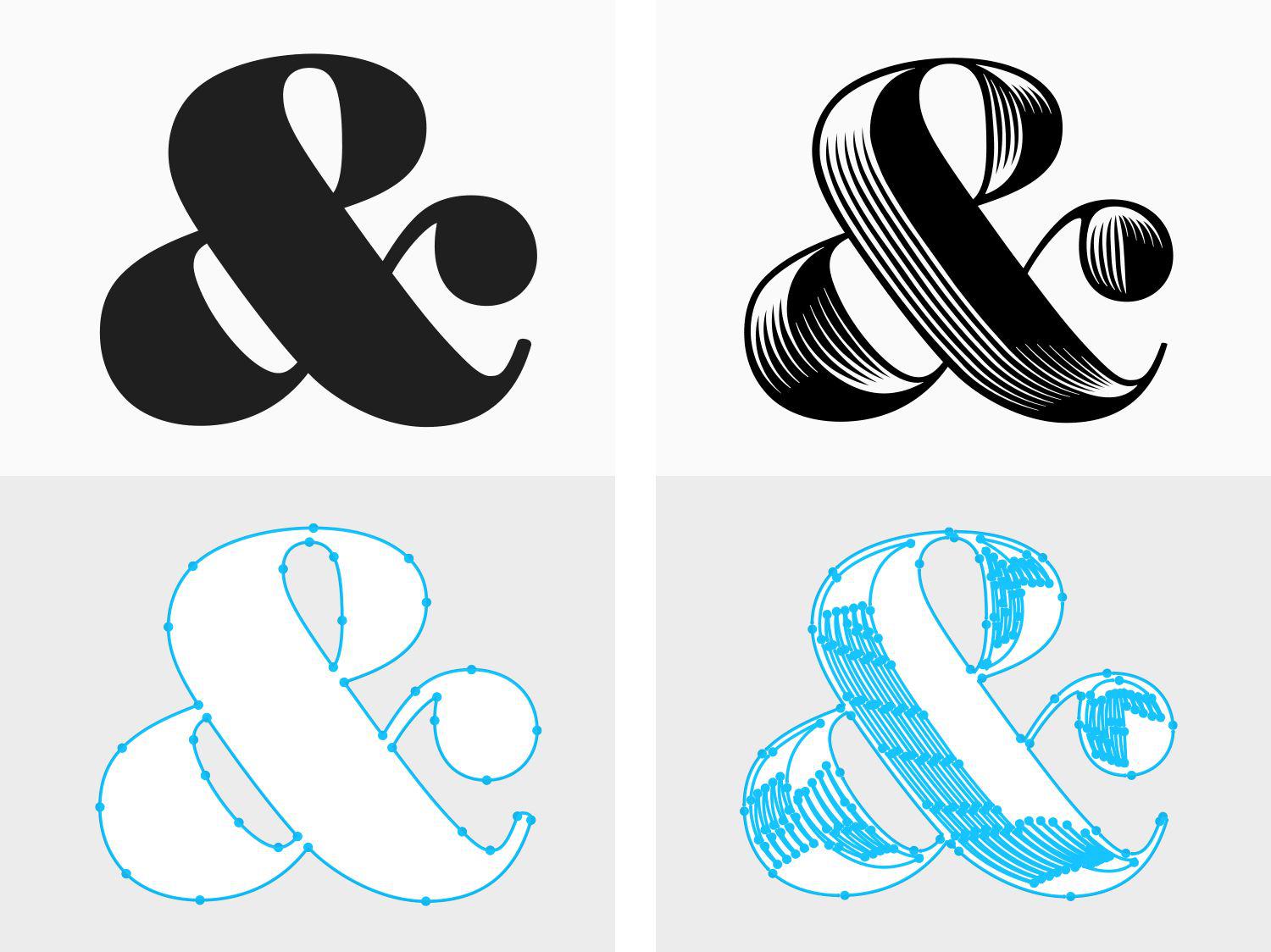
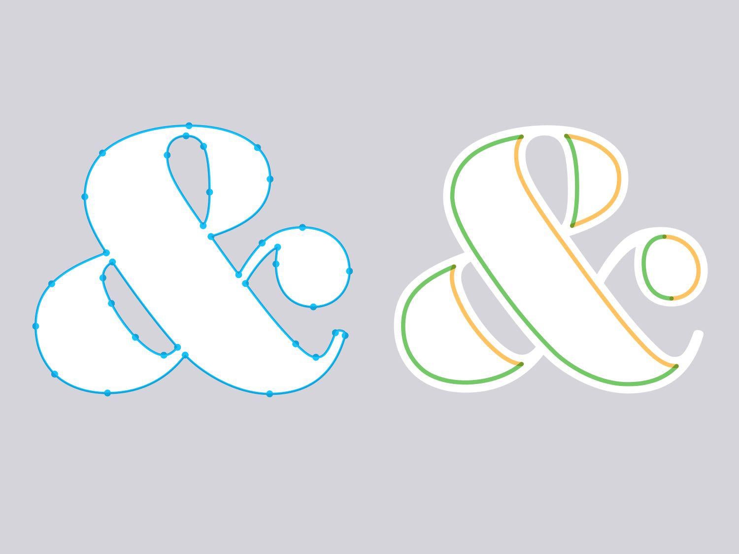
Typeface designers draw fonts by manually plotting every line and curve in every letterform. Even simple shapes require complex geometry: Above, an ampersand has 36 connected curves. Elaborate typefaces like Obsidian are unmanageably tortuous: This ampersand alone would require the designer to draw and coordinate 284 different curves.
Courtesy of Hoefler & Co.
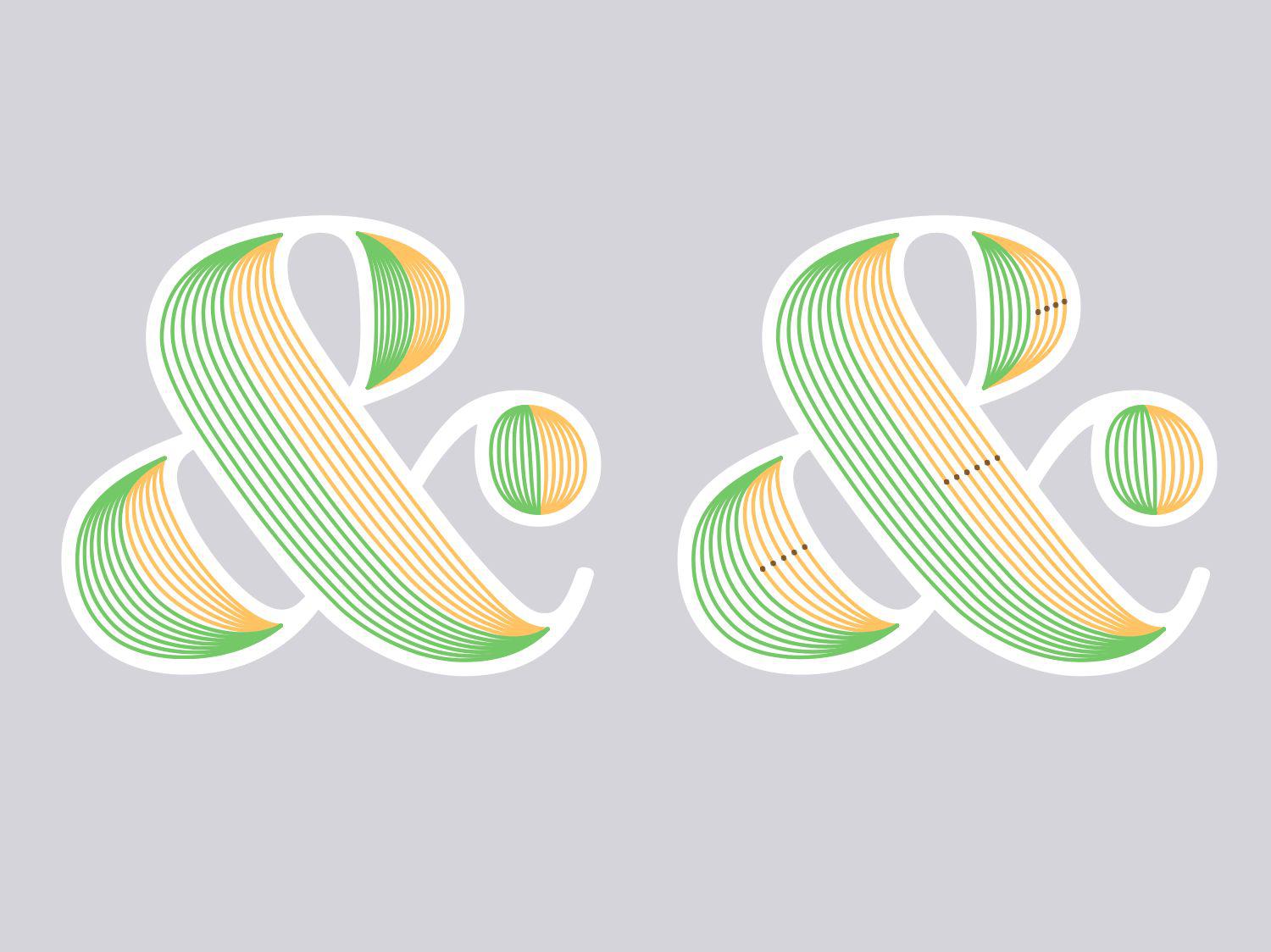
Building on a font whose exterior outlines had been completed, Clymer created a suite of proprietary tools to help apply complex decorations to font outlines. The process begins by dividing each of the more than 1,400 characters in the family into individual “panels” (above), each defined by western and eastern edges, shown here in green and orange.
Courtesy of Hoefler & Co.
Once the panels are established, a script divides each panel into slices, giving the font’s designers their first glimpse of what a “hatched” version of the typeface will look like. The number of slices for each panel can be adjusted independently to give the resulting letterform a more consistent texture: Above, different parts of this ampersand are divided into four, five, or six slices.
Courtesy of Hoefler & Co.
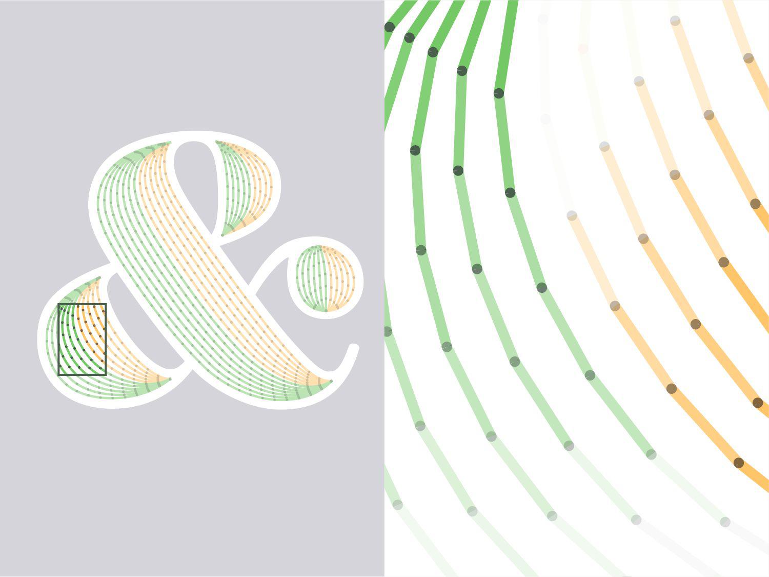
Having chosen the number of slices for each panel, Clymer’s script divides each slice into a series of shorter segments. The angle of each segment is compared with the direction of an imagined light source, to determine how “bright” it should be. Segments on the western and eastern faces are oppositely illuminated to create the illusion of dimensionality.
Courtesy of Hoefler & Co.
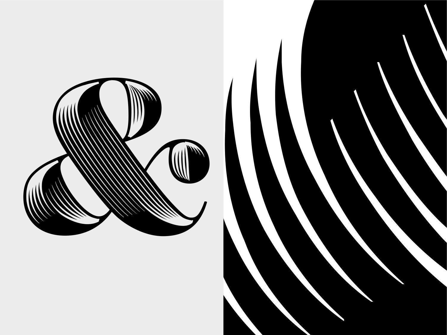
Finally, in its most complicated bit of mathematics, the script interprets the brightness of these connected segments as a set of continuous curves and generates its first draft as a working font. This font is used to create proofs that demonstrate the design in a variety of contexts, which are presented to the project editor for review.
Courtesy of Hoefler & Co.
During a font’s development, some of its biggest steps forward happen during the exchanges between designer and editor. As the company’s editorial director, Hoefler works with designers to refine and articulate a typeface’s goals, identify its most successful features, and improve its appearance. Some of these comments inspired Clymer to add new features to the software itself.
Courtesy of Hoefler & Co.
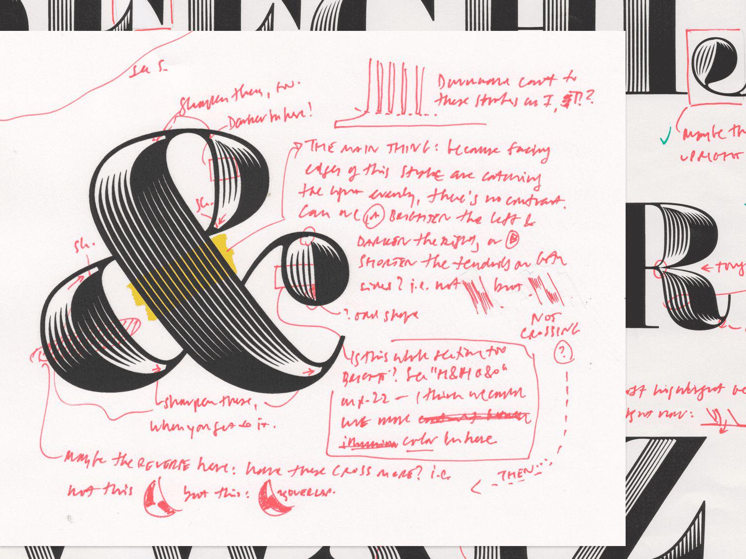
A refined version of Clymer’s software allowed him to individually light different parts of a character to achieve a more consistent overall effect. In panel No. 1 above, a raked light from above gives a “ball terminal” greater clarity. In panel No. 2, rotating the light source provides more balanced illumination to the bowl on the left side. In panel No. 3, side-lighting the main diagonal stroke gives it a defining contrast. The final character in panel No. 4 is a composite of these different highlights.
Courtesy of Hoefler & Co.
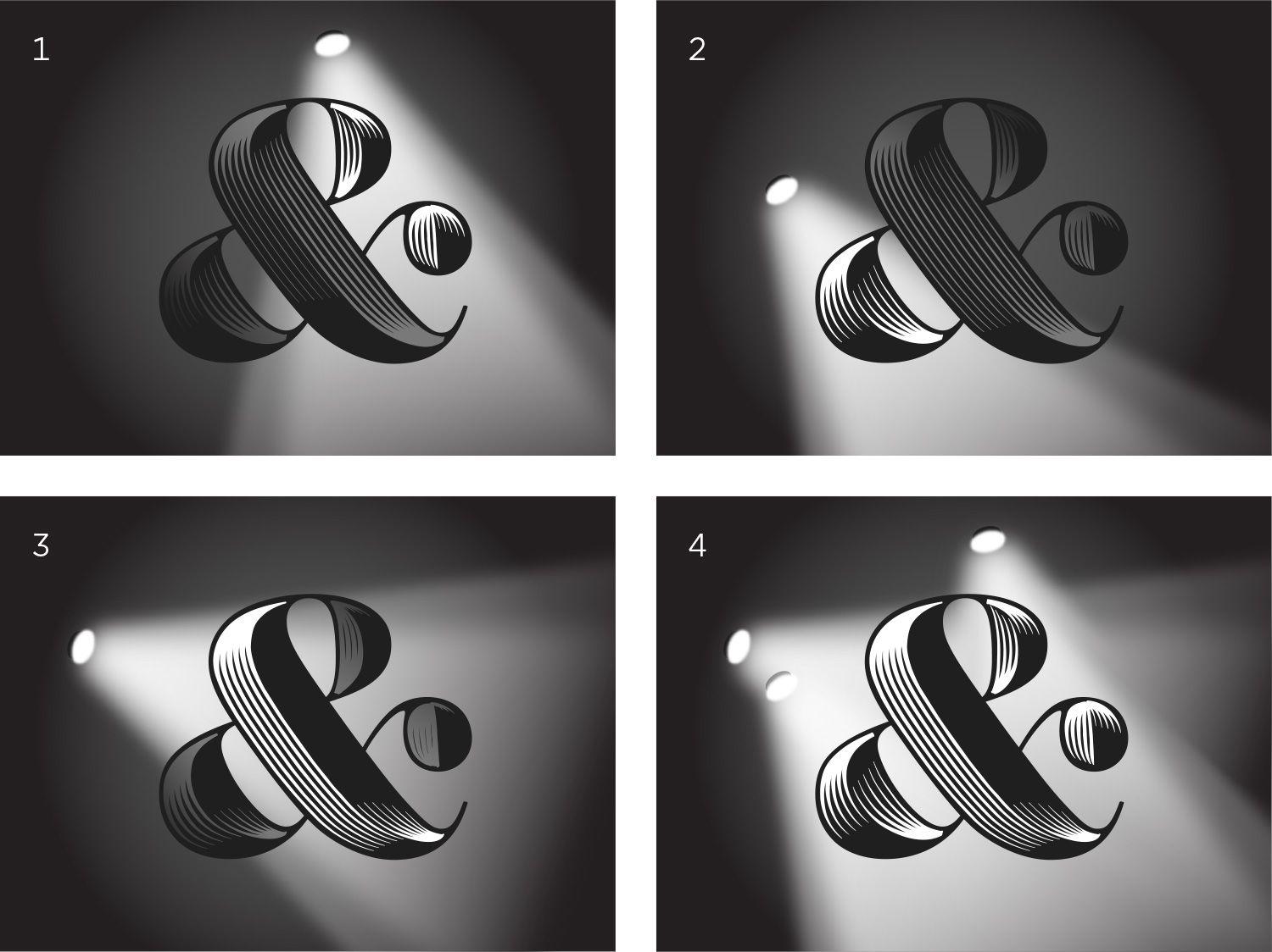
Above left, the first draft of Obsidian’s ampersand, compared with the final version at the right, showing the work of 10 months of revisions. Still another generation of tools made it possible to vary not only the angle of each light source but also its intensity, to help the designers better accentuate those details that best conveyed the illusion of dimensionality. Small details, like the tight interior corners, were refined by hand.
Courtesy of Hoefler & Co.
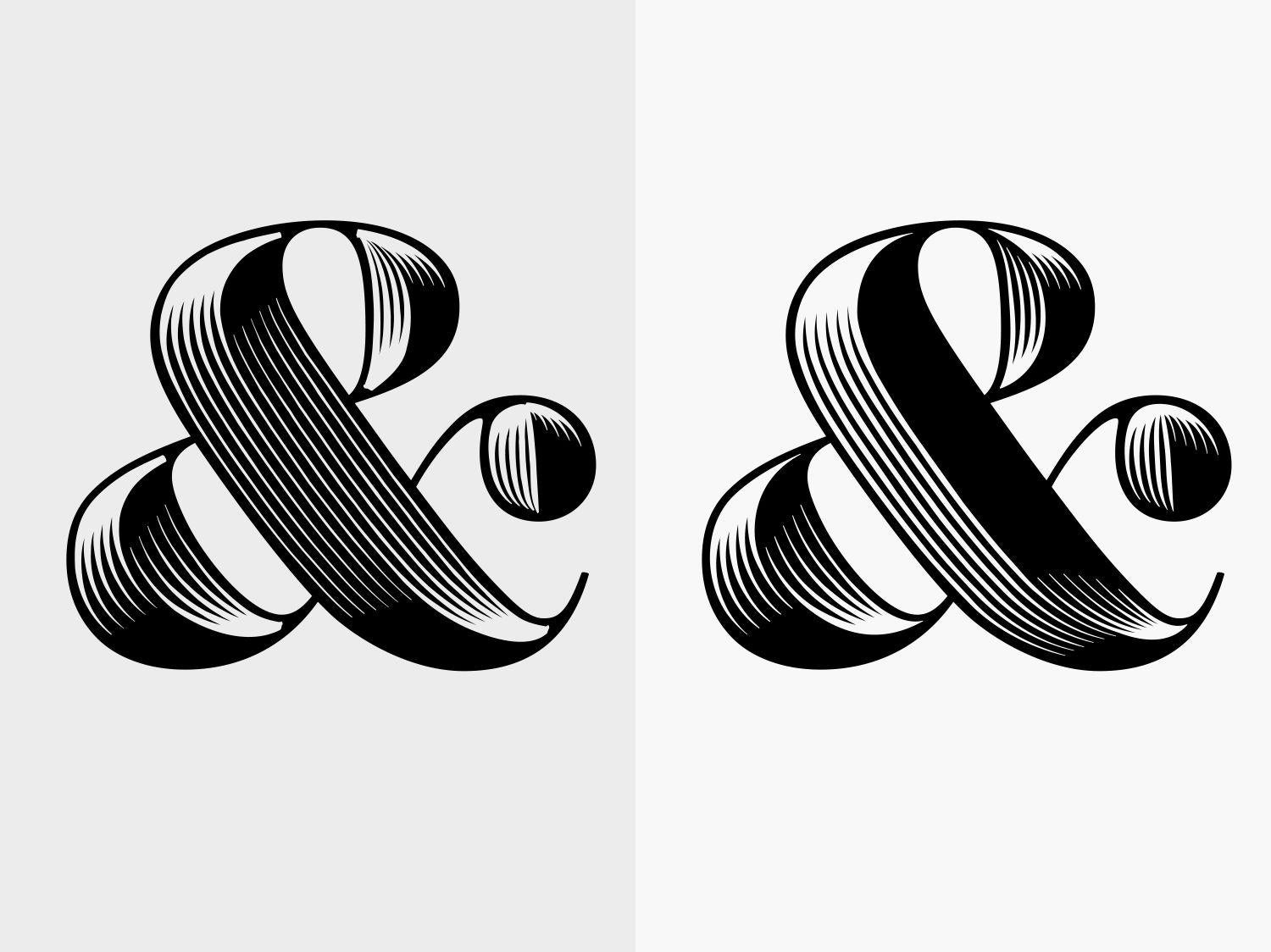
Surprisingly, it was the plainest letters in the alphabet that proved the most difficult to illuminate. At left above, the first draft of the capital D: Its rounded bowl catches the light nicely, but its straight vertical stem has a dull, uniform color. The solution was to alter the code so that highlighted stems become subtly brighter at the top and bottom and subtly thicker as they move from left to right.
Courtesy of Hoefler & Co.
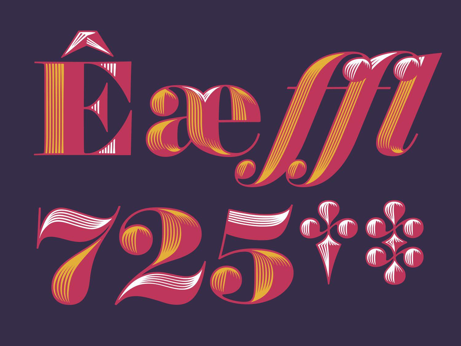
Some characters revealed the need for new approaches. Serifs like those on the capital E couldn’t be extruded into a plausible three-dimensional form, so a new policy was needed to shade shapes like these. Overlaps in joined characters, like the æ diphthong and ffl ligature, presented additional opportunities to heighten the illusion of dimensionality. Some characters were redesigned completely to catch the light in more interesting ways: The flat crossbars on the 7, 2, and 5 were replaced with flowing curves, and the linear dagger and double-dagger were refashioned in a more ornamental style.
Courtesy of Hoefler & Co.
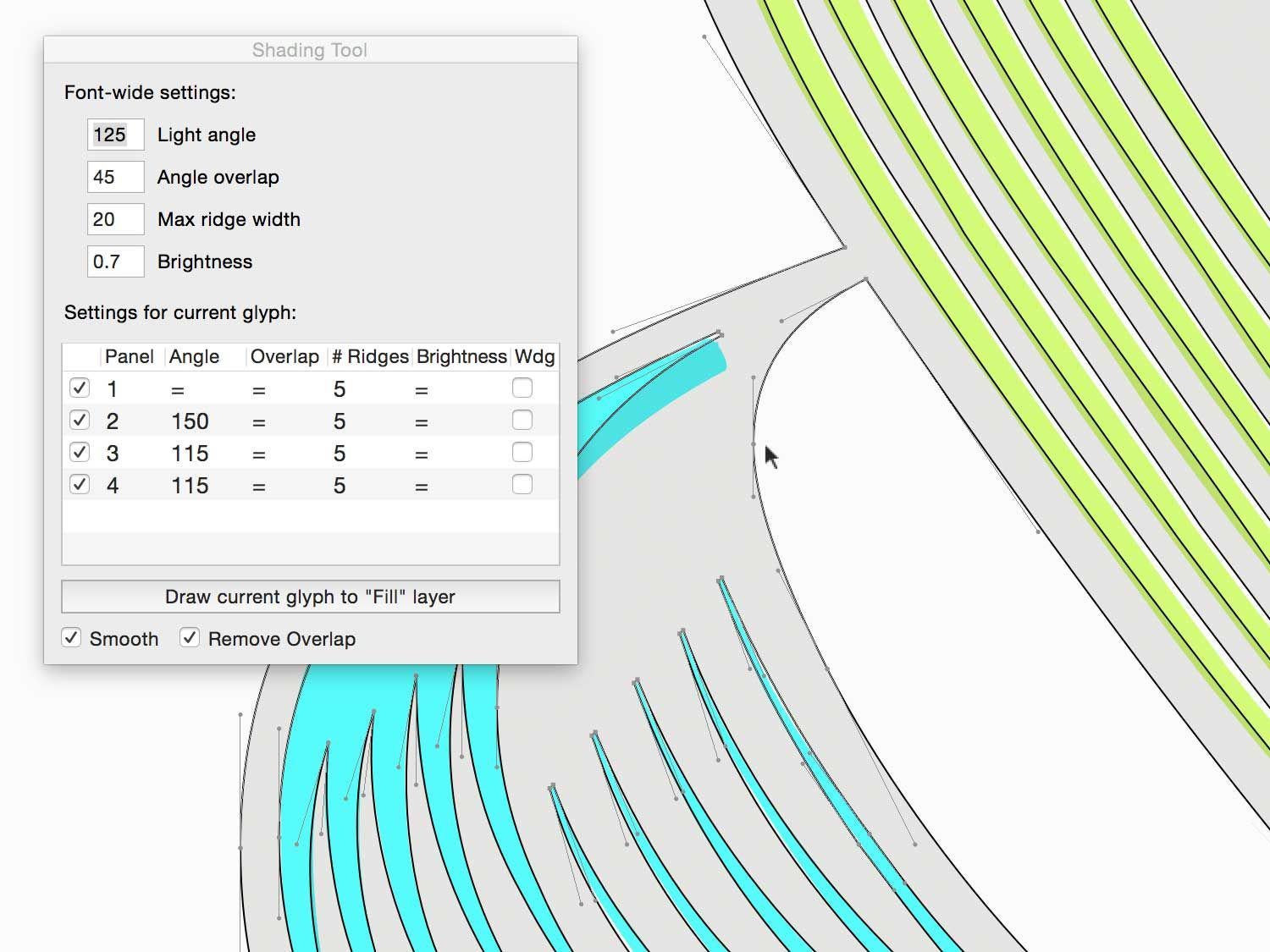
A humble user interface conceals complex inner workings. Clymer’s shading tools were written in Python—long the language of choice for managing font data—and built as an extension for the RoboFont font editor. Intuitive, modular libraries for building interfaces and rendering shapes on screen make RoboFont a wonderful environment for invention. Shown above in color are the software’s best attempts to apply shading, based on the designer’s inputs; the black outlines reflect manual adjustments, introduced to improve the design of the letterform.
Courtesy of Hoefler & Co.
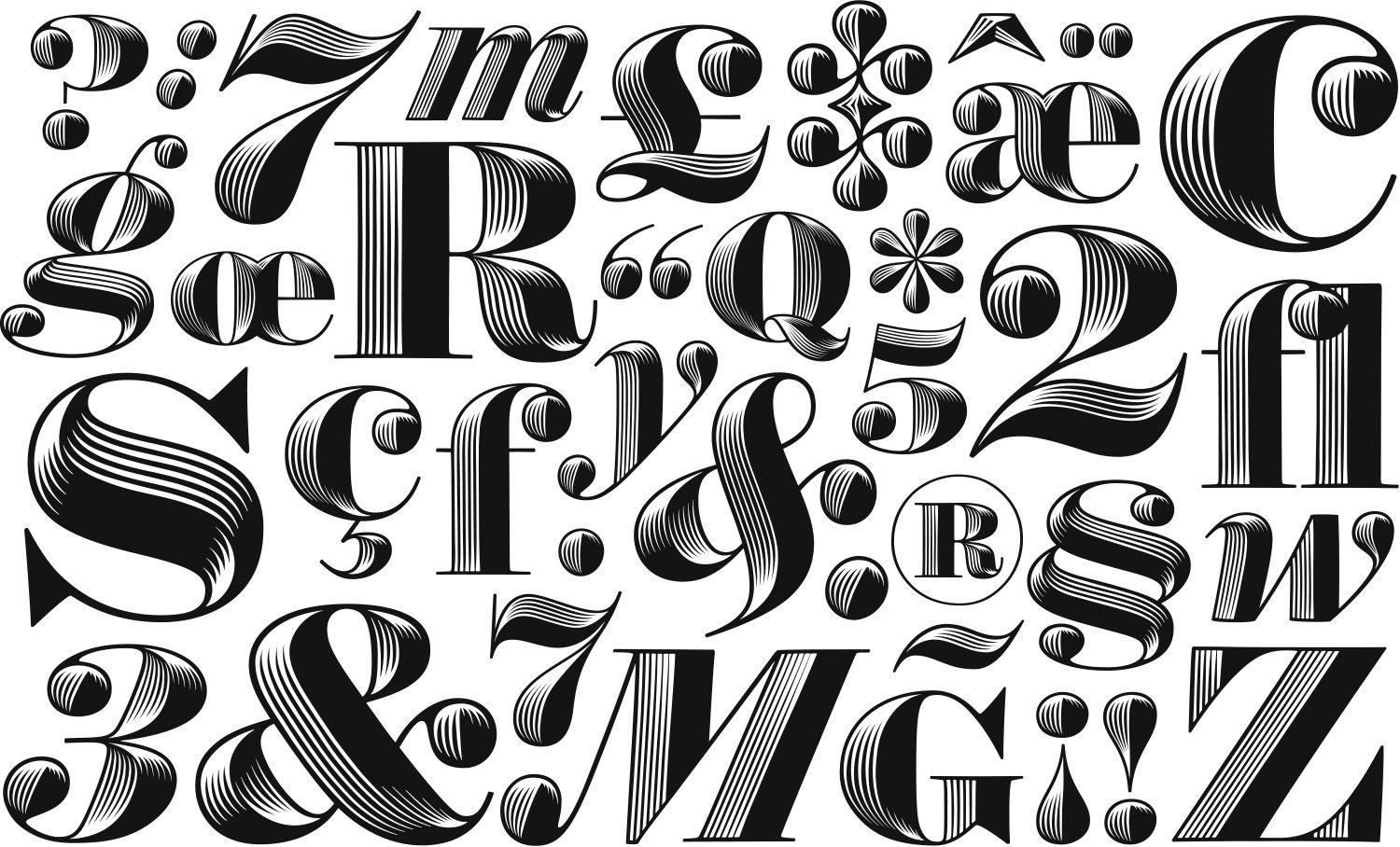
Above, characters from the finished typefaces Obsidian Roman and Obsidian Italic. For decorative typefaces, Obsidian contains an unusually broad range of characters, with roman and italic small capitals, swash caps and swash small caps, and accents for more than 140 languages. Both fonts are also provided in “chromatic layers” so designers can independently control the color of the backgrounds and foregrounds.
*Update, Feb. 5, 2015: This post has been updated to reflect that Jonathan Hoefler has received awards for his typeface design. It has also been updated to note Obsidian’s origins in the Surveyor font. (Return.)