Over the past 25 years, Tobias Frere-Jones has created some of the world’s most widely used typefaces. He has taught at the Yale University School of Art since 1996, gives lectures around the world, and has work in the permanent collections of the Victoria and Albert Museum in London and the Museum of Modern Art in New York. Here at The Eye, Frere-Jones shares a post from his blog about the history of typography names.
Years ago, I asked one of my mentors what he thought was the hardest part of designing a typeface. I was expecting “the cap S” or “the italic lowercase” or something like that. But he answered without hesitation: the name. Finding the name is the hardest part.
Type has a long and rich history, not just in its shapes but also its organization and presentation. Scholars have discussed the marriage of roman and italic, originally independent forms. Others have charted the idea of “bold,” the shift of weight that is a signal all by itself. But the idea of a typeface name has received less attention.
Today, we expect a name to be a unique designation, independent of context, emphasizing personality rather than structure. It wasn’t always this way, so I went digging to find the beginning of this concept. As with most of type history, the answer is complicated.
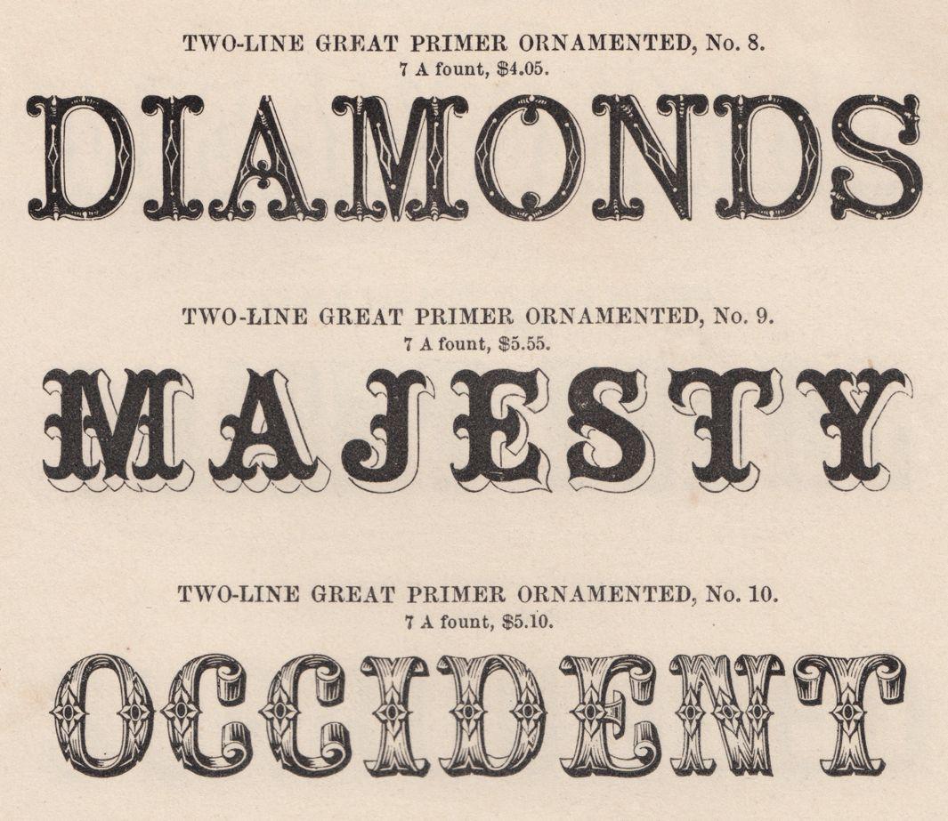
For centuries, punchcutters would develop their styles within a narrow group of genres. There would be only one style of roman or italic, even if that style had been refined and focused over a span of years. The name only needed to pin down the remaining variable, the size (see above).
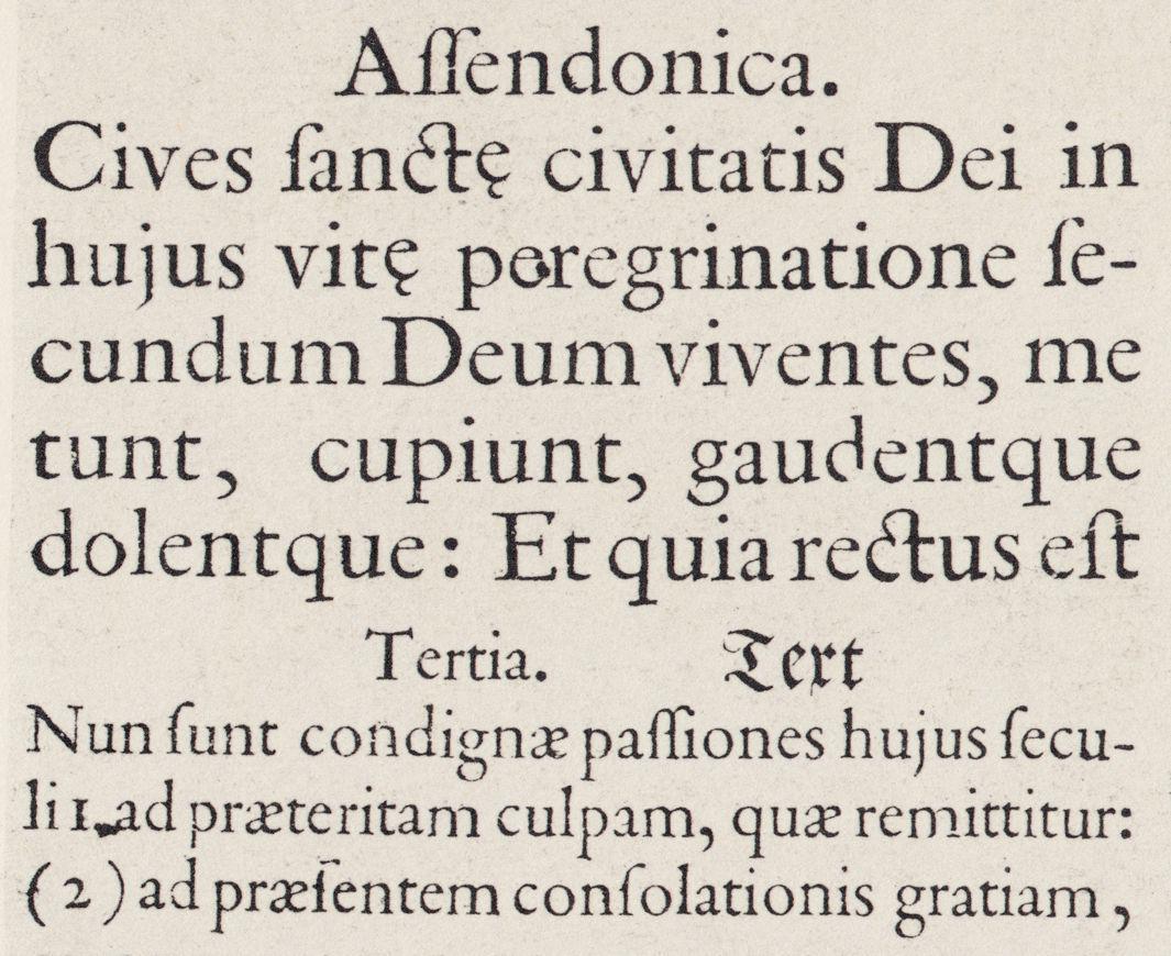
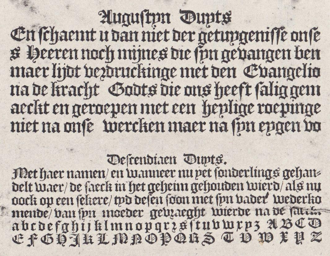
Less common genres would get a single broad term: Blackletter, Greek, Hebrew, Music, and so on. In this specimen printed by Dirck Voskens’ widow, Duyts (Deutsch) literally means German, and Textura or Blackletter by extension.
Courtesy of Tobias Frere-Jones
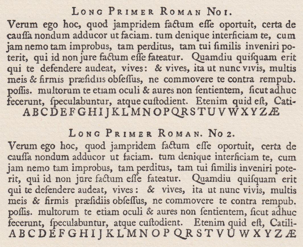
If there were multiple versions of a roman or italic (or anything else), a number could differentiate them simply. Roman No. 2 would be distinct from Roman No. 1, but the genre would not be reinvented or major new ingredients introduced. There was no need for more detail; the customer just needed to know which one was a little heavier or lighter, wider or narrower, and so on. (Professor Indra Kupferschmid touches on this point in her post about type classification.)
Courtesy of Tobias Frere-Jones
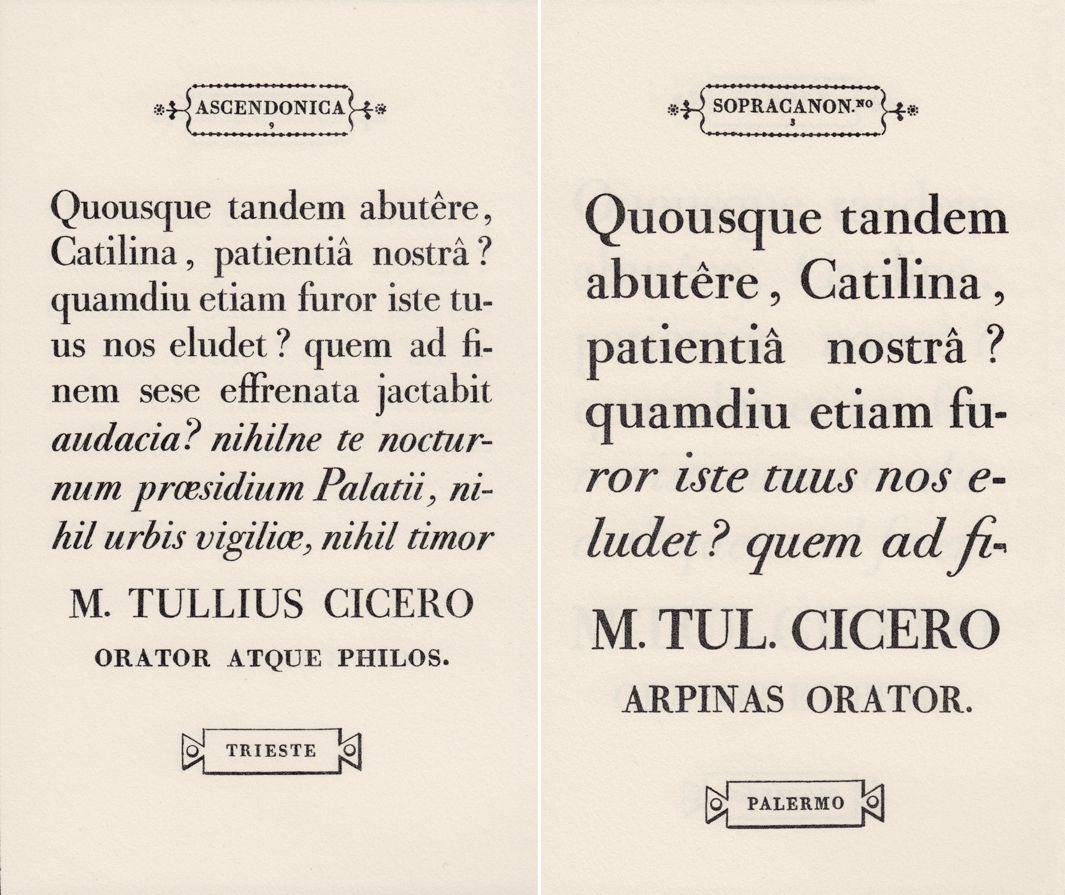
In Giambattista Bodoni’s epic Manuale Tipografico of 1818, more than 100 romans and italics are shown with the name of a city as a kind of nickname, though the real name was still a size and a number. Trieste is really Ascendonica (22 point) No. 9, Palermo is Sopracanoncino (28 point) No. 3, and so on.
Courtesy of Tobias Frere-Jones
Throughout the Industrial Revolution, a new market for advertising drove typefounders to expand their inventories. The established vocabulary soon proved inadequate—a predictable result, given novelty was such a conscious goal. Founders needed to coin new terms to signal the unique aspect of new designs. But customers would need to understand this new jargon, so it behooved the founders to establish and maintain some equivalence in new terms.
Some of these new genre names found longevity in a stable definition. Latin came to mean something with spiky triangular serifs. Italian or French became a kind of adverb, indicating an inverted distribution of weight. Some accords could never be reached, so Antique means “slab serif” in the United States or Britain but “sans serif” in France. In Germany, Antiqua would take on another meaning, of modern or old-style serif.
Conflicts aside, new terms like Egyptian, Grecian, Tuscan, Ionic, Latin, and Grotesque took root. Always striving for curiosity and surprise, founders broke out of genres as soon as they were established. Ever narrower terms appeared, with little endurance in the marketplace: Bretonnes, Athenian, Runic, Arabesque, etc. Some foundries had inventories too large for evocative names, particularly for their decorated designs. Where no modifier could be coined or accepted, founders simply assigned a number and called it done.
Courtesy of Tobias Frere-Jones
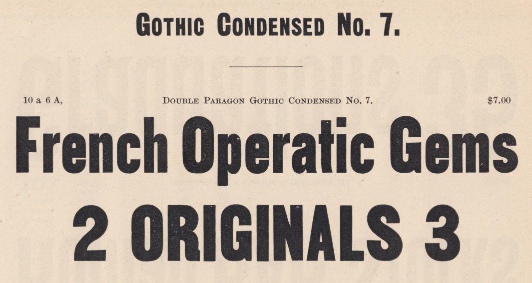
By the middle of the 19th century, names for the more common designs had settled into a reliable syntax of base words and modifiers, with numbers appended as necessary. The result often seemed more like an ingredient list than a recognizable name. Just as “scrambled eggs and bacon” isn’t really the name of a dish, but a tally of the items involved, Gothic Condensed No. 7 is a (hopefully unambiguous) report of attributes.
Courtesy of Tobias Frere-Jones
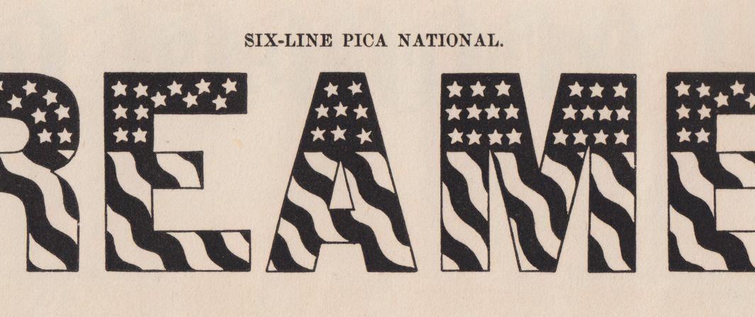
Lawrence Johnson’s 1857 specimen shows a decorated design under the name National. Being an adjective like all the other genre names, it’s not clear if this was meant as a unique name, or the start of yet another novelty genre.
Courtesy of Tobias Frere-Jones
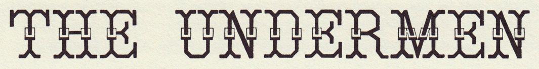
Wood’s Typographical Advertiser shows two designs under proper names with no connection to typography: Albert Edward and Lord Mayor. If Johnson’s National was not meant as a modern name, these would be more likely candidates.
Courtesy of Tobias Frere-Jones
Courtesy of Tobias Frere-Jones
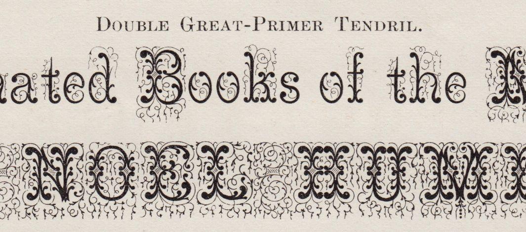
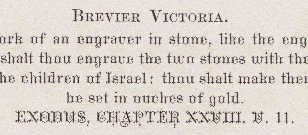
George Bruce’s 1869 specimen continues the trend, with Tendril and Victoria. The shift from adjectives to nouns seems to be an important moment: Adjectives suggest a larger group while a noun stands alone.
Courtesy of Tobias Frere-Jones
Courtesy of Tobias Frere-Jones
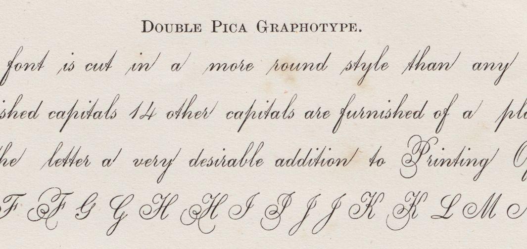
A concocted name, the next stage of evolution, appears in the same specimen with the design Graphotype.
Courtesy of Tobias Frere-Jones
These new approaches became increasingly popular, and some foundries seemed to use them as a badge of modernity. Still, the old constructs like Ornamented No. 16, Antique Shaded, and Gothic Condensed No. 2 persisted well into the 20th century. In fact, a few old-school names survive to this day, like Linotype’s Old Style No. 7.
To return to our analogy on the diner menu, the Monte Cristo or the Reuben do not list any ingredients. Similarly, Cheltenham and Futura offer no preview of the design. The name is now part of the design itself, rather than a retrospective description, or a part number. The name precedes the typeface like a herald, rather than trailing behind like a stenographer. At its best, a typeface’s name is a one-word sales pitch.
So the modern typeface name—evocative and abstract—was not a breakthrough by one individual, but a project that took countless hands and more than 200 years to realize.
And I quickly came to agree: The name is the hardest part.