This is one in a series of posts analyzing and celebrating typefaces. The series was originally published by HiLobrow.
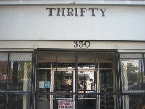
SAVANNAH SIGN | MARCUS POLITE (?) | c. 2000s
You recognize Savannah from movies or travel photography: antebellum architecture, moss-draped oaks, shady downtown squares. All true. But escape the horse-drawn carriage circuit and you’ll learn there’s more to the local aesthetic: gloriously dilapidated buildings, odd small businesses (barbecue joint + car wash, etc.), and, best of all, hand-painted signage.
Shortly after moving here, my wife and I became mildly obsessed with a particular sign-lettering style that recurred all around town. Gritty and elegant, bold strokes connected by delicate lines, it was the visual equivalent of a seductive but unplaceable accent. Was one person responsible for this style? Or was it a lettering vernacular that never crossed the Talmadge Bridge?
I asked around—for a couple of years. Everybody knew the aesthetic; nobody had facts. I idly referenced my attraction to the style in the caption to a photo posted to Flickr in 2007, and to my amazement received a confident response: “Mr. Marcus Polite, an African American, did the freehand letter painting, 5 yrs ago.” I eventually had coffee with the guy who left that comment—a 60-ish Asian man chock-full of local lore I wasn’t sure I should believe. Over the years, however, I have concluded that on this subject (and probably others) he is correct.
Later I met the creator of the Hand-painted Signs of Savannah, Georgia Facebook page. But in general, genuine knowledge and appreciation of the hand-painted signage here seems rare even among locals. So it was another year or two before I belatedly discovered Savannah College of Art Design graduate Rebecca Boehm Carr’s thesis, “Straight By Eye,” evidently completed in 2005.
This focused on three local sign painters; one was Marcus Polite. But even here, he’s elusive. “He rides around on a bike and talks to small business owners, often undercutting [other painters’] prices,” Boehm Carr writes, in one of just two Polite mentions.
Notably, the thesis’s chapter headings are set in a Polite-esque typeface made by another SCAD alum, Chris Risdon. (He’s made two: Sav Display, and SAV PT.) Risdon’s work is quite nice, considering the challenge: In real life, this lettering style varies from location to location, and it’s impossible to know whether they’re all made by Polite, or if some come from imitators. (The guy who answered my Flickr post told me Polite had died—yet I feel certain I’ve seen new instances made in his style since then.)
Although it says little about the man, Boehm Carr’s thesis notes that among local sign-painters, his work is “arguably the most prevalent in terms of numbers in the landscape.” Precisely. He ought to be a celebrated figure, for contributing brilliantly to Savannah’s visual charisma.
But the Polite mystery only adds to the appeal of his work. The effort required to get the lowdown, through a patchwork of informal sources on a near-ubiquitous feature of the local aesthetic strikes me as very Savannah. If you want see beyond the moss-draped oaks here, you have to try. This town is shady, in more ways than one.
Previously
Leave Comic Sans Alone. It’s Fine.
How the Gotham Typeface Came to Define Our Era
The First Macintosh Font Made a Machine Seem Friendly
One of the World’s Great Typefaces Was Created Nearly 600 Years Ago