This is the first in a series of posts analyzing and celebrating typefaces. These posts were originally published by HiLobrow.
JENSON’S ROMAN | NICOLAS JENSON | 1470
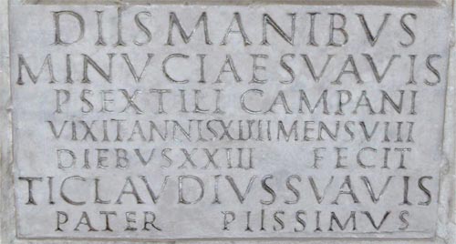
In much of the world, for the better part of a millennium, the most visible, identifiable letter-form was one carved in stone on Roman statues and monuments. Square and stern and solid, if you were reading (or, more likely, just looking at) a Roman-style inscription, then you were somewhere civilized. Beyond their meaning, beyond whatever battle, orator, or emperor they were commemorating, the letters spoke of armies, aqueducts, government.
The Roman-style letter-form was so popular, although awkward for this purpose, it was even used as a scribal hand. There’s an especially likable example, written around the 6th century, from the Book of Maccabees, residing in Durham Cathedral. It was preserved for posterity because, as with many older manuscript fragments, it had been recycled as book-binding waste.
So it was natural, when movable type was invented, that a Roman-style typeface should be contemplated. However, as anyone who has been on an Internet message board with crazy people knows, majuscule (uppercase) is a terrible way to set a block of text, much less an entire book. It is much less readable, and less human, than even the most egregious example of Blackletter. Luckily, just at that moment, humanists were writing in a revived 9th-century handwriting style called Carolingian or Caroline minuscule. What better marriage of form and function than the majuscules from the Empire’s stone monuments paired with minuscules in a hand that might have begun in recording the Carolingian Empire’s official documents, but had been repurposed to write scholarly editions of Horace and Vitruvius?
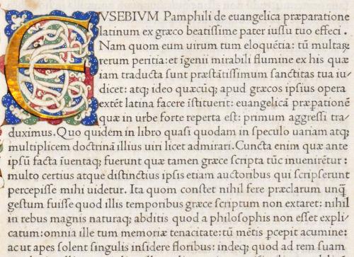
Although 15th-century printers were not artists or aesthetes—they were metal workers, punching type and maintaining these huge, new pieces of machinery—they were designing a means of expression intended to last (as the Roman letter-form had, by that point) a thousand years. And so it was that Nicolas Jenson, lately of Mainz, settled in Venice and began to punch type for a 1470 edition of Eusebius set in a Roman typeface. He didn’t invent anything, simply took two things and put them together in a manner and with a fineness of line and expression that was and is inspiring.
A year later the Speyer brothers, also from Mainz, punched a Roman typeface that was almost as fine, nearly as fluid, and very close to as lovely as Jenson’s. But the Speyer brother’s Roman typeface was not the one that would be a model and inspiration for modern typographers from William Morris (Cloister Old Style) to Bruce Rogers (Centaur). At the dawn of the 20th century, practically every fine-type foundry trying to dig out from under a mountain of uninspired Roman typefaces—the gluttonous, monotonous gifts of the industrial revolution—turned to Jenson’s Roman. Jenson had nailed it.
Try setting a book in Blackletter, these days—you might as well use runes or Klingon for how contemporary it looks. But if you set a book in Jenson’s 1470 Roman, no one would bat an eye. It is a perfect expression of humanism, of the Renaissance, of ideas suddenly and forever set free.