Sigh. Here we go again.
The Daily Mail and Mail Online are to scientific accuracy what a sledgehammer is to an egg. Especially when it comes to global warming.
David Rose is oftentimes the wielder of that sledgehammer. He’s written error-laden climate articles in the past, like saying that global warming has stopped (no, it hasn’t), that the world is cooling (no, it really really isn’t), and that the Intergovernmental Panel on Climate Change had to hold a crisis meeting because Rose’s articles have caused such a fuss (that meeting never happened, which Rose had been told several times, but he still made the claim). Other examples abound.
This time, in Sunday’s Mail Online he writes that Arctic sea ice, which hit a major record low in 2012, “has expanded for the second year in succession.”
This claim is a humdinger, and typical denial double-speak. It’s technically true, but also really wrong. It’s like examining someone who has a 106° fever and saying it’s really made their skin glow. But what do you expect from an article that has this breathless headline:
Myth of arctic meltdown: Stunning satellite images show summer ice cap is thicker and covers 1.7million square kilometres MORE than 2 years ago…despite Al Gore’s prediction it would be ICE-FREE by now
“Myth of arctic meltdown” is enough to tell you just how slanted and wrong the conclusions of this article will be … and the inclusion of Al Gore’s name brings it home. Mentioning Gore is at best a distraction, red meat to the deniers. Gore isn’t a climate scientist, and as we well know actual climate scientists overwhelmingly agree that the world is warming. One of the outcomes of this is the decline of Arctic sea ice.
Briefly: Arctic sea ice reaches a minimum in late September every year. The overall trend for the amount of ice at that time is decreasing; in other words, there is less ice all the time. Some years there is more than others, some less. But the trend is down, down, down.
In 2012, a mix of unusual causes created conditions where the minimum reached a record low, far below normal. The next year, in 2013, the ice didn’t reach quite so low a minimum extent, and this year looks very much the same as 2013. But saying the ice is “recovering” is, to put it delicately, what comes out the south end of a north-facing bull. You can’t compare two years with a record low the year before that was due to unusual circumstances; you have to look at the average over time.
Of course, if you do, your claims that global warming isn’t real melt away.
I’m happy to provide that information. Here’s the Arctic ice extent graphed by the National Snow and Ice Data Center:
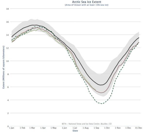
Graph by NSIDC
The black line is the average for 1981–2010. The gray region shows the ±2 standard deviation extent for that average; statistically speaking it’s an expected range of extent (it’s actually more subtle than that, but that’s enough to understand what’s going on here). The dashed line shows the 2012 ice extent, and is clearly very low, well outside the expected range. The brown line is 2013, and the light green line is this year, 2014, up to late August. Notice 2014 follows the year before pretty closely.
Note also they are well below average, near the bottom of the expected range. If you look at any recent year’s ice it’s below average; you have to go back to 2001 to find an ice extent near the average.
So the claim that the ice is “recovering” is made based on the wrong comparison. Compare the past two years to the overall trend and they fit in pretty well with overall decline.
Also, that “recovery” claim cannot be made with only two data points. Two years is not a trend. There have been many times ice has gone up over a year or two in the Arctic, only to drop once again over the long run.
Here’s the graph showing this:
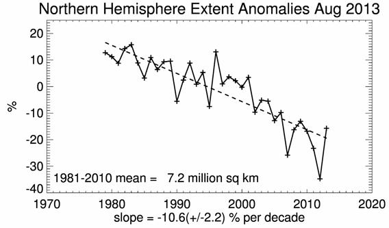
Graph by NSIDC
That’s also from NSIDC, and it shows the ice extent for August of every year from 1979 to 2013. Yes, in 2013 it goes up, but note: 1) There are several times it jumps up for a year or so, but 2) the overall trend is down. Looking at two data points in a row and ignoring everything else is incredibly misleading at best. David Appell at Quark Soup shows this very clearly as well.
There’s plenty more to debunk about Rose’s article, but this shows that his central premise is dead wrong. You absolutely cannot say Arctic ice is recovering, and in fact everything we know—like rising temperatures, and how the Arctic is more sensitive to warming than the rest of the world on average, and the obvious long-term trend—is that we are still losing Arctic sea ice at an alarming rate.
And don’t believe the tired malarkey you might hear about Antarctic sea ice increasing; that has nothing to do with any of this, and is hugely offset by the tremendous land ice loss every year anyway.
What makes this even more aggravating is that there’s nothing new here. This claim of Arctic ice recovering was made last year, and it was just as wrong then as it is now. It’s shameful. Global warming is real, it’s a huge problem, and it’s our own damn fault. There’s still time to fix this, though that breathing room is getting slimmer all the time … and it’s not helping when media give air to deniers.
Correction, Sept. 1, 2014: In the original version explaining the first graph, I wrote “temperature” when I meant “extent.” My apologies for any confusion.