If you’ve been paying any attention at all to the ongoing noise about global warming, then you’ve heard of the so-called pause. This is the idea that the planet hasn’t actually been warming for the past 15 years or so.
However, this is baloney. First off, the plot used by people who would deny the Earth is warming up (and that humans are behind it) only shows the temperature of the air over land and ocean. But our atmosphere (pardon the weird metaphor) doesn’t exist in a vacuum; the extra heat retained by our planet is also warming the oceans. In fact, most of that heat is going into deep ocean waters.
Second, if you look at temperatures historically, we see ups and down like this every few decades; you have to look at the overall multidecade trend and not focus on some short (and cherry-picked) time frame.
And now we have something else to add to that list: The “pause” may not exist at all.
A new study shows that the temperatures over the past 15 years are still on the rise. The problem, say the authors, is that the global surface temperatures have been based on incomplete data, with some regions left out (most notably over Africa, the Arctic, and Antarctica). The most northerly latitudes have been warming faster on average than other spots on Earth since the late 1990s, so if you leave them out you see a somewhat cooler global average than you should.
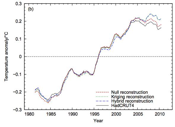
Plot by Cowtan and Way, from their paper
The graph above shows their results. It’s what’s called a “temperature anomaly” plot, which shows how temperatures deviate away from an average over a period of time. The usual plot you see is in black—what’s called the HadCRUT4 data, derived from ground measurements—and you can spot the “pause” in the more recent temperatures. The green line is from a more detailed mathematical analysis of the data, and the blue line includes satellite data that can fill in much of the missing temperature records from the poles and Africa. (You can get more details on this in an excellent article in the Guardian by John Abraham and Dana Nuccitelli.)
One of the authors of the journal article, Kevin Cowtan, created a video to explain this new method and what it means.
Clearly, these new techniques show that the pause has gone away. When you include better coverage and analyze the data more carefully, the Earth’s surface is warming right along with everything else. As the authors themselves say:
The existence of bias in recent global mean temperature estimates has been confirmed by multiple means. This bias leads to an underestimation of recent temperature trends.
By the numbers, far from pausing, overall the Earth is warming 2.5 times faster since 1997 than the previous figures indicate. To be clear, warming over the past few years has slowed a bit compared with a few years before but not nearly as much as has been previously claimed, and we know that most of that heat is going into the oceans anyway.
In other words, global warming hasn’t stopped.
I’ll note that this is one paper, and one result. I’m sure there will be legitimate debate over it in the climate-science community. And you can bet every last dollar you have that there will be illegitimate “debate” over it in the science-denial community. As I, and many others, have pointed out time and again, all they have is noise.
The problem is, they’re loud, and they have convinced some media they have something to say (c’mon CNN, really?) when really they don’t. The evidence, the facts, the science, and the reality are clear: The Earth is warming up, the climate is changing, it’s happening faster now than it has for thousands of years, and we’re the reason behind it.