The Vault is Slate’s history blog. Like us on Facebook, follow us on Twitter @slatevault, and find us on Tumblr. Find out more about what this space is all about here.
Here are five more great digital history sites and archives, new to me in 2014. (To see the first five on my list, click here.)
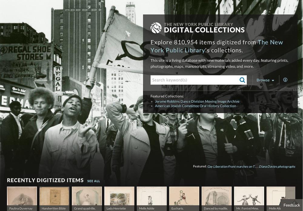
New York Public Library.
1. The New York Public Library’s digital collections released a site update this month, and the new browsing experience is excellent. A stream of recently digitized items allows for some serendipity, and another stream of items in the public domain directs browsing for those who have a specific use in mind. But the many curated collections are the main attraction, offering a multiplicity of ways into the library’s holdings. You can browse by type of document, for example infographics, postcards, or menus. Or explore collections that highlight the library’s strengths: New York City, theater history, and LGBT liberation. The organization scheme conveys a quirky and enjoyable sense of the curators’ personalities. For example, there’s a whole collection of photographs of New York City doors.
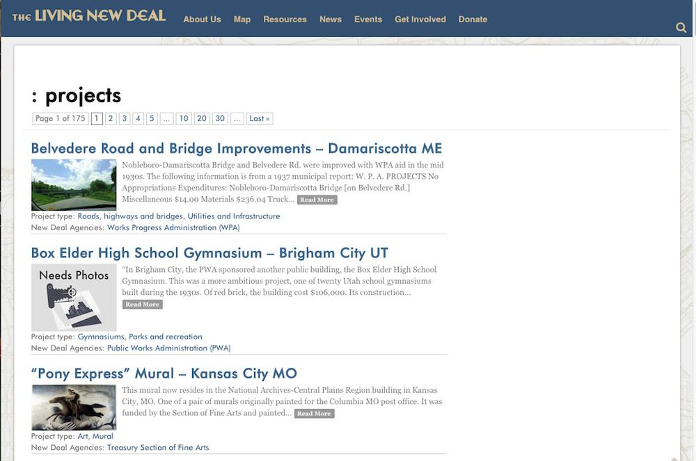
Living New Deal.
2. The Living New Deal project is an inventory and database of places where New Deal programs funded infrastructure, public art, parks, and trails. The group behind the project writes that they want to make the impact of these programs visible: “Because these public works were rarely marked, the New Deal’s ongoing contribution to American life goes largely unseen.” You can browse the register of New Deal projects on a map, or filter by category, by commissioning agency, by artist, or by location. Living New Deal invites readers to submit photos, family stories, or new entries to the database.
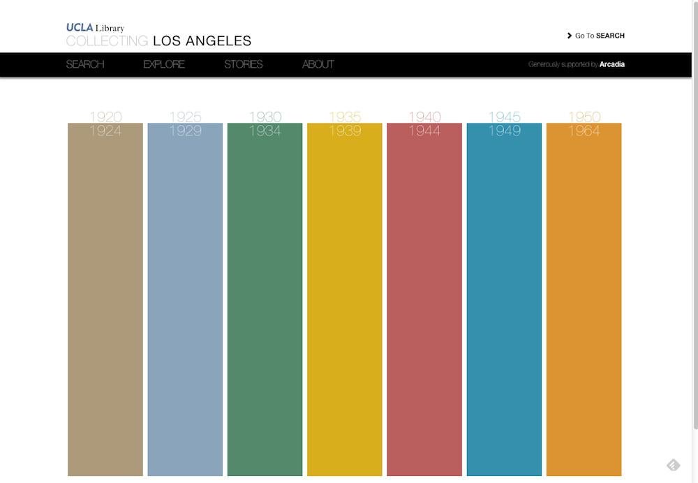
Collecting Los Angeles.
3. The UCLA Library’s Collecting Los Angeles project offers interesting new ways into the library’s collections of photographs and portraits of life in 20th-century Los Angeles. On the site’s most fun page, the library’s database of images, which run from 1920 through 1964, is represented as a colorful timeline. You can browse each decade thematically (“culture,” “arts,” “crime”) or hover your cursor over the timeline, seeing a preview of each item’s description pop up before selecting.
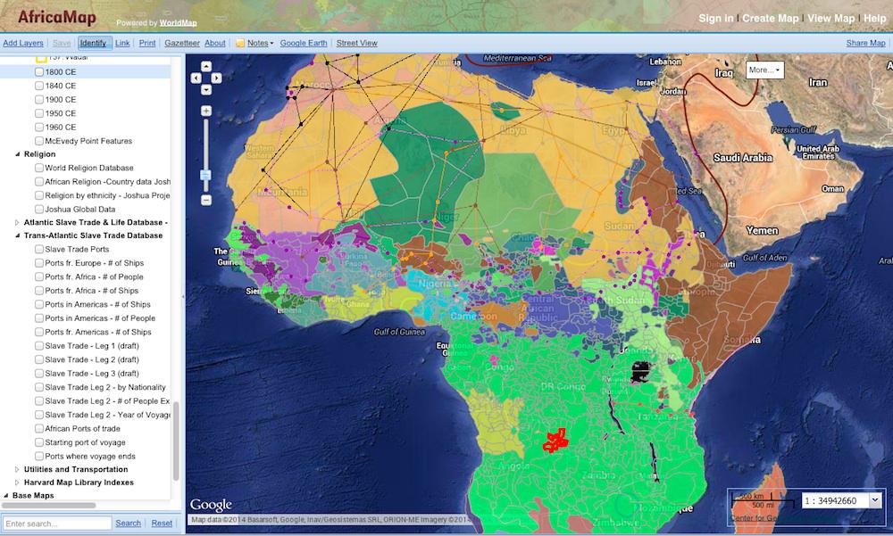
AfricaMap.
4. AfricaMap, from the Center for Geographical Analysis at Harvard, has been around for a few years, but I saw it for the first time this year, so I’m including it. The map allows you to select many layers of contemporary data related to African demographics—languages and ethnic groups, histories of conflict, health statistics, utilities and transportation—but it’s also helpful to use when trying to understand the continent’s history. The map offers historical overlays, geographical data tracking the slave trade, and period views which show you the configuration of major language groups at various points in time.
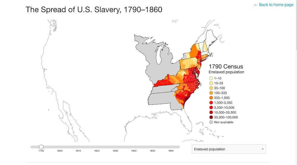
Lincoln Mullen.
5. And, finally, another interactive map, The Spread of U.S. Slavery, 1790-1860, by historian Lincoln Mullen, is simpler (but perhaps more accessible) in its approach. Using census data, Mullen shows the presence of slavery in American counties across the specified decades. The slider takes you forward and backward in time, and hovering the cursor reveals the data for each county, including the total number of people, the people per square mile, and the percentage of white, free black, and enslaved people present. Mullen’s discussions of the reliability and usefulness of his data are a model of transparency.