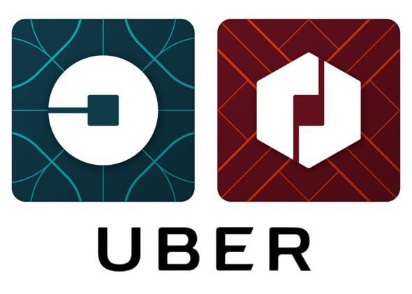
Uber launched a substantial rebranding on Tuesday that includes dropping the signature “U” from its app; shaving the typeface on its logo; and swapping its sober black, gray, and blue visual identity for a country-specific series of color palettes that the ride-sharing service says is a “celebration” of the 400 cities and 68 countries where it currently does business.
In a statement, Uber CEO and co-founder Travis Kalanick tried to explain the motivation behind the rebranding by asking: “Have you ever looked at someone’s hairstyle and thought ‘oh my, you peaked in the 1990s?’ Well that’s a bit how I feel about Uber’s look today.”
The rider app will now have a circular symbol that resembles Pac-Man, and the driver app will have a hexagon to replace the familiar “U.” Kalanick said the company “cut the curls” on its ’90s hairstyle with a streamlined easier-to-read logotype that Kalanick characterizes as “more grounded and elevated” and “a more substantial look as we too have matured as a company.”
But that change will likely be lost on users, much like Kalanick’s redesign origin story of how the new look was inspired by bits and atoms and how they relate to Uber’s corporate culture. Wired points out in a behind-the-scenes look at the redesign that despite not being a designer himself, Kalanick chose a DIY approach, working alongside Uber design director Shalin Amin and an in-house team to come up with the redesign rather than hiring a corporate branding agency.
Uber
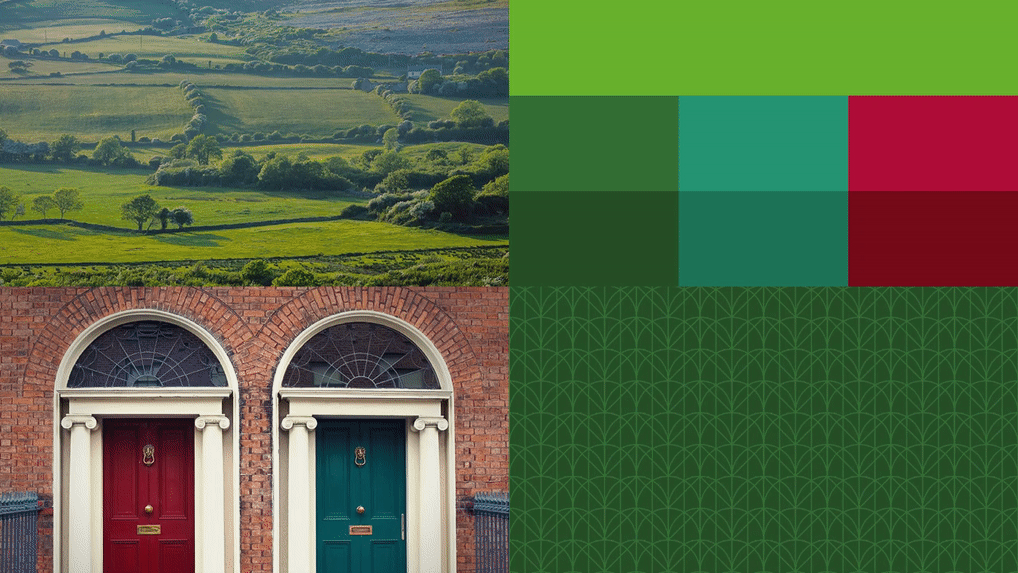
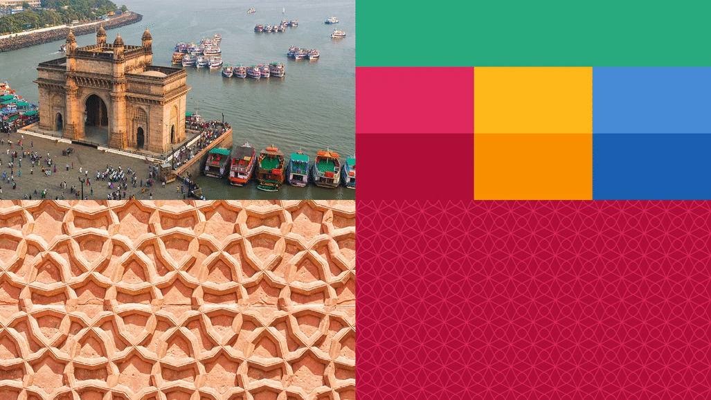
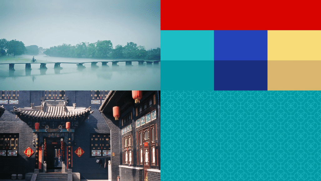
While the changes might ruffle a few feathers among riders and drivers until they simply get used to looking at them, the news that struck me as most troubling was swapping the “somewhat distant and cold” color scheme in favor of country-specific palettes that are meant to represent the company as “a transportation network, woven into the fabric of cities and how they move,” Kalanick writes.
Uber
The team spent “months researching architecture, textiles, scenery, art, fashion, people and more to come up with authentic identities for the countries where Uber operates,” Kalanick writes. It was “inspired by Mexican pink and the patterns in the local tiles; in Ireland, from the Georgian architecture and the lush greens; and in Nigeria, from the ankara, which came up again and again because of its bright colors and beautiful geometric patterns.” The long-term goal, he says, is to create unique designs for cities as well as countries, “adding hundreds more color palettes and patterns” in the future.
Uber
I reached out to Uber to ask whether the research had been conducted by a U.S. team or if partner countries had been included in the decision-making design process. An Uber representative said in an email that the U.S. team did initial research and then reached out to local teams around the world, who pointed out when it had missed key themes or cultural highlights that were then incorporated into the final designs.

Uber