
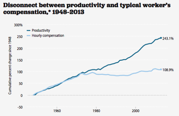
If you keep up with the debate about inequality, at some point you’ve probably read that pay for middle-class Americans has failed to keep up with their productivity. Workers are creating more value for companies than they used to, but aren’t being compensated for it. Maybe you’ve even seen a graph like this one, from the Economic Policy Institute. The dark blue line shooting up at 45 degrees? That’s productivity—or economic output per hour of labor. The light blue line that nearly plateaus around the late 1970s? That’s compensation for production and nonsupervisory employees—wages and salary plus benefits for people who basically aren’t in management. The bigger the wedge between those two lines, the more it seems like something has been fundamentally wrong with capitalism for the past 30 or so years. It may have been working, but not for workers.
But is this picture misleading? Is your average employee still reaping the gains of the economy? Clive Crook at Bloomberg View seems to think so. In a post headlined “American Capitalism Isn’t Broken After All,” he points to a set of graphs from Harvard Economist Robert Lawrence that adjusts the typical productivity-pay comparisons in a number of ways. It’s a bit involved, but in brief:
- Instead of tracking wages, he tracks compensation. (EPI does the same, but some writers and economists just look at cash income.) This is important, because lots of worker pay might be getting eaten up by the cost of health insurance and other benefits.
- Instead of calculating pay for nonmanagement workers—or for the median worker—he looks at average compensation for all workers.
- He subtracts capital depreciation—the cost of replacing worn-out equipment, from giant auto-factory robots to the laptops in your office—from economic output. Why do that? Because neither workers nor company shareholders really get to pocket the money that’s eaten up by depreciation. It’s basically part of our national cost of doing business.
- He adjusts everything for inflation based on the cost of products workers produce, rather than the cost of living.
Ultimately, you get a graph that looks like this. Average wages don’t really fall behind productivity until about 2000.
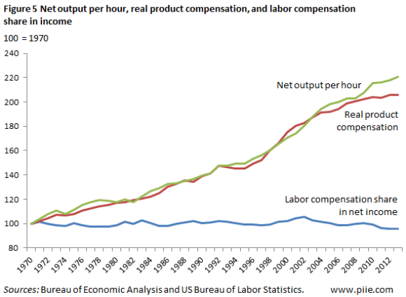
Why the relationship breaks down after that point is still a subject for debate. (Lawrence, to radically simplify, argues that companies essentially haven’t been investing enough.) “The main point to grasp, though, is simpler,” Crook writes. “For decades after 1970—contrary to one popular account—labor incomes grew roughly in line with productivity. Over the long haul, far from being irrelevant to well-being, growth in productivity goes far to deciding how poor or prosperous ordinary Americans will be.”
That is not, in fact, what Lawrence’s graph tells us at all. Again, Lawrence is looking specifically at average pay for all workers. That includes everyone from Tim Cook on down to your office cleaning crew. Odd as that sounds, it makes perfect sense for Lawrence’s purposes: He is basically in a fight with Thomas Piketty and his academic fans about the relationship between capital and labor, and wants to precisely measure how much workers’ overall share of national income has declined in recent years, while suggesting some theories as to why the change has occurred. His math tells us absolutely nothing, however, about whether compensation gains have been distributed evenly among workers. And guess what? They haven’t been, even when you include things like health insurance, in the equation. Pay for the imaginary “average worker” has tracked productivity. For the typical worker, it hasn’t.
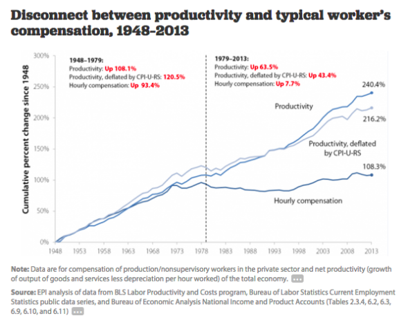
This is not a new point. You can find liberal economists like Jared Bernstein making it back in 2013. And for its part, EPI illustrates it in the graph below. It adjusts productivity and compensation data somewhat similarly to Lawrence’s approach, except it still looks only at production and nonsupervisory employees, who make up about 80 percent of the workforce. As you can see, there is still a big gap between the country’s productivity and compensation growth.
Now, some might argue that this makes total sense, at least if you assume that most of our productivity improvements in recent years have been due to highly educated Americans making good use of computers to automate things like factory production. But that is a) debatable and b) a separate issue from whether all of the economy’s gains in recent years are filtering down to your typical worker. They’re not. It’s been a long time since we’ve been able to count on a rising tide lifting all boats.