On Monday, Olive Garden announced a “brand renaissance” to lift lagging sales. Said renaissance includes a revamped logo, a focus on small plates, remodeled restaurants, and “a complete dining experience that is casual, yet stylish, creating an atmosphere that promotes togetherness, nurtures relationships and welcomes sharing.” (You can read more of Olive Garden’s marketing-speak at Eater, which has slides from their investor presentation.)
Of course, all laypeople care about is the logo. And it is dreadful.
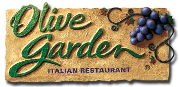
Olive Garden’s old logo
Darden Restaurants, Inc.
Olive Garden’s old logo—which, by virtue of how long it’d been around, had achieved something of an iconic status in the universe of sit-down chains—looked like the signature of a teenager who was cultivating his creative side. Though it resembled cursive, not all the letters were connected to one another, and the end of each word—the “e” and the “n”—were slightly elongated, as though they’d been dashed off quickly. It was a scrawl with self-conscious sophistication, sophistication that was enhanced with a cluster of grapes off to one side, a winking allusion to the vino that could be had with Olive Garden’s meals.
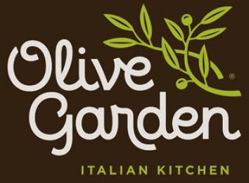
The new logo looks like the homework assignment of a teacher’s pet in second grade. The cursive letters are perfectly formed, circular, evenly sized. Clearly, Olive Garden is aiming for a youthful audience with its “brand renaissance,” but it has aimed far too young—no adult has ever written two words in cursive as perfectly formed as the new wordmark.
But even if Olive Garden is, with extreme forward thinking, trying to capture the loyalty of the under-8 set, it’s miscalculated. Kids don’t even learn cursive in elementary school anymore! In 20 years young people won’t even be able to decipher Olive Garden’s logo—they’ll need their Google Glass to interpret it for them. And then they’ll probably decide to go to Chipotle, a company with good, clean block letters in its logo.