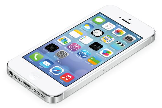
The first time you turn on your phone after installing iOS 7, you’ll feel like Charlie Bucket landing in Willy Wonka’s chocolate factory. Those colors! Those icons! So much neon! You’ve fallen into a world of pure imagination, a place where everything familiar and solid has been flattened, slimmed down, spray painted, and made translucent—but now you’re feeling some regret. Was that golden ticket worth it after all? When old things are made new, it’s natural to feel both lost and nostalgic, and it’s usually wise to push through your immediate sense of disorientation. Give iOS 7 a few days. Become comfortable with its technicolor aesthetic, lighter type, and spare graphics. Do this and you’ll notice, around Day 3 or 4, that your initial shock has given way to a new emotion: familiarity. Soon that feeling becomes so powerful that you may have trouble remembering what the old iOS looked like. And then, surprisingly, a new question pops into your head: Wait, is that all there is? That’s where I am now. It’s been almost a week since I installed Apple’s new mobile operating system on my iPhone 5. (You can get iOS 7 if you’re an iOS developer, or if a kind developer registers your iPhone with Apple. Beware: The OS is still in beta phase, so it’s annoyingly buggy.) Because the software is clearly a work in progress, I’ve tried to give it every benefit of the doubt, and I expect that a lot of it will be improved by the time it’s launched publicly in the fall. At this point, though, I’m puzzled by iOS 7. For a redesign that’s so immediately jarring and radical, it comes to feel strangely superficial over time. As I used iOS 7, I kept thinking of something Steve Jobs once said: “Most people make the mistake of thinking design is what it looks like,” he told the New York Times Magazine in 2003. “People think it’s this veneer—that the designers are handed this box and told, ‘Make it look good!’ That’s not what we think design is. It’s not just what it looks like and feels like. Design is how it works.” Yet once I got used to the new icons and typography in iOS 7, there was no next step—no clear payoff for braving the dislocation the new design had caused. What’s this design in service of? How does it improve your phone? Does it make it faster, easier to use, more enjoyable, less annoying? In other words, does iOS 7 change how your device works, rather than just how it looks? Most of the time, not really. While iOS 7 does introduce several new and useful features—like an immersive new app switcher, a handy finger-swipe gesture to go back to a previous screen, a superfast camera app, and a universal search and address bar in Safari—few of these feel like organic outgrowths of the new aesthetic. The app switcher, back swipe, and faster camera would have been possible and just as useful in the old iOS. Yes, there are places where the new design does pay off—in the Calendar and Photos app, the lighter type and buttons allow you to see more of your appointments and pictures. Thanks to new transition animations, switching in and out of apps from the home screen feels faster and more fluid. But these improvements are offset by other areas where the lighter design leaves too little of the interface exposed. In a few places, the new touch targets are too small to hit accurately. And while I welcomed the removal of some of the “skeuomorphic” real-world textures that gummed up the old iOS—like green felt and stitched leather—the one-dimensional, line-drawn icons in iOS 7 are sometimes too inscrutable to give you an intuitive sense of what’s going on. A lot of the redesign feels like aesthetics for aesthetics’ sake—the reflection of design chief Jony Ive’s personal taste for minimalism rather than an effort to improve how the software works. Or, as Jobs might say, it’s just veneer. Take one of the biggest design innovations in iOS 7, the use of translucent interface “layers” that pile on top of one another. When you look at the home screen, you’ll see two different planes—a layer of app icons on top, and beneath that a layer of wallpaper. You don’t know they’re two layers until you angle your phone; when you do, you’ll notice the top layer of icons shift against the bottom layer of wallpaper, creating the effect of parallax. Then swipe down from the top of the screen to bring down iOS’s Notification Center. In old iOS, this pane was opaque, carrying the texture of faux linen; all such textures have been removed in iOS 7. Now the Notification Center is another translucent plane—just behind it, you can see your app icons, like you’ve brought down a piece of frosted glass over your home screen. OK, so? How do these planes improve how your phone works? They don’t. The parallax effect is an innovation Ron Popeil of Ronco might prize—it will look great in ads, but on your own phone, having your icon shift position as you move your screen feels gimmicky, purposeless, and mildly irritating. It smacks of unnecessary ornamentation, calling into question Apple’s iOS 7’s marketing copy: “We don’t add features simply because we can, because it’s technologically possible.” Meanwhile, having the Notification Center sit on glass rather than linen isn’t an obvious improvement, especially because the design changes make Notification Center less informative than the one in iOS 6. iOS 7’s version shows you far less data about your day at a glance, and it makes some bizarre and even unfriendly aesthetic choices. For example, rather than icons depicting the weather—say, an instantly recognizable sun-and-clouds picture—it gives you a written weather report. Three full sentences, in small type, that a radio weatherman might read in a newsbreak: “Partly cloudy conditions with 20 mph winds out of the northwest. …” That’s nuts. Altogether, the changes make for a design that’s neither an obvious improvement nor a downgrade. Instead, iOS 7 is a step sideways. It’s a bold new look, and depending on your aesthetic sensibility, you’ll either love it or hate it. But that’s as deep as it goes. It doesn’t add many new features to your phone. It doesn’t improve the iPhone’s usability to any great degree (and for smartphone novices, it might well be more difficult to learn than iOS 6). It won’t fix Apple’s problems with data-driven cloud software. Perhaps, over time, iOS 7’s purpose will become apparent; it’s possible that the new design is a foundation for the future of Apple’s mobile software, one whose ultimate utility will be proven over the next few years. That’s the best-case scenario. The more likely outcome is a collective meh.
Flattened Affect
I’ve spent a week with iOS 7 and I’m already bored.
iOS 7
Courtesy of Apple
Advertisement