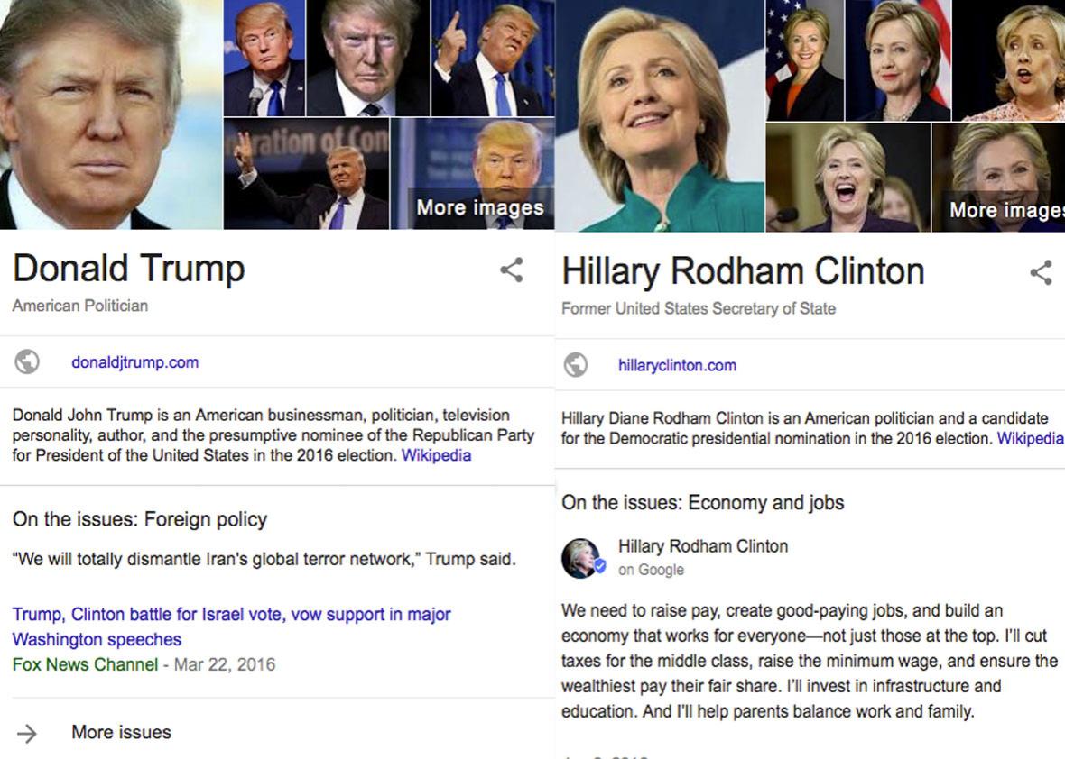
If you Googled any of the U.S. presidential candidates over the past four months, you probably noticed an information box displaying their stances on specific political issues.
It seems impartial enough: a list of topical info cards with issue-related quotes from the candidates, mostly pulled from news articles. But at the Computational Journalism Lab at the University of Maryland, we are investigating how bias in search engines can affect the political process, and we started collecting data on this new info box in April. Our analysis of data collected from the guide shows significant differences in the way candidates are portrayed. Among the issues: unequal space given to each candidate, the use of quotes that don’t really explain their stances, and overreliance on a limited set of news sources.
Screenshot via Google
This matters because search engines are powerful brokers of political information that can shape an electorate’s perceptions. Political biases can emerge from the complex and opaque search algorithm, surfacing more or less supportive or critical information about candidates. With the issue boxes, Google is taking a more direct approach to curating information about the candidates. And, as we found, that comes with its own set of unique biases.
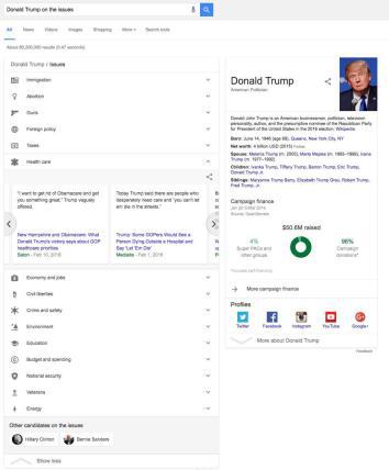
The first concern is the way the guide lists the issues. It’s not alphabetical; the first three issues for each candidate are immigration, abortion, and guns. And it doesn’t align with the public’s assessment of the importance of each issue, at least comparing it to polls conducted by Gallup and Pew. If it did, the economy would be much higher up. This matters, because items listed higher on the page will get more attention from searchers.
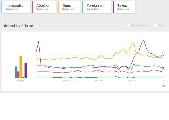
According to a Google representative, issues are defined and ranked using “several factors,” which include the way other websites and organizations do it (the representative specifically mentions Pew, Vote Smart, or OnTheIssues.org) and user interest. We tried, unsuccessfully, to replicate the issue ranking in Google Trends, which indicates the frequency of searches of specific terms through time. For instance, the first two items in the issues guide list are “immigration” and “abortion,” but in Google Trends the user interest is higher for “guns” and “taxes.”
Screenshot via Google
The list is relatively static, suggesting that any data-driven techniques to order the issues are moderated through human editing or approval, not unlike the Facebook Trends process that has recently come to light.
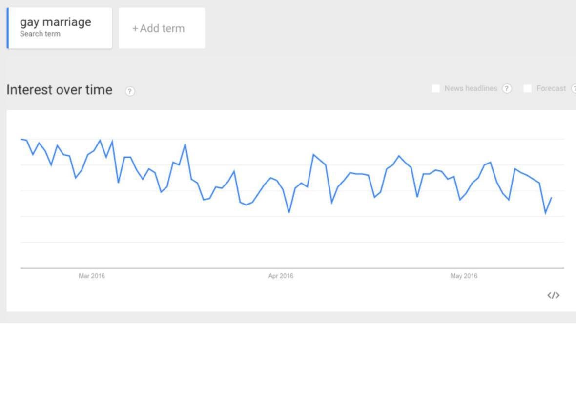
Unlike Google Trends, the topic ordering in the info box does not change over time. Google says the list is adjusted according to user feedback, and since we started collecting the data, the only change we saw was between April 1 and April 22, when a new category was included: gay marriage. Yet Google Trends didn’t indicate any new spike in the interest in gay marriage during that period, and it’s not as if candidates weren’t speaking about it before mid-April.
Screenshot via Google
Before the change, quotes about same-sex marriage were included in the “civil liberties” rubric. This suggests that somewhere along the way, a human editor decided to include that specific issue as a standalone field. If human editors are involved in selecting and ordering issues for the guide, Google should be more transparent about their role in selecting and ordering the issues. Why are immigration and abortion listed more prominently if they are ranked lower than economy or health care on Google Trends?
Our second concern is with the way the tool actually works. “The quotes are algorithmically aggregated from news articles on Google Search, similar to the Google Search results you get every day,” according to a Google representative.
But that doesn’t explain the process of how quotes are found, selected, and fed into the cards—or why there are discrepancies between the information provided for each candidate. We might expect the tool to treat all candidates equally.
For instance, it would be reasonable to assume that all candidates would have a similar number of cards, emulating some sort of equal-time rule, like the ones that regulate candidate access to television and radio broadcasts. But that’s not what the data shows.
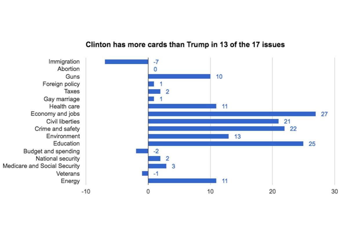
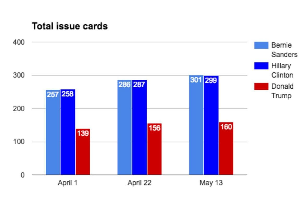
As of May 13, Google’s guide to the candidates had 299 cards with Hillary Clinton’s stances, versus 160 for Donald Trump. In fact, Clinton has more cards than Trump in 13 of the 17 issues covered by the tool. This discrepancy is more noticeable when issues such as economy and jobs (27 extra cards for Clinton) and education (25 extra). Trump only leads in immigration (by 7), budget and spending (2), and veterans (1).
Screenshot via Google
This disparity in the number of cards has been evident since April 1, when we first started collecting data. Back then, Sanders and Clinton were already in the lead in terms of card count, with Trump (and the rest of the Republicans) way behind. During each subsequent data collection, we found new cards being added for all candidates, but Trump’s were added at a slower pace. That could mean that Trump speaks less about actual issues, or stances aren’t as easily extractable from his quotes, but maybe the tool is not adjusted to his style.
Screenshot via Google
Another problem is conceptual: the underlying idea that quotes, by themselves, are enough to understand a candidate’s stance on an issue. By focusing only on candidates’ statements, the Google issue guide paints an incomplete picture, especially compared to websites such as PolitiFact, Vote Smart, or OnTheIssues.org. These last two have candidate quotes, sure. But they also have voting records and even ratings from interest groups to help give voters a clearer idea of what a candidate will actually do about a given issue—not just what he or she says.
How does focusing on quotes alone work for a candidate such as Donald Trump? Never mind the fact that he is currently in the process of scaling back on some of his previous campaign stances, such as his tax plan and his Muslim ban (a promise that is not even in the Google issues guide). Take this classic Trump quote that is used in the Google issues guide: “I would end Obamacare and replace it with something terrific, for far less money for the country and for the people.” How helpful is that statement to voters looking for specifics?
Generic statements are frequent in the Google issues guide. Like this one from Bernie Sanders, listed as a stance on immigration: “I am the son of a Polish immigrant who came to this country speaking no English and having no money.” While this may help give context for his views, it doesn’t actually tell us what he would do on immigration. And then there are quotes that don’t provide any context at all. Here’s a challenge, try to guess who said the following quotes:
- “Nothing (is) more important than higher education and education in general”
- “I believe taking care of veterans is part of our solemn duty as Americans”
- “(The candidate) said Israel had ‘very right in the world to destroy terrorism.’ ”
This raises the question of the quality of the material being collected. Google indicates the process is automated: An algorithm reads articles indexed by Google News and then identifies the candidate and relevant quotes from that article. It identifies what the quote is about, generates the card, and assigns it to a specific issue. “We will only show issue topics from candidates when they have submitted a statement or if there is a sufficient amount of news articles that include relevant quotes from them that our algorithm has found,” says the Google spokesperson.
It’s difficult to pinpoint at what stage of the process bias could be entering into the system, but there are a few possibilities. It could be that the algorithm is picking up articles about all candidates, but it’s not able to identify the same volume of quotes and issues for all of them. Or maybe Google News, which is the source for the quotes, is not indexing the same number of articles for each candidate. Or maybe the media is not covering the candidates equally, leading to more coverage of Sanders and Clinton than Trump.
Only Google knows if the first option is a real possibility. But we can test the second option fairly quickly by searching Google News. The numbers change quite often, but searching for each candidate for news in the past month, excluding duplicates, we found 630 articles about Bernie Sanders, 710 about Hillary Clinton, and 941 about Donald Trump. Trump is not underrepresented in Google News. In fact, he’s the most talked about candidate in the media, according to LexisNexis data.
There’s a parallel bias relating to the publication outlets for the articles. For all candidates put together, there are 726 cards that come from 332 different news organizations, an average of 2.2 news stories per source. There are four “big hitters”: The Hill, Politico, the Washington Post, and the Huffington Post have more than 20 articles each, accounting for a total of 14 percent of all cards.
To get a better look at whether the news sources are biased, we used data collected from a 2015 Facebook study on filter bubbles. The study analyzed what kind of articles are being consumed by people of different political leanings on Facebook and calculated an average ideological score of users who shared articles from a given news source.
If that number is positive, the website tends to be more shared by right-leaning users; if it’s negative, it’s a favorite among left-wingers. Daily Kos, for instance, has a score of -0.897; Breitbart, on the other hand has as score of 0.914. (Slate, if you’re curious, is a -0.681). The 500 most shared websites have an average content alignment of 0.05—very close to neutral.
We used those ratings to see if the sources used by the Google issues guide slant one way or the other. What we discovered is that, from all the 83 sources that are mentioned in the study and are used by the Google issues guide, the average score is -0.16, slightly left-leaning. Those 83 cover 50 percent of all the articles used as sources for the cards. However, when you take into consideration the top 10 sources for the tool (which, combined, feed articles to 188 cards and are all rated by the Facebook study), the score is much more left-leaning: -0.31.
It’s possible these left-leaning sources are simply better at getting issue-relevant quotes on record for the candidates, but this bias could also be due to automated filtering bias inherent to Google’s quote extraction technique.
Even if these distortions are byproducts of some algorithm (and set of people) that takes into account searches or aggregated interest by internet users, Google is not doing an adequate job of explaining this tool. Much like Facebook has had to disclose more details about the algorithms and people behind its trending topics in the wake of revelations that there may be political biases, we should expect other internet giants, like Google, to be more transparent about the systems driving public exposure to political information. Google should create a new position for an algorithmic ombudsperson to disclose and explain key bits of how its systems mediate our political information and news. More generally, standards should be set up to ensure robust algorithmic transparency around systems such as this.
In one of its official blog posts promoting a new batch of these new info boxes, Google writes that “finding unbiased, objective election information isn’t an easy task.” That’s right. But users must be aware that part of the problem might be the information giant itself.
This article is part of Future Tense, a collaboration among Arizona State University, New America, and Slate. Future Tense explores the ways emerging technologies affect society, policy, and culture. To read more, follow us on Twitter and sign up for our weekly newsletter.