After the Federal Reserve announced on Wednesday that it would again raise interest rates, Chairman Jerome Powell stepped out for his customary press conference and admitted that, just like most of the economics world, he’s not entirely sure why employers aren’t raising wages faster. Unemployment is at lows not seen since the late 1990s, businesses can’t stop complaining about how hard it is to find good people to hire, and nonetheless pay has yet to really take off.
“Everywhere we go we hear about labor shortages. But where’s the wage reaction?“ he said. “So it’s a bit of a puzzle. I wouldn’t say it’s a mystery, but it is a bit of a puzzle.”
Powell is right that slow wage growth is still a bit of an unsolved jigsaw. There’s no clear consensus among economists about what’s responsible for the problem, and lots of possible answers. But the simplest, most elegant explanation is the job market still has more slack in it than the Fed wants to acknowledge—meaning that there are still plenty of people sitting on the sidelines waiting to find work, which is keeping the pressure off employers to raise pay quickly.
Here’s the puzzle that Powell and his fellow central bankers are trying to piece together. For many decades, there seemed to be a reasonably straightforward link between the official unemployment rate and hourly pay. When unemployment dropped, wage growth sped up. When unemployment rose, wage growth slowed down. But after the Great Recession the relationship seemed to collapse. Unemployment fell dramatically; wage growth only sped up modestly, and still has yet to crack the 3 percent mark we enjoyed before the recession. Many mainstream economists have been baffled by this development.
One possible explanation, which I’ve written about a few times, is that the official unemployment rate doesn’t give us an accurate picture of how much slack is in the labor market anymore, because of how it counts the unemployed. This is a point that economists like Adam Ozimek of Moody’s Analytics and Evercore ISI’s Ernie Tedechi, as well as the Washington Center for Equitible Growth’s Nick Bunker, have argued for at length. Instead, they say, we might be better off looking at the straightforward employment rate among working-age Americans—the percentage of adults 25 to 54 who have a job.
It turns out that number, which is still a bit below its pre-recession peak, has had a remarkably steady relationship to pay growth over the past 25 years.
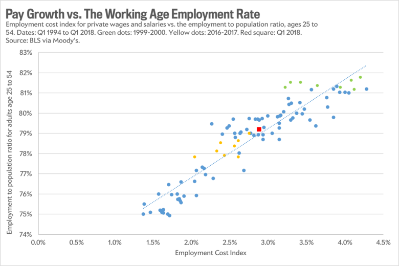
This graph tells a really neat, easy to understand story that makes the whole wage puzzle disappear. Why was pay growth faster at the end of the 1990s (the green dots), even though the unemployment rate now is roughly the same? Because in reality more of the adult population had jobs. Why was pay growth slower a few years ago (shown by the yellow dots)? Because fewer people had jobs. It also suggests that the labor market, despite what the official unemployment rate would suggest, has lots of room for improvement before we have to worry about fast-rising wages fueling out-of-control inflation—which, again, is what the Fed ultimately fears.
The one problem with this graph is that it’s admittedly, well, a little dumb. Or, to put it another way, it’s not the sort of sophisticated analysis that economists typically like. It’s only a simple correlation, two sets of numbers plotted against each other that just happen to march more or less in lockstep, which we all know does not actually prove causation. And there are lots of theoretical reasons to question whether the picture is actually showing us a meaningful pattern, or a coincidence.
The most vocal critic has been Jason Furman, a widely respected economist at Harvard’s Kennedy School and former chair of President Obama’s Council of Economic Advisers. One of his big points is that the working-age employment rate isn’t necessarily “stationary”—meaning it doesn’t always just bounce back to the same level after a recession. Instead, it’s influenced by long-term, structural changes in the economy—the share of men with jobs has been declining for decades, for instance—and so using it to predict short-term, cyclical changes in the labor market doesn’t make much sense, in his opinion. He also dislikes that it measures pay growth using the Employment Cost Index, which controls for the composition of the workforce, and essentially tracks whether employers have to pay more in order to hire for the same kinds of jobs over time. If we want to explain what’s happening with wages, Furman argues, we should look at actual wages.
It’s possible to offer point-by-point rebuttals to Furman’s points. But in the end, the main retort is fairly simple: To paraphrase Bunker, the one-dumb-graph approach to predicting the labor market may not work in theory, but so far, it does seem to work in practice. Graph beats no graph. And nobody has offered up a significantly better model, even if they’ve provided interesting theories. Take Paul Krugman’s two-part hypothesis. First, he suggests that employers don’t want to raise pay, because they’re still scarred by their experience in the recession. Second, they don’t have to raise pay, because America seems to be developing a problem with what’s known as monopsony—where companies don’t face any competition in hiring, because of issues like industry consolidation or widespread noncompete agreements. One advantage of this argument is that it’s totally consistent with the situation we’re seeing where employers are complaining about labor shortages yet seemingly refuse to raise pay in order to attract workers; in fact, it’s literally a textbook explanation for that phenomenon. The problem with it is that research on monopsony is in its infant stages, and nobody is really sure about the extent to which it’s influencing the labor market, or if it’s more of a problem now than it was 10 years ago, when wages grew faster.
In the end, there is a simple, plausible explanation of why pay growth has been so slow, and if it’s correct, it suggests the Fed should be much more cautious about raising interest rates. Instead, though, our central bank is choosing to head off the theoretical possibility that rapid inflation might be lurking around the corner, while ignoring the evidence staring them in the face that it’s probably not.