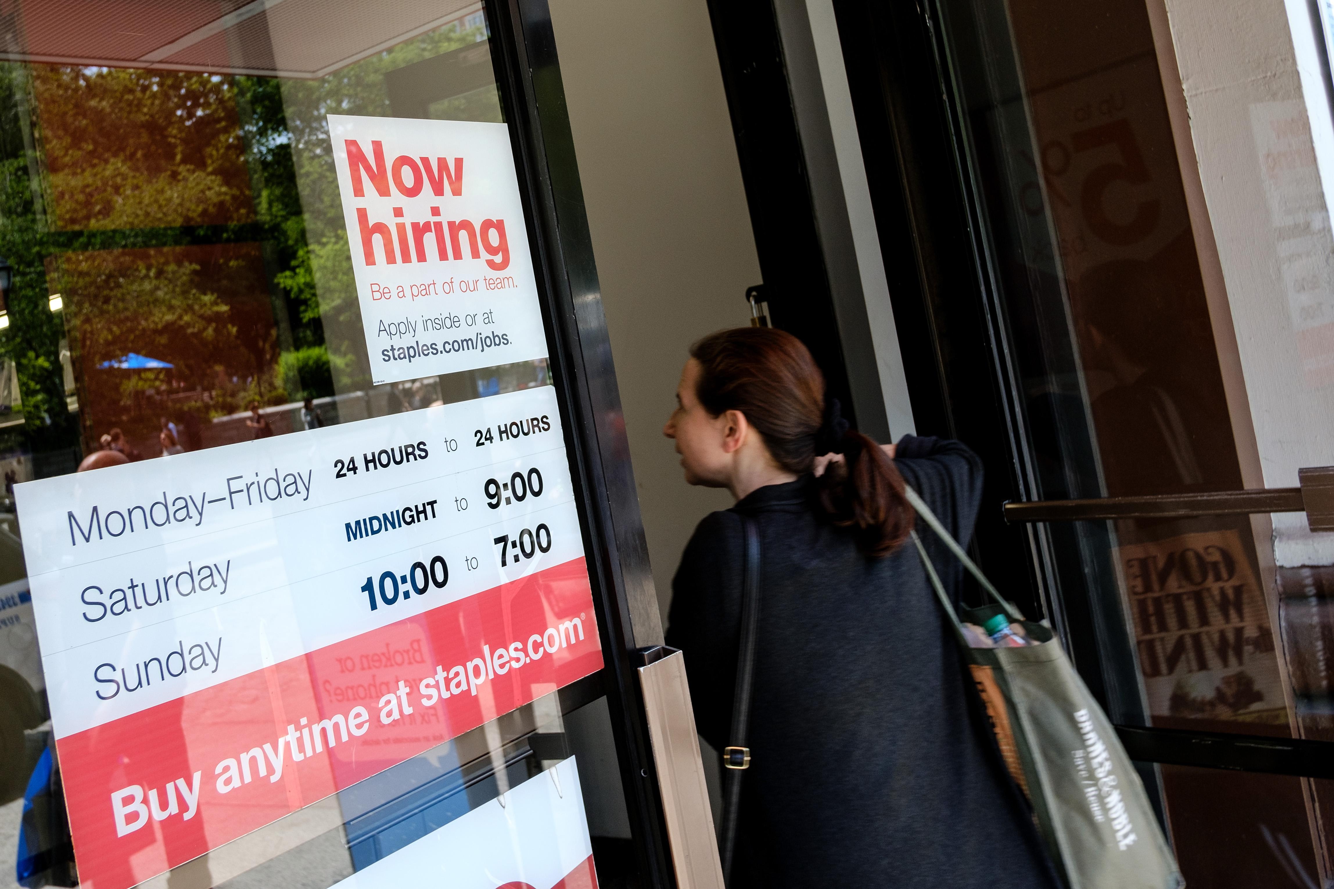
The U.S. unemployment rate dropped to 3.9 percent in April, the Bureau of Labor Statistics reported today, a point not seen since the bubbly, waning days of Bill Clinton’s presidency. Yet, while the labor market seems to be getting tighter by the month, wage growth is still tepid and doesn’t seem to be accelerating.
Some people find this confusing.
It’s hard to blame people for thinking this is a mystery, since publications like the the Wall Street Journal have been banging on recently about how the healthy economy is creating “historic” labor shortages. But there really isn’t much of a mystery at all, as long as you look at the right numbers. If you want to understand the state of the labor market right now, it’s time to forget the official unemployment rate and learn to love what I like to call the working age employment rate.
The unemployment rate that the Department of Labor unveils each month is a decent, broad barometer of whether people who want work have it. But the statistic also has some important deficiencies that make it less helpful than it used to be for judging the overall state of the economy. Most importantly, it doesn’t count people among the unemployed unless they are both jobless and say they are looking for work. This is meant to keep the government from counting people who really don’t want a job, such as full-time college students or happy stay-at-home parents, as “unemployed.” The drawback is that it excludes people who would actually like a job, or at least be willing to take one if the right opportunity came along, but haven’t been actively trawling Monster.com.
That downside became more of a problem after the recession, because a great many Americans stopped job hunting after getting frustrated seeing their resumes rejected over and over. Some young people never got a foot in the workforce. A lot of parents likely decided they were better off staying home with their kids rather than toughing it out in a brutal labor market. But a lot of these men and women probably would take a job if the right opportunity came along, or might start hunting if the economy was truly torrid. Because the unemployment rate doesn’t account them, it’s no longer a very precise measure of what economists call labor market “slack”—basically, how many potential workers are still stuck sitting at home. The less slack there is in the economy—or, to put it another way, the tighter the job market becomes—the more pressure builds on employers to raise wages, since they can’t just go hire someone who’s unemployed and happy to take any paycheck they can get. The fact that the unemployment rate is way down, while wage growth isn’t moving much, is a sign that the official number has stopped telling us much about how much slack is left.
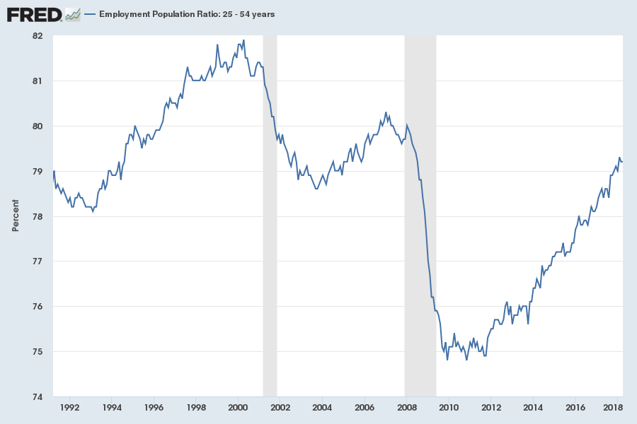
Thankfully, there is a much better measure of slack, which analysts like Nick Bunker of the Center for Equitable Growth and Adam Ozimek of Moody’s Analytics have been advocating for years: The prime age employment to population ratio—which, as I said above, is what I’ve dubbed the working-age employment rate, because it just tells you the percentage of Americans between the ages of 25 to 54 who have a job. In other words, it tells you what share of Americans you’d expect to be working are actually gainfully employed.
Take one quick glance at the the working-age employment rate, and I’m sure you’ll notice the obvious: The labor market is still only about four-fifths recovered from the recession. The employment rate is steadily improving. But there are still a lot of Americans who could use a job right now.
In all likelihood, that explains much of why wage growth has been so much lower than you’d expect, given the low official unemployment rate. As shown on the graph below—which I adapted with help from Ozimek—the working-age employment rate and pay growth have moved almost in lockstep for the past few couple decades.1 Why were wages rising quicker in 2000 (shown in green) than today (shown in red)? Maybe it’s because the working age employment rate was almost 3 percentage points higher.2
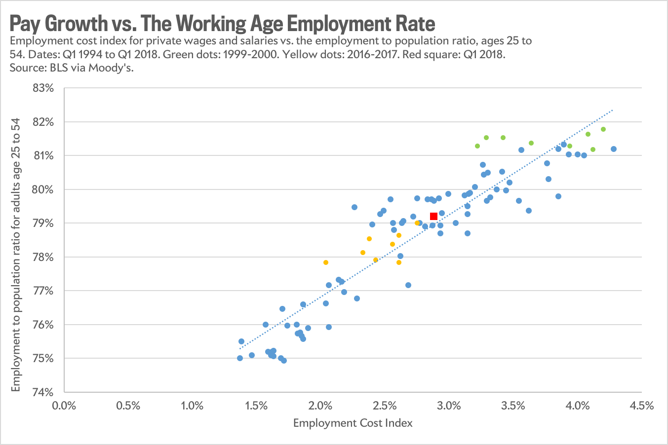
Another simple way to think about this graph: The green dots show you what an legitimately hot economy looks like. Meanwhile, we’ve been stuck in the yellow (2016 and 2017) and red.
Obviously, there are no certainties in economics. Maybe the relationship between working-age employment and wages will break down soon. But as of now, it looks like the best guide to what’s actually going on in the job market. What it tells us is that the unemployment rate is making the economy look closer to full health than it actually is. We still have plenty more time before employers are going to be anywhere close to short on workers to hire, and therefore plenty more time before they start handing out raises .
1 The correlation coefficient comes in at 0.92. This graph starts in 1994, but you can play around with the exact dates and the gist stays the same)
2 Instead of hourly wages, the graph measures pay using the Department of Labor’s quarterly “Employment CostIndex” for private wages and salaries, which tracks compensation while adjusting for changes in which industries workers are employed in.