The chart below demonstrates how many times, in the last 90 days, that people have searched Google for information about sequestration. “The sequester” is in red; the more accurate “sequestration” is in blue.
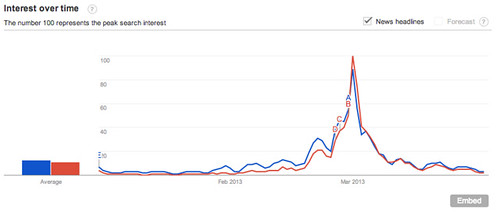 The embed code is a little buggy for me, but if you click the link above, you’ll see that interest started to rise at the end of February, that the buzziest news stories were about congressional action, and that search volume exploded on March 1 – the Friday the cuts went into effect. By Monday, search volume had fallen by 63 percent. And it’s never recovered, even as the cuts get implemented and local news outlets diligently file stories on their impact. McKay Coppins was right!
When People Stopped Caring About Sequestration, in One Chart
Advertisement