You’ve likely seen images online, including here at Slate, showing the stark visual difference between North and South Korea as seen at night. But that’s hardly the only place where you can pick up interesting clues from nighttime visuals—and some economists even argue that light can be used as a proxy for measuring economic development.
In a recent NBER working paper (summary here), Maxim Pinkovskiy of the Federal Reserve Bank of New York and Xavier Sal-i-Martin of Columbia University used luminosity as measured by NOAA weather sattelites as an “independent measurement of true income.”
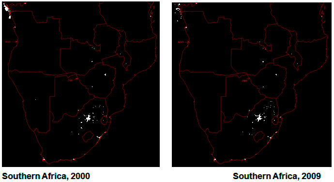
The comparison above shows a decade of change in sub-Saharan Africa. Angola (the third country from the bottom on the west coast) has many more lights in 2009 than in 2000, as you might expect from a country whose GDP per capita has nearly doubled. Zimbabwe, on the other hand, “has fewer lights, because of its economic collapse under the disastrous hyperinflationary policies of Robert Mugabe.”
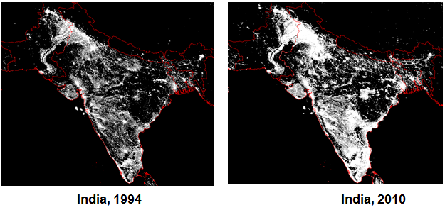
The map below shows 16 years of development in India:
Graphic created by Maxim Pinkovskiy and Xavier Sala-i-Martin from NOAA satellite photos. Originally published at VoxEu.org.
Pinkovskiy and Sala-i-Martin have been arguing for some time that poverty in the developing world—articularly in sub-Saharan Africa—is falling much faster than most official estimates. Not everyone is convinced by their research.The light data probably isn’t conclusive enough to put the debate to bed, which isn’t to say I wouldn’t want to see more of it.