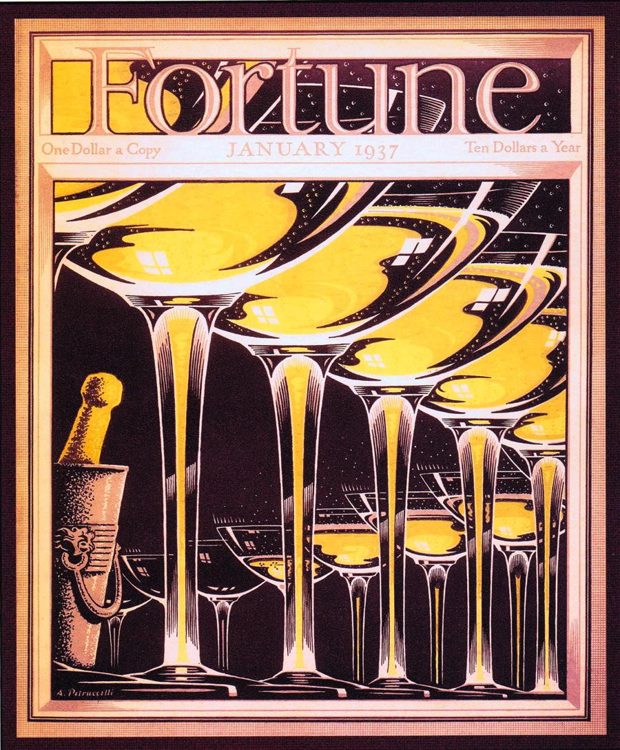
Fortune, which launched in 1929 as the brainchild of Henry Luce, had a lux appearance and premium price. (In 1935, the magazine’s prominently-noted subscription rate of ten dollars a year would have translated to around $172 in 2014 dollars.) As part of the project’s mandate to emphasize visual presentation, the magazine commissioned artists to create covers that would lend it what we might now call a strong brand identity.
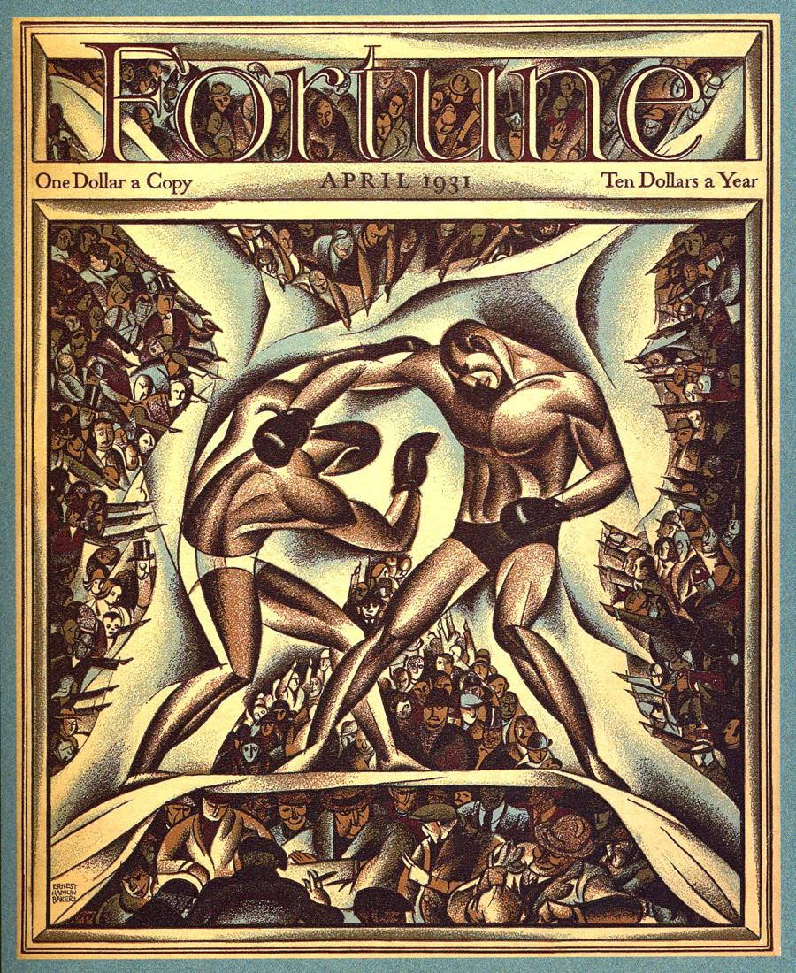
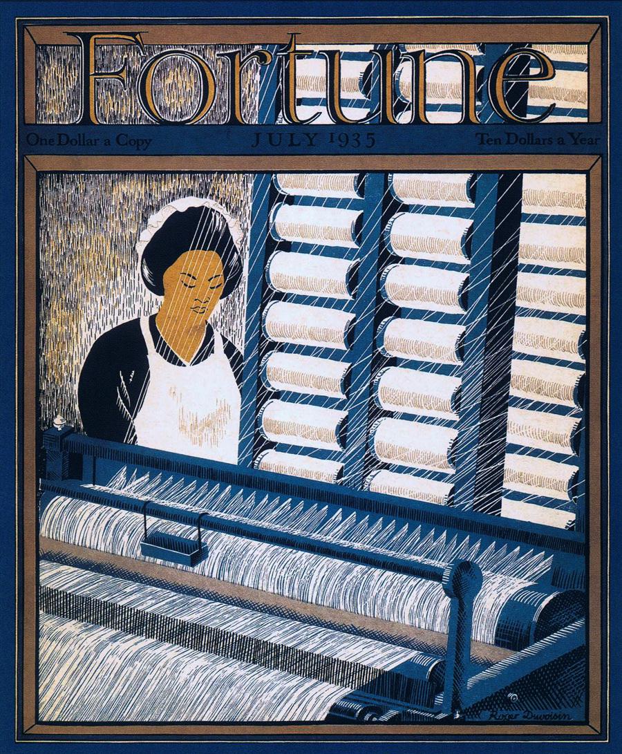
Scholars have long mused over the striking contrast between Fortune’s 1930s patronage of fine writers and artists like James Agee, Ernest Hemingway, and Margaret Bourke-White—who often wrote about, or photographed, people struggling during the Depression—and the magazine’s luxurious presentation and exclusive audience. These covers show how the two mandates overlapped.
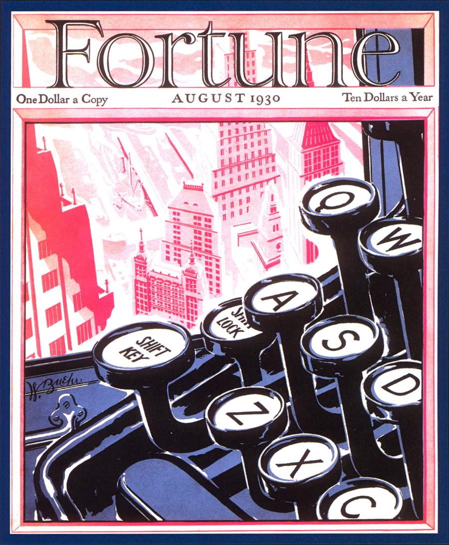
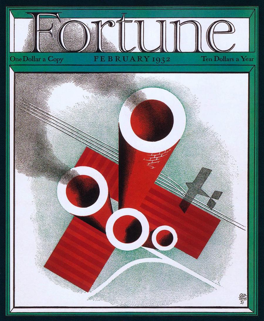
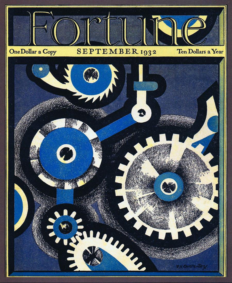
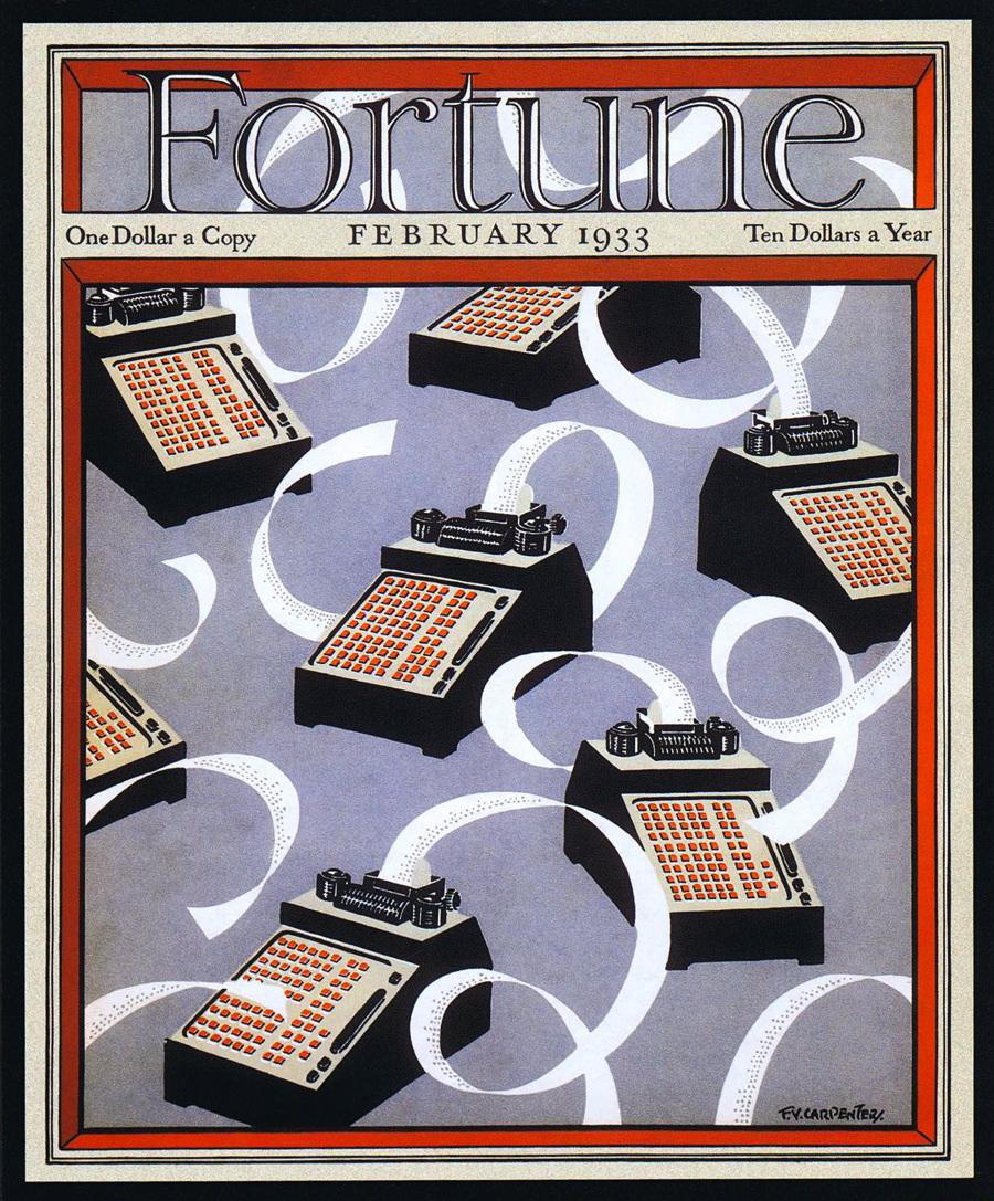
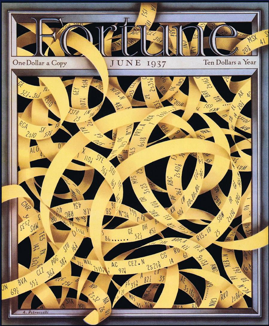
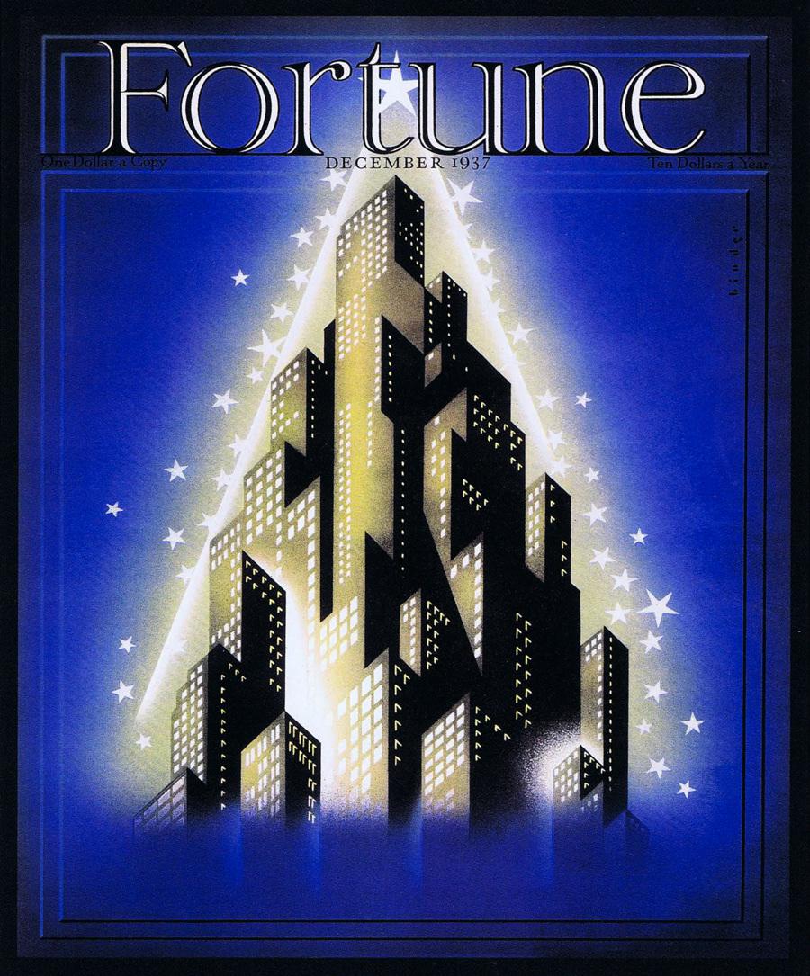
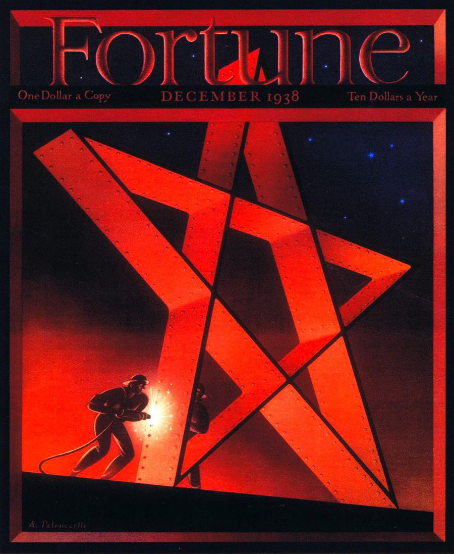
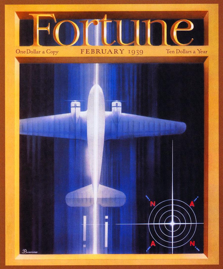
As a rejection of the idea that capitalism was at odds with American life, historian Michael Augspurger argues, Fortune “celebrated the business-driven culture of modernity.” The designs below emphasize technologies of the office, like ticker tape and typewriters, as well as symbols of impressive corporate achievements, like airplanes and city skylines. The Fortune covers represented business as integral to the functionality of the American system, and made it look gorgeously appealling.
Used by permission of Time Inc. Scan via CreativePro.com
Used by permission of Time Inc. Scan via CreativePro.com
Used by permission of Time Inc. Scan via CreativePro.com
Used by permission of Time Inc. Scan via CreativePro.com
Used by permission of Time Inc. Scan via CreativePro.com
Used by permission of Time Inc. Scan via CreativePro.com
Used by permission of Time Inc. Scan via CreativePro.com
Used by permission of Time Inc. Scan via CreativePro.com
Used by permission of Time Inc. Scan via CreativePro.com
Used by permission of Time Inc. Scan via CreativePro.com
Used by permission of Time Inc. Scan via CreativePro.com