The Vault is Slate’s history blog. Like us on Facebook, follow us on Twitter @slatevault, and find us on Tumblr. Find out more about what this space is all about here.
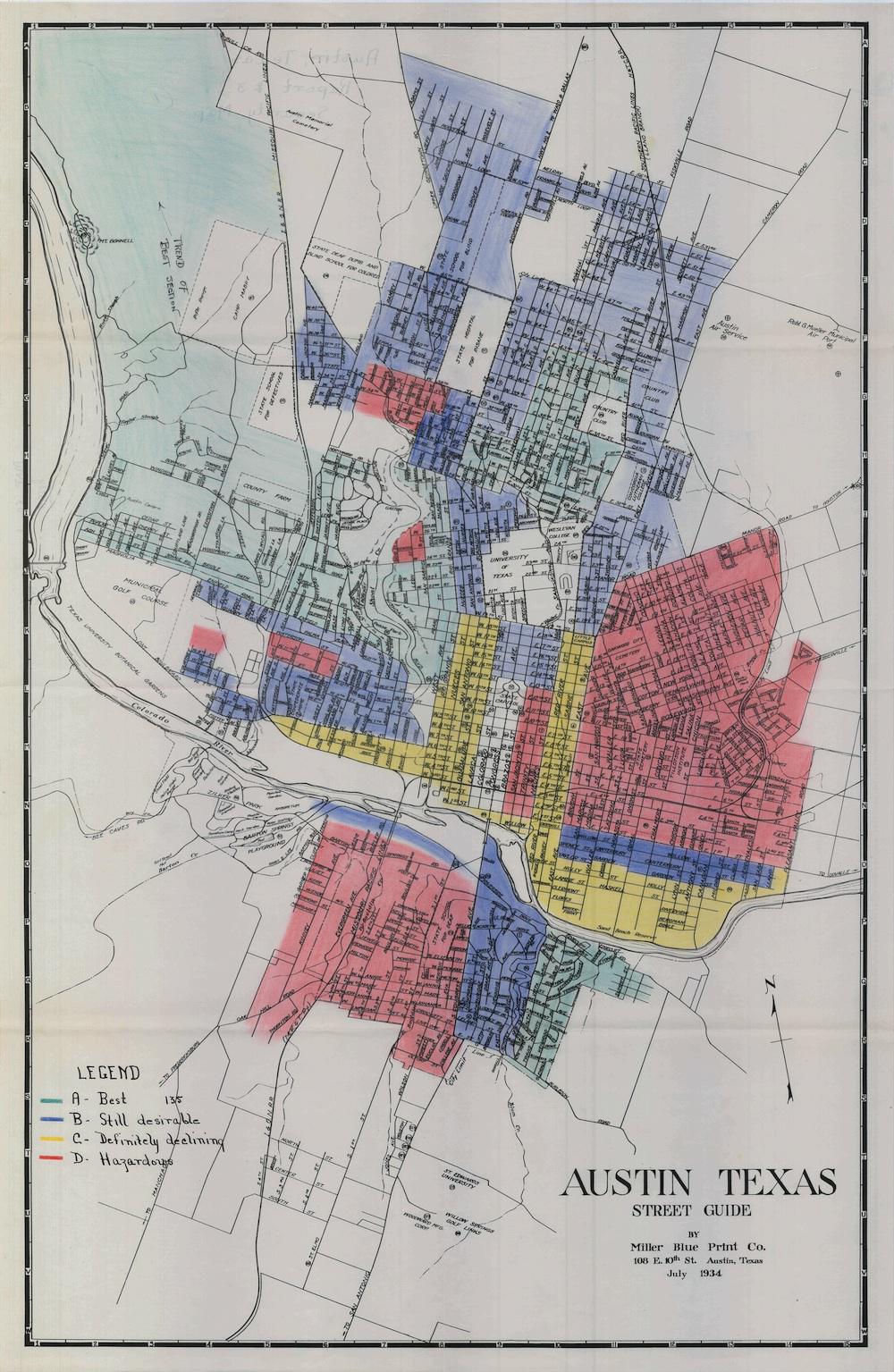
During the Depression, the Home Owners’ Loan Corporation, a New Deal agency, refinanced mortgages for over a million struggling homeowners. As part of this work, the agency sent out assessors who rated neighborhoods based on several factors: housing stock, sales and rental rates, physical attributes of the terrain, and “threat of infiltration of foreign-born, negro, or lower grade population.”
In Ta-Nehesi Coates’ powerful Atlantic cover story “The Case for Reparations,” the twentieth-century practice of redlining, or selective denial of home loans based on the assessed desirability of neighborhoods, is central to his argument. The Depression-era HOLC “security” maps, which categorize neighborhoods from “best” to “hazardous,” are some of the most striking visual documents of the long history of racially-based housing discrimination.
It’s important to note that some scholars, most notably the University of Pennsylvania design and urban studies professor Amy Hillier, have argued [PDF] that HOLC maps weren’t necessarily used to redline. Hillier, who looks at uses of HOLC data in Philadelphia, writes that the practice was widespread before and after the New Deal agency sent out its assessors, and that the uses of HOLC maps in actual decision-making aren’t necessarily clear. (“For Hillier, the HOLC maps reflected rather than caused redlining practices,” writes historian Robert K. Nelson—emphasis mine.)
WNYC’s Brian Lehrer Show recently put up a blog post linking to the archive of HOLC maps hosted by Urban Oasis, a site run by Virginia Tech historian LaDale Winling. (That’s where I found this 1934 map of my onetime home, Austin, Texas.) Eventually, Winling and a team of other researchers plan to create a database of hundreds of these maps.
Right now (Friday afternoon), some of the site’s links aren’t working, probably because of the traffic directed its way via WNYC. This made me wonder where else on the Web people could see redline maps. Here are a few options, some of which allow for enhanced viewing with searchable interfaces.
-The National Archives has digitized some HOLC maps from the mid-1930s—for Birmingham, Ala.; Miami; Richmond, VA; New Orleans; Atlanta; and Providence—and those are available here.
-The University of Richmond’s project Redlining Richmond offers an interactive map of the city’s HOLC data that lets you compare ratings of neighborhoods with information about city poverty rates in the 2000s.
-Last week, the Atlantic’s Alexis Madrigal wrote about T-RACES, a digital project that presents historical HOLC maps of California. Madrigal includes reconfigured T-RACES maps, finessed by data artist Josh Begley, in his post.
-UConn’s libraries have digitized the 1937 HOLC report for Hartford, Conn. and presented it as a GoogleMap overlay, in association with a larger project on Hartford’s historical social geography.
-Amy Hillier and the University of Pennsylvania have digitized HOLC maps of Philadelphia from 1936 and 1937, as well as an earlier, non-HOLC map of “racial concentrations” in the city that was created by a private agent in 1934.
-The Ohio State University has digitized HOLC maps for fourteen Ohio cities, along with supplementary HOLC “area descriptions” for most of those locations.
-A project hosted by the University of North Carolina Libraries, Dividing Durham, uses HOLC data to create an interactive version of Durham, North Carolina’s 1937 HOLC map.
-Thanks to Mitch Fraas for this addition: the Southern Redlining Collection, run by the same group that produces T-RACES, features HOLC data for Asheville, North Carolina, juxtaposed with later data on urban renewal.
-Thanks to Mont Brownlee for this addition: the Johns Hopkins library has made a very large, hi-res TIF of a 1937 HOLC map of Baltimore available on its website.
-Thanks to Vanessa Massaro for this addition: the project Mapping Decline: St. Louis and the American City makes use of HOLC maps, among others.
-Thanks to Johnny Finn for this addition: the project Redlining in Virginia, which uses HOLC maps of Norfolk, Richmond, and Roanoke.
Know of HOLC maps available elsewhere on the Web? Please let me know and I’ll be happy to add them to this roundup.