The Vault is Slate’s history blog. Like us on Facebook, follow us on Twitter @slatevault, and find us on Tumblr. Find out more about what this space is all about here.
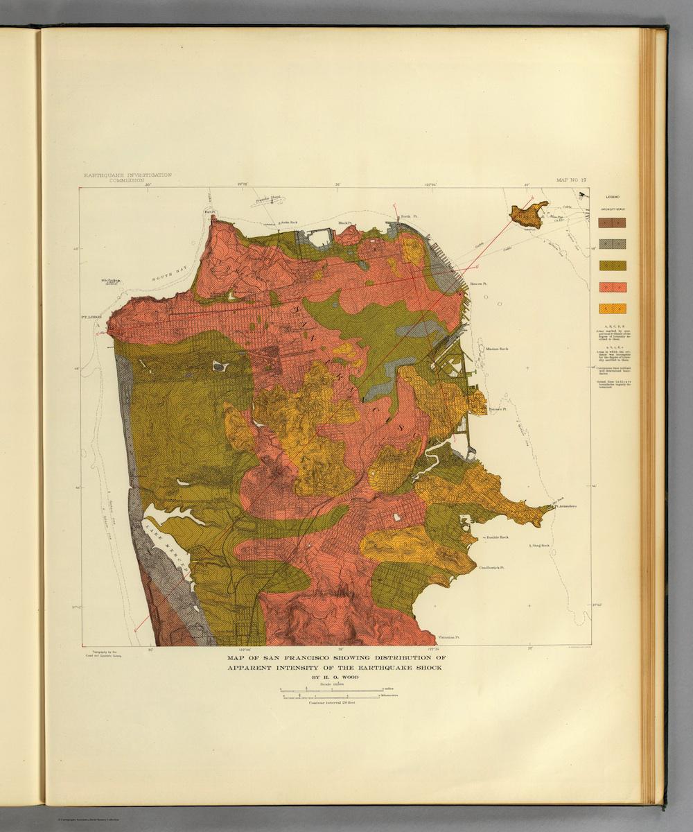
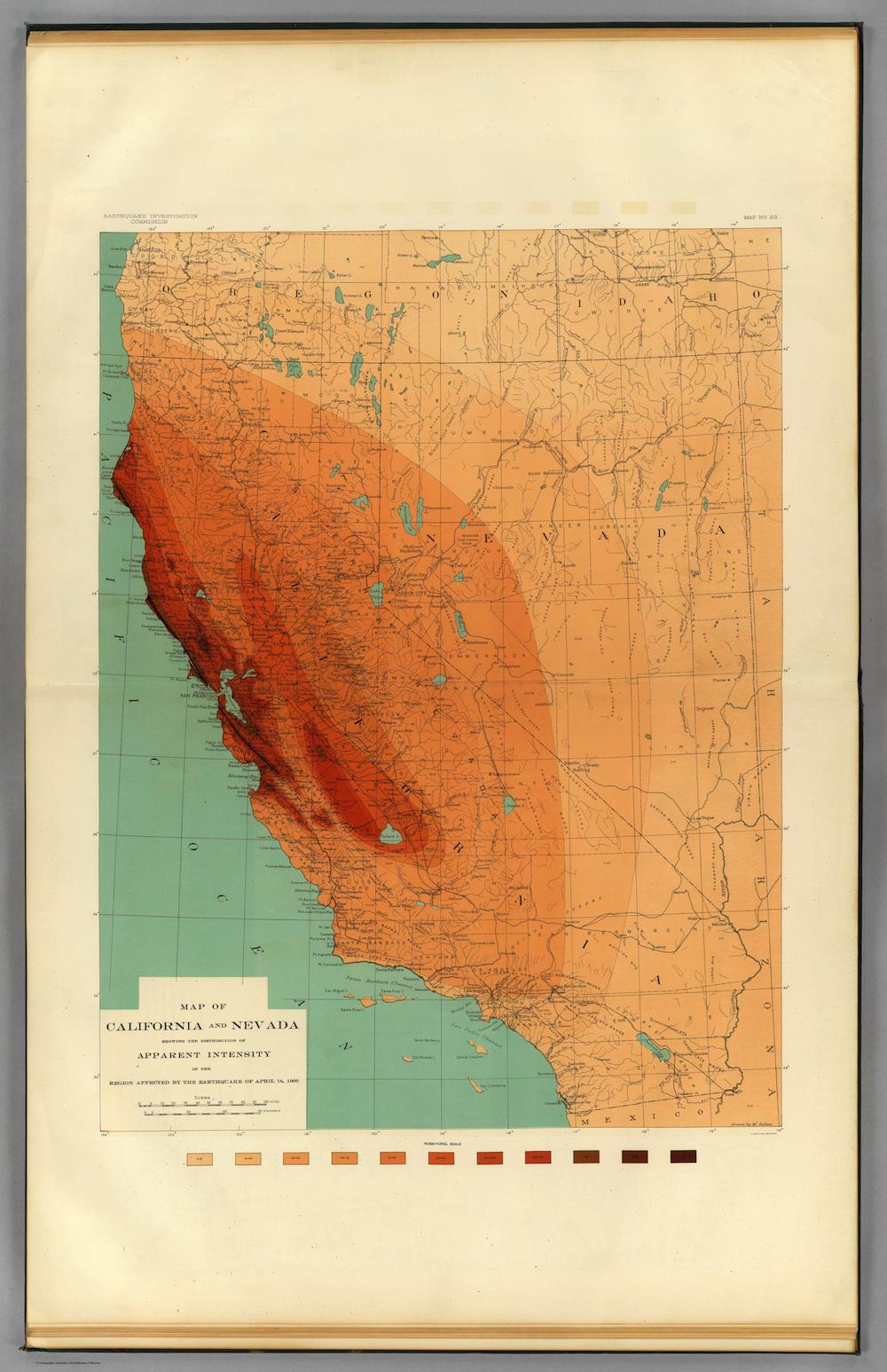
These maps come from an atlas that accompanied the 1908 scientific report attempting to explain the causes and effects of the San Francisco earthquake, titled The California Earthquake of April 18, 1906: Report of the State Earthquake Investigation Committee. The two maps use the data that the commission collected to represent the earthquake’s intensity geographically.
Andrew C. Lawson, a prominent geologist who was head of the Department of Geological Science at Berkeley at the time of the quake, headed up the commission. Right after the earthquake, Lawson writes in the preface to the report, the effort to understand the event began:
The scientific men of the state, each on his own initiative, began the work of assembling observations; the more intelligent citizens became persistent in their inquiries as to the nature of the earthquake, its extent and intensity, and the causes in general of such terrible disasters…
Susan Elizabeth Hough, a seismologist with the U.S. Geological Survey, points out that while government officials approved funding for the commission, they refused to pay for the publication of this report. Hough suggests that the dominant political climate in the years after the quake, in which local businessmen and politicians tried hard to minimize reports of damage done, may have been to blame. In any event, the Carnegie Institution stepped in and provided financing for the report’s printing.
Besides reports on intensity of the quake, the committee included surveys of the effects on plants and animals, illustrations of damage inflicted ( “statue of Agassiz thrown from its niche above arches, Stanford University”), and a sobering map showing the extent of fire damage in the city.
The commission used the Rossi-Forel scale, a now-outmoded measurement of earthquake intensity that incorporated seismograph readings (where available), human reports, and observed physical damage. Each map here refers to “apparent intensity” of the effects—a term meant to remind the reader that the Rossi-Forel measurements had some degree of subjectivity to them.
Click on the images below to reach zoomable versions, or visit the David Rumsey Map Collection’s website to see these maps along with the rest of the digitized atlas.
David Rumsey Map Collection/Cartography Associates.
David Rumsey Map Collection/Cartography Associates.