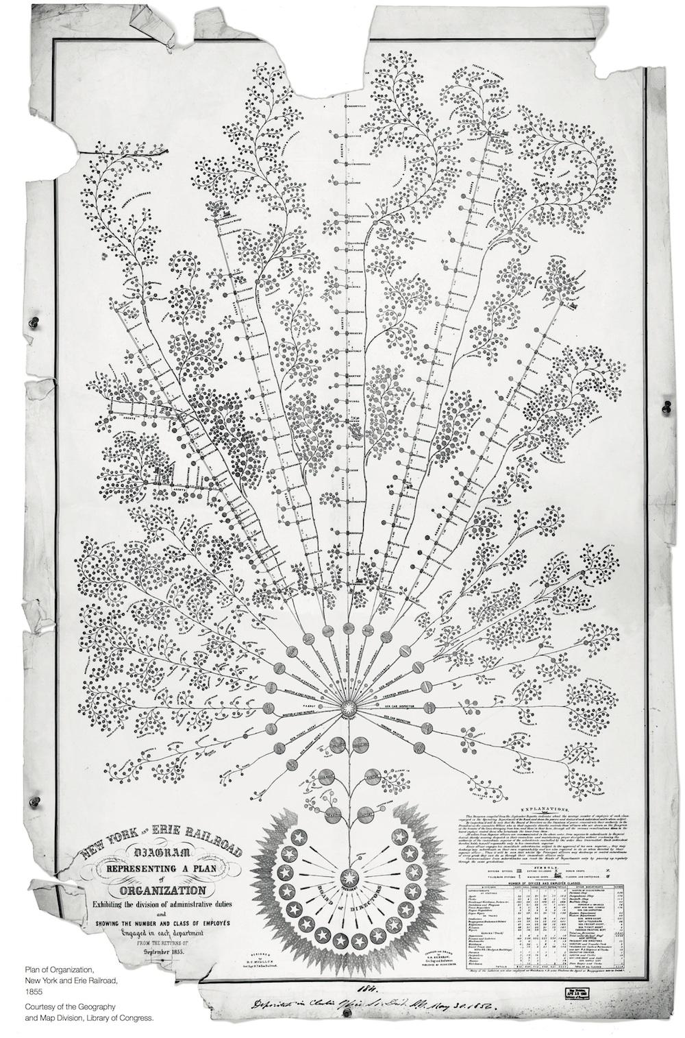
With this 1855 chart, Daniel McCallum, general superintendent of the New York and Erie Railroad, tried to define an organizational structure that would allow management of a business that was becoming unwieldy in its size. The document is generally recognized to be the first formal organizational chart.
Historian Caitlin Rosenthal, writing in the McKinsey Quarterly, points out that the chart was a way for McCallum to get a handle on a complex system made more confusing by the new availability of data from the use of the telegraph (invented in 1844). Information about problems down the track was important to have—it could help prevent train wrecks and further delays—but the New York and Erie’s personnel didn’t have a good sense of who was in charge of managing this data and putting it into action.
The chart put daily responsibilities in the hands of the divisional superintendents of the railroad’s lines. The superintendents, in turn, had to provide McCallum and the central office with reports on their operations. Rosenthal writes: “McCallum … designed a system of hourly, daily, and monthly reports that enabled him to calculate practical metrics, such as cost per ton-mile and average load per car.” The railroad’s board would use this data to improve operations.
Besides being historically significant, the chart is beautiful to regard. Designed by McCallum and drafted by G.H. Henshaw, a civil engineer, the chart draws from the natural motifs popular in the Victorian aesthetic. Looked at from afar, the whole resembles a tree laden with fruit or blossoms. Up close, the individual “branches” illustrating groups of employees who worked on the trains have the rough, natural look of vines, twining alongside the straight lines of the tracks that they service.
Click on the image to reach a zoomable version. Thanks to David Kirsch for the suggestion.
Library of Congress