The Vault is Slate’s new history blog. Like us on Facebook; follow us on Twitter @slatevault; find us on Tumblr. Find out more about what this space is all about here.
Handwriting in late-nineteenth-century letters is almost universally beautiful: regular, precisely slanted, and pleasing to the eye. This broadside, which outlines the principles of a popular system of instruction in cursive writing at the time, proves that achieving that style took a lot of work.
Platt Rogers Spencer made a lifelong career out of the art of cursive writing. He taught, founded business schools that promised to impart the skill, and wrote a series of bestselling books and pamphlets. After he died in 1864, his many children carried on that work. (You can read a copy of Spencerian Key to Practical Penmanship [1866] on the Internet Archive’s website.)
In the days before typewriters, people engaging in business correspondence needed to learn how to write legibly. The Spencerian hand was meant to be both easy to read and lovely to regard. In its perfectly slanted, liquid shapes, it was supposed to reflect forms found in nature.
This sheet, printed sometime between the 1860s and 1880s, presented a condensed version of the advice in Spencer’s books. It offers tips on posture, tells the reader how to hold the pen, and provides suggestions for correctives if the student can’t break bad habits. (“The pen may be confined to the thumb and second finger by two bands of tape, and the third finger may be held in its proper position by tape from it to the wrist.”)
Spencerian handwriting was eventually displaced by the typewriter and the Palmer method, a more minimalist script developed in the 1910s in reaction to Spencer’s flowing, decorative lettering.
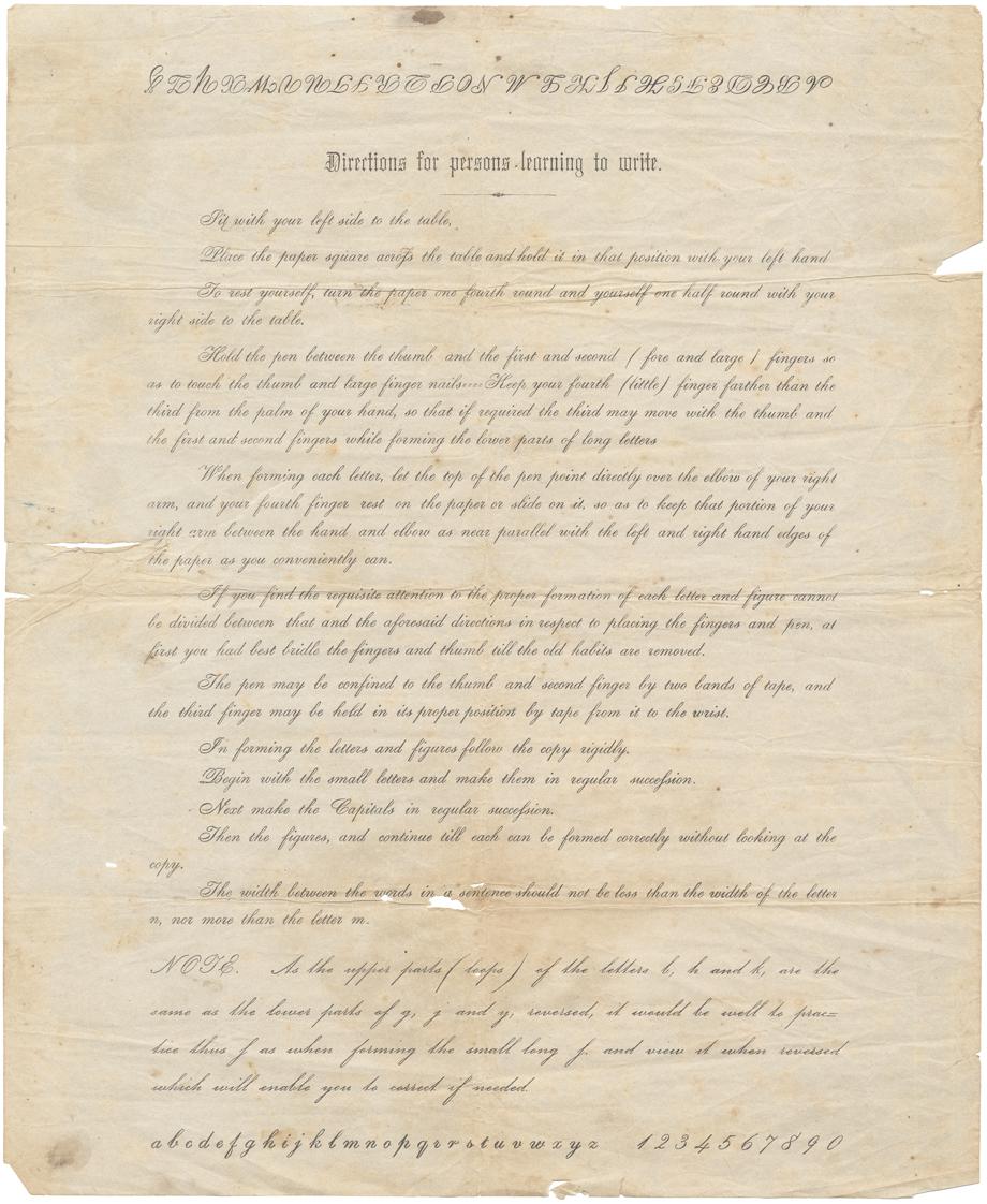
“Directions for Persons Learning to Write.” Ca. 1850s-1870s. Image courtesy of Ian Brabner Bookseller via RareAmericana.com.