One of the most fatuous features of modern TV election coverage is its obsession with who’s “in the lead” in various states, based on partial returns as they come in.
Throughout the night, you’ll hear talking heads breathlessly report things like, “Clinton is now leading in Ohio, with 51 percent of the vote, with 32 percent of precincts reporting!” Behind them, continuously updating graphics mirror these figures, like a scoreboard of football games in progress. These figures are the bread and butter of election-night coverage, especially early in the evening, before the electoral map starts to fill in.
In the absence of further context, however, these numbers are essentially meaningless. Pick the reddest state in the union, and if the bluest precincts happen to report early, you could conceivably find Clinton in the lead—and vice versa.
It isn’t that these data have no value. They’re actually very instructive, if properly interpreted. But what matters in partial returns are not the raw vote counts. It’s how the vote counts in early reporting precincts align with our expectations. If Clinton has 51 percent of the Ohio vote with 32 percent of precincts reporting, the relevant question is: How much of the vote was she expected to carry in those precincts? If she’s outperforming expectations, that alters our understanding of how likely she is to win the state. She could be “in the lead,” in TV news parlance, but if the precincts reporting skew Democratic and her margins are thinner than expected, this could actually be great news for Trump.
And the networks know this, at least in their calmer moments. That’s why you’ll occasionally see them call a state for one candidate even as the other one appears to be “in the lead,” leading to widespread viewer confusion—and this year, no doubt, suspicions of “rigged” elections among the sort of people susceptible to conspiracy theories. It’s also why you’ll hear their analysts constantly jumping in with caveats about which precincts have yet to report, and which way they’re likely to lean.
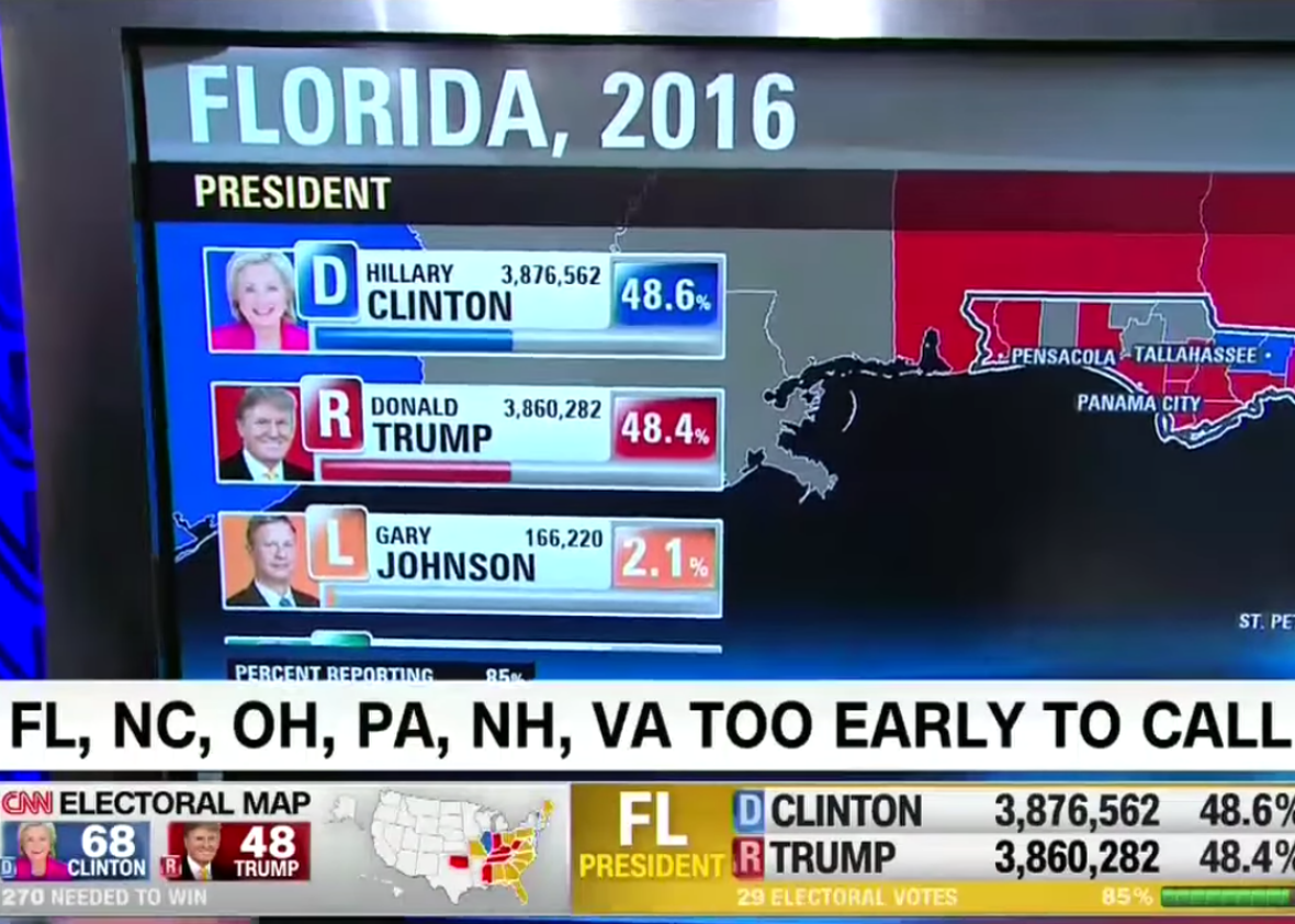
These analysts, however, inevitably get cut off by an excited anchor jumping in with a “key race alert” that pulls us all back to the meaningless raw numbers. On CNN, for example, Wolf Blitzer and some dramatic sound effects interrupted a worthwhile discussion of voting patterns in Durham County, North Carolina, to proclaim that “Donald Trump, all of a sudden, has taken the lead in Florida!” No, he hasn’t. What has really happened is that some red-leaning precincts have just reported, giving the impression of a shift in the race, regardless of how those precincts’ results align with expectations.
Those “key race alerts” are exciting, and they give the coverage the feeling of a sporting event in which one team has just made a game-changing play. The reality is nothing of the sort. It’s more like the game has already ended, and the scoring plays are being revealed to us retrospectively in random order.
A far more useful approach is exemplified by the New York Times’ live presidential forecast. First of all, the Times responsibly places at the very top a caveat that the forecasts are volatile early in the night. Then, rather than telling us who’s “in the lead,” it shows us its constantly shifting estimates of who’s going to win, based on what we know so far, along with a probability that corresponds to its model’s confidence in that prediction. So if new data come in from Ohio that put Clinton “ahead,” but they leave her with an uphill battle to hold that lead in the remaining counties, her win probability in Ohio will go down, rather than up—even as Blitzer’s tie is curling up and down over Clinton pulling ahead.