
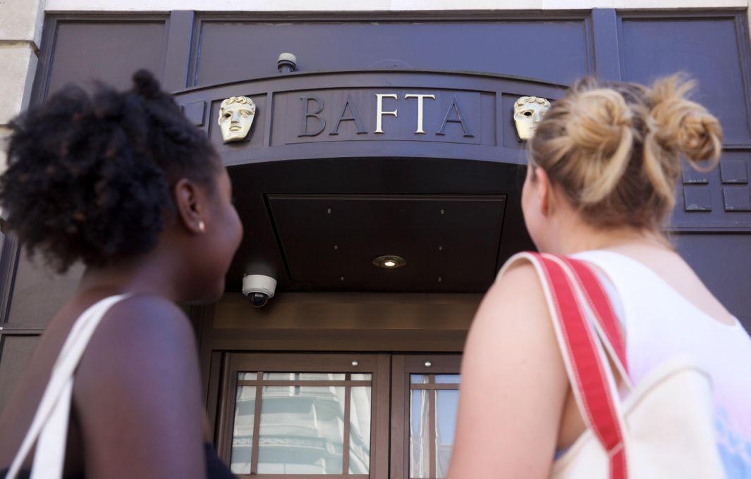
Last year the U.K.’s NHS Blood and Transplant launched the Missing Type campaign in England and North Wales to help sign up new blood donors and reverse a steep decline in donations by removing the A’s, B’s, and O’s from corporate logos and familiar landmarks.

Missing Type

Missing Type

Missing Type
A survey by the NHS Blood and Transplant reported a 30 percent drop in donors worldwide in the past decade. On Aug. 16 the campaign went global, with blood services in 21 countries around the world participating.
Missing Type

A NHS Blood and Transport Missing Type blood van.
Ian Enness

Missing Type
Crucial vowels representing the main blood groups have gone dark in thousands of brand logos, storefronts, and online, with name-brand corporations such as Google and Microsoft helping demonstrate the need for donations of all types of blood. It’s a clever, subtle, cost-effective effort that is a reminder that sometimes the most powerful design gesture is one that tweaks expectations by stripping something away, rather than creating more visual noise in a cacophonous world.