James I. Bowie is a sociologist at Northern Arizona University whose Emblemetric blog examines patterns and trends in logo design using quantitative analysis of data from the United States Patent and Trademark Office. Here at the Eye, Bowie shares a recent Emblemetric post about the brief history of uninspired marijuana logos.
Now that 23 U.S. states and the District of Columbia have legalized marijuana in some form, the drug’s potential in the legitimate business world is quickly being recognized. The legal sale of marijuana is now being bolstered by the same marketing and branding techniques used to sell soap and toothpaste. But a quick glance at the current practice of marijuana branding reveals that it is clearly still in its infancy.
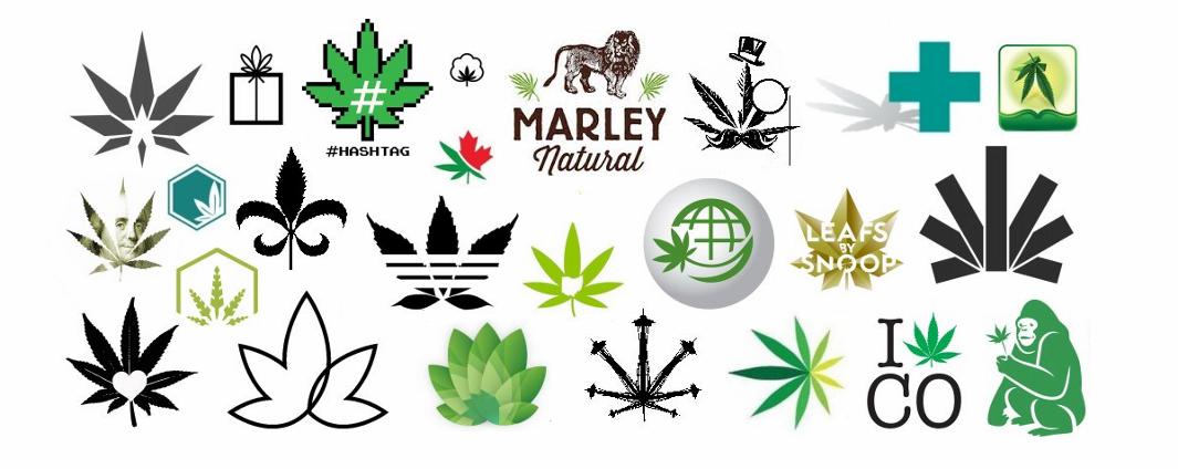
In a 2015 interview with Fortune magazine, investor Brendan Kennedy, a backer of the Marley Natural marijuana brand, complained that in the marijuana business, “Everything is named ‘canna-something’ or ‘mari-something,’ with a green and black logo and pot leaves.” Indeed, analysis of United States Patent and Trademark Office records shows that 44 percent of logos registered as trademarks for marijuana-related businesses feature the familiar cannabis leaf.
As a result, marijuana branding is visually indistinct. Even when the heavy-hitters of branding and design have been brought in, avoiding the easy design solution represented by the leaf has proved difficult. For instance, the mark for Snoop Dogg’s high-profile Leafs by Snoop marijuana line, designed by Pentagram’s Emily Oberman, while visually arresting, is simply a depiction of a pot leaf. And even the Heckler Associates–designed logo for Kennedy’s Marley Natural featured the leaves as a secondary design element at the time of his quote (although they have recently been dropped, with the focus now squarely on the brand’s lion symbol).
Emblemetric
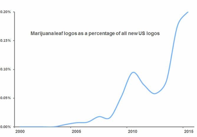
USPTO records show that the first U.S. marijuana leaf logo trademark was filed in 2004, and the years since have seen an explosion in the symbols. By 2015, more than 1 in 500 new U.S. logos featured a cannabis leaf.
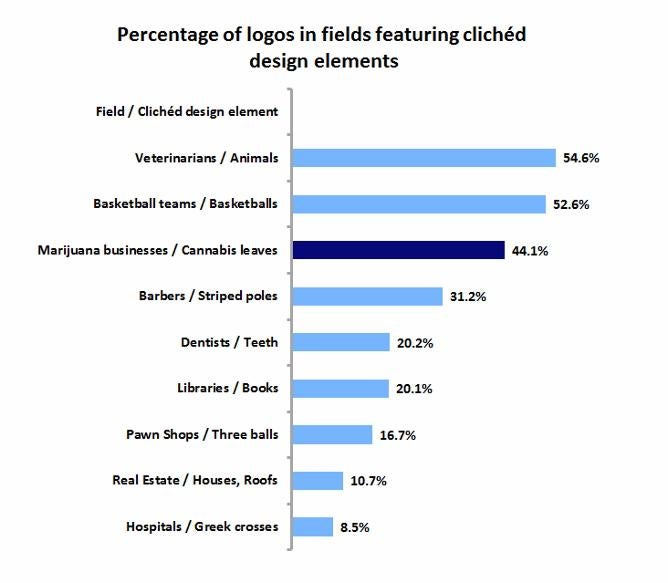
The problem with the leaf in a marijuana business logo is that it is so commonly used that it acts as a symbol of merely the general category, rather than of the specific brand. Such visual clichés can be found in many fields, stemming from tradition (such as the use of striped poles as symbols for barbers) or obviousness (like dentists employing tooth logos). The graph below shows that the use of cannabis leaves in marijuana logos has reached a particularly heightened level of cliché.
Emblemetric*
This is fine when the category is more important than the brand. If you need a quick haircut or your molar is killing you, you’ll look for the first striped pole or tooth logo you can find. Because legal pot is still a novelty, the leaf itself is enough to attract business. But as marijuana becomes legally available on a more widespread basis, its branding is going to have to move beyond the generic leaf to incorporate more distinctive visual elements.
*Correction, April 20, 2016: The bar chart in this post originally misstated the percentage of logos with clichéd pot leaf design elements. It is 44.1 percent, not 41.1 percent. The chart has been updated.